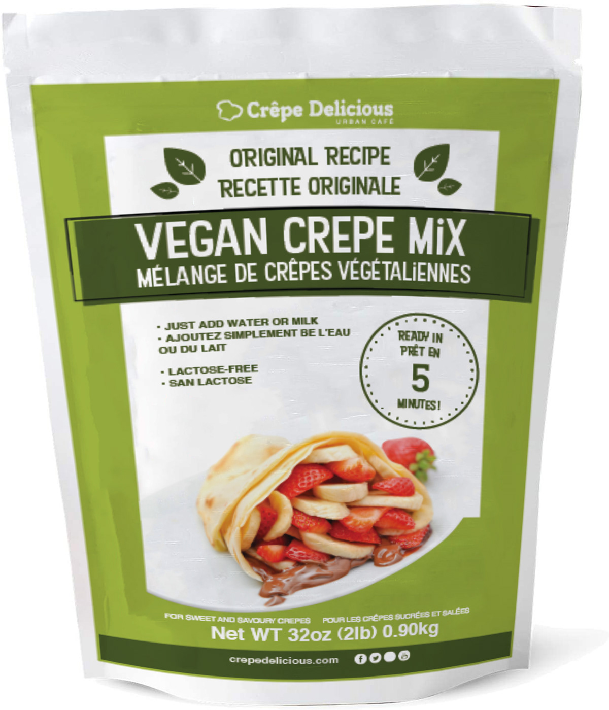
I was requested by Crepe Delicious to create a vegan crepe version of the original red crepe mix package the company had. The company told me to use inspiration from other vegan labeled packaging and create my own twist.
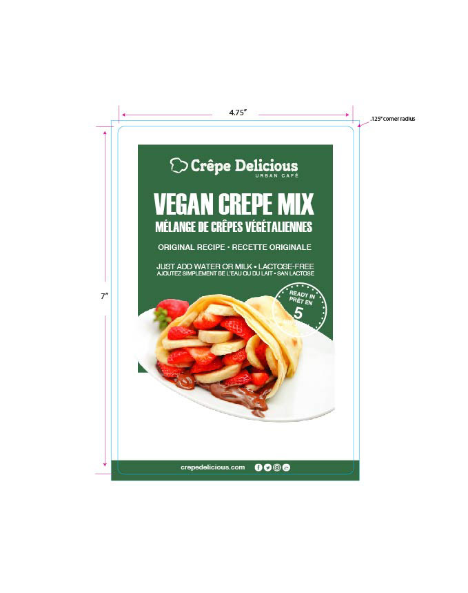
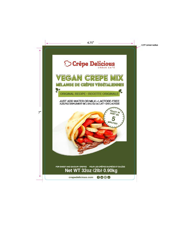
They wanted the package to look organic and healthy. I researched some vegan and vegetarian packaging that other food companies that created. I made multiple version of the vegan crepe mix package and made it really green to distinguish the package from the original version. With a couple of the other designs, I took the leaf from the company's menu design, and implemented in some of the designs. Most of the designs were inspired by the original crepe packaging that they had, which had a red and white packaging, colours that represent Crepe Delicious.


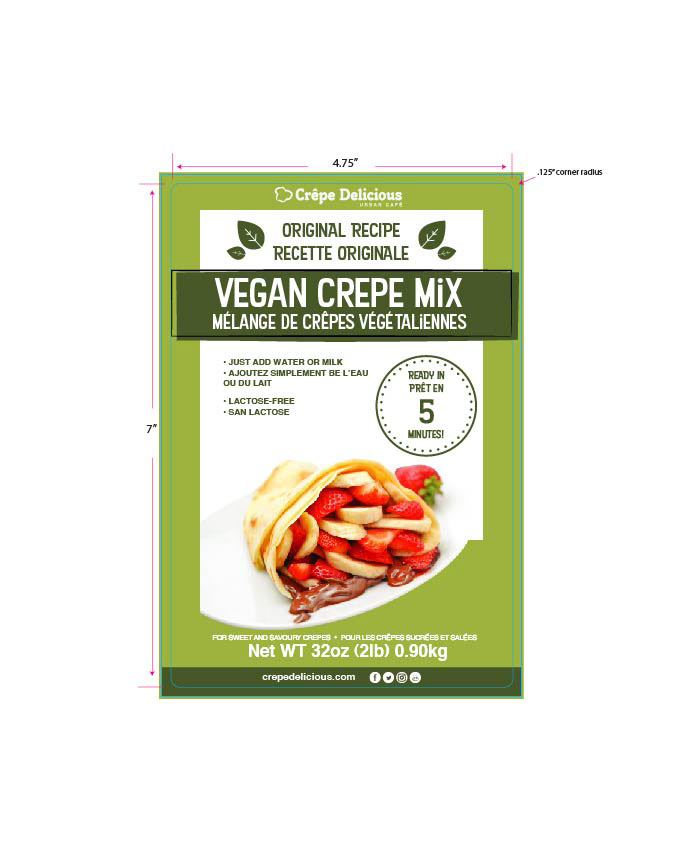
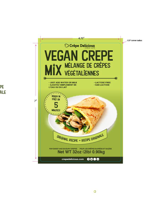
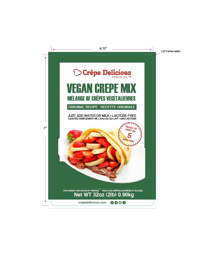
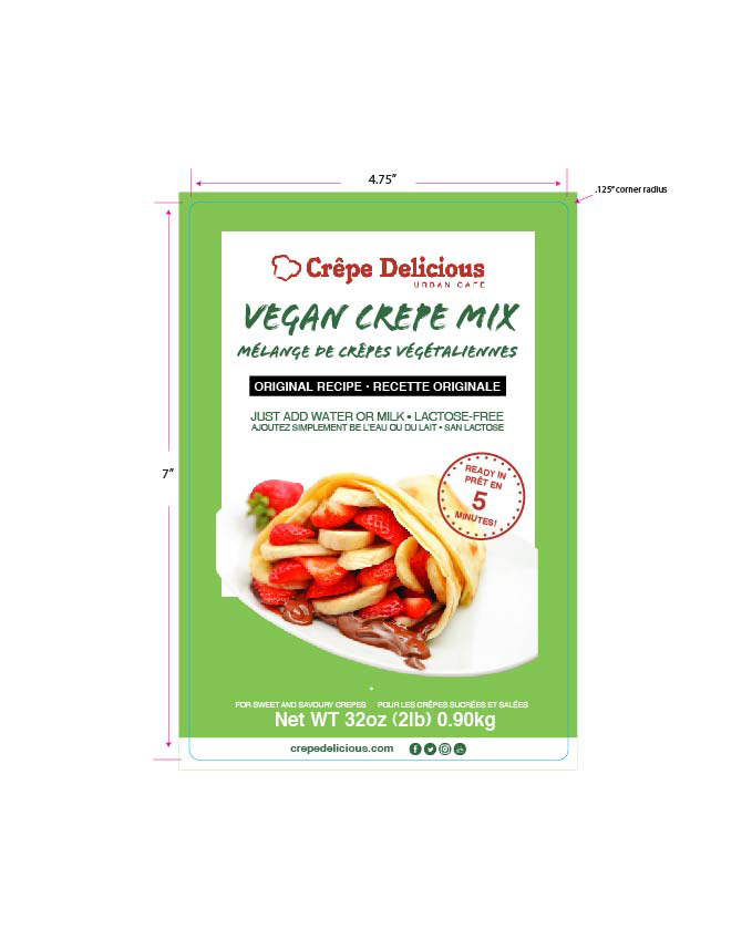
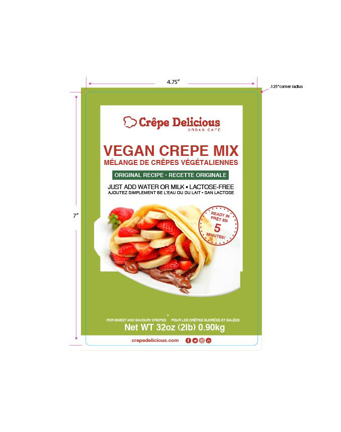
The final decision had the leaves coordinated as part of the banner. With this design, I was also inspired by the organic food packaging that I encountered growing up.
I wanted a font that markets to people that the food is natural, organic, and vegan and that you might see in similar packages like the vegan crepe mix. I stuck with the font Kon Tiki Aloha JF because the font looked organic and looks like it suits with modern day graphic design.
Adding the black rectangle outline to the darker green box helps contrast from the different shades of green that was being used for the design. The black rectangle outline helps make the main focal point 'Vegan Crepe Mix' stand out as the main focal point and create a more organic flow with the design.