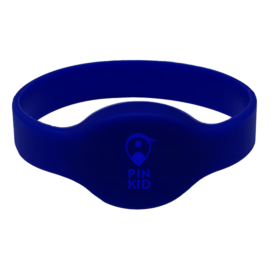
The concept of PinKid was to specifically target parents and their children. The idea is a children's bracelet to help parents find their lost children and to help the slow down the cases of missing or kidnapped children across Canada. So I wanted to make sure that the concept that I come up with is designed to target that specific audience.
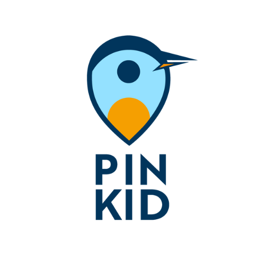
Penguins are the main animals that I wanted to implement across various designs of PinKid since they are animals that are approachable to parents and children when it comes to marketing and Emperor penguins are known to find their families and soulmates despite many of these penguins looking vastly similar to each other. I liked the how emperor penguins looked like, and along with the pin-drop icon, it was pretty easy to come up with different ideas with this combination. I wanted a design that looks like a penguin and looks like a pin-drop location icon whilst keeping a clean and simple design. So I went with the pin-drop design, but using the inside circle as eyes and having the beak at the side arched like how a penguin's beak would.
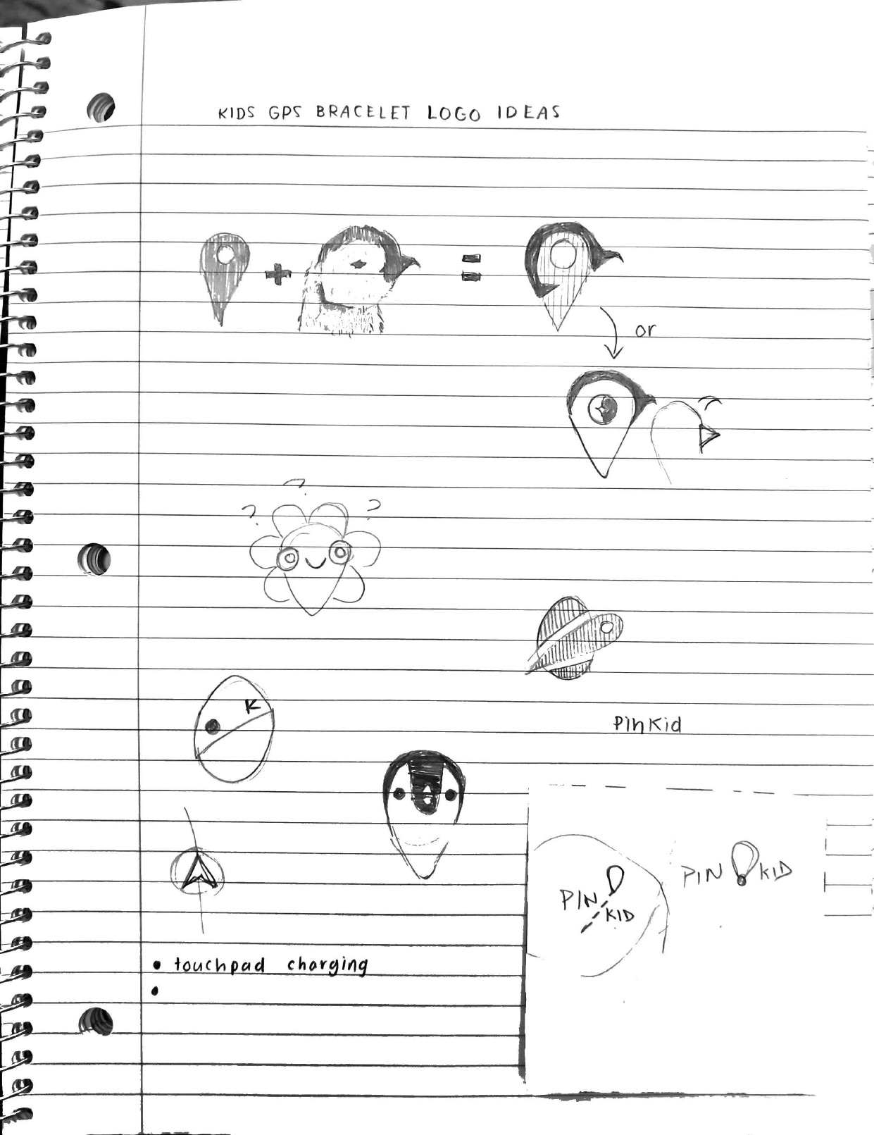
In the final logo designs, I decided not to arch the penguin beak to keep a cleaner look and to use bright and pastel colours to create a child-like feel to the designs. I used the orange at the bottom of the penguin to emulate an Emperor penguin's belly. I did not want to use black as part of the main logo other than the black and white version is to complement the baby blue and orange better in the designs.
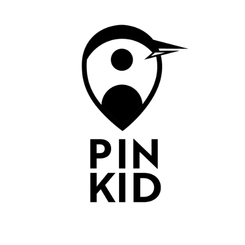
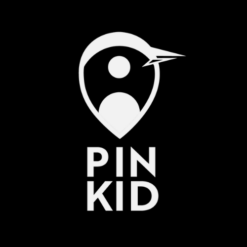
When translating the full colour into black and white, it was a little tricky since there were three different colours used for the logo design. I wanted to use black and white version of the logos to create the designs for the bracelets. What I ended up doing was using the belly as the outline and inverting the bottom part of the beak to keep the same concept of the original design.