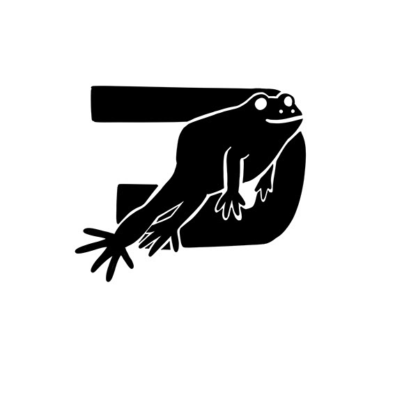
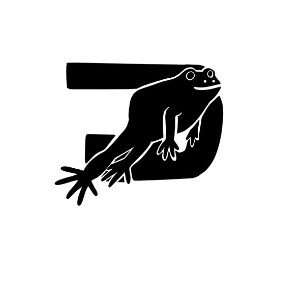
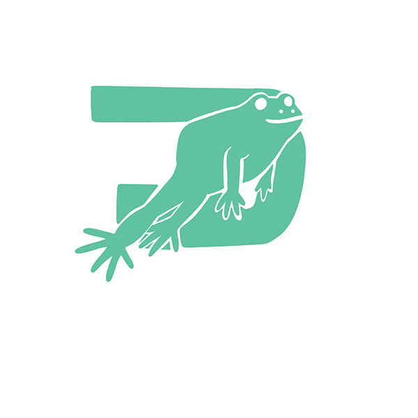
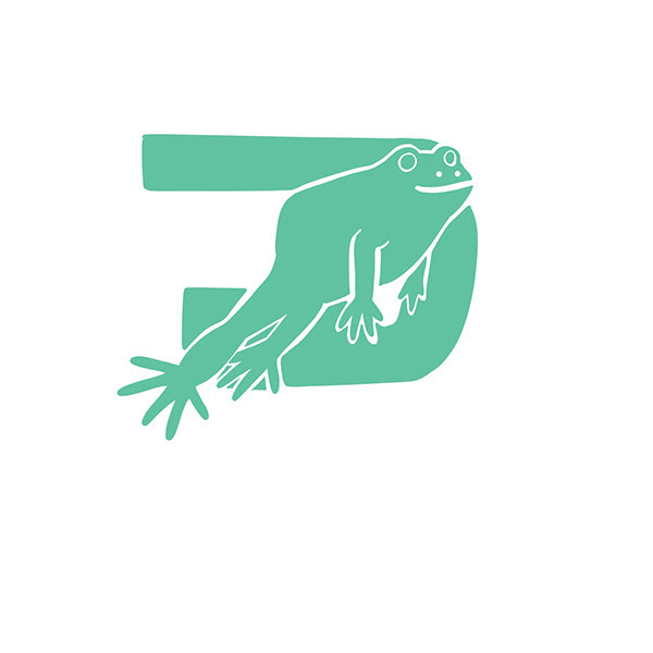
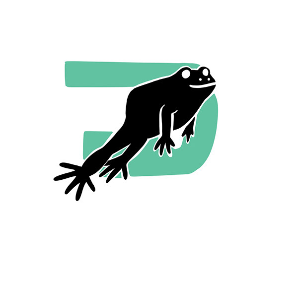
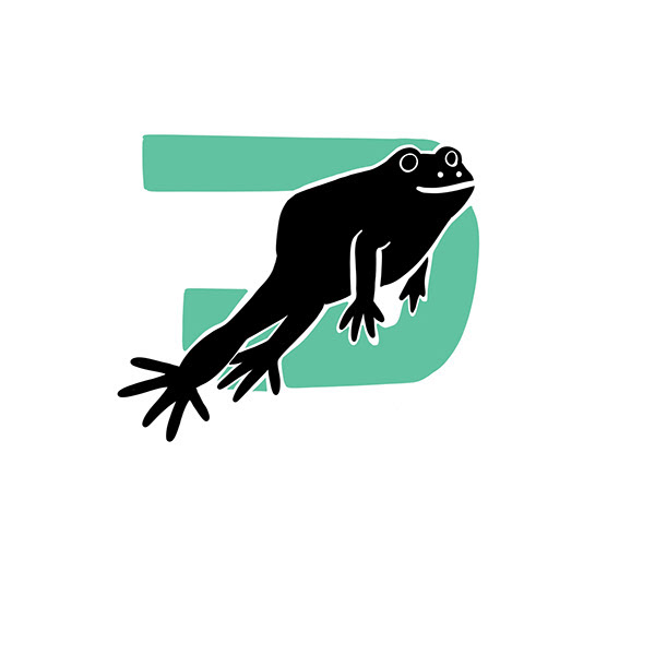
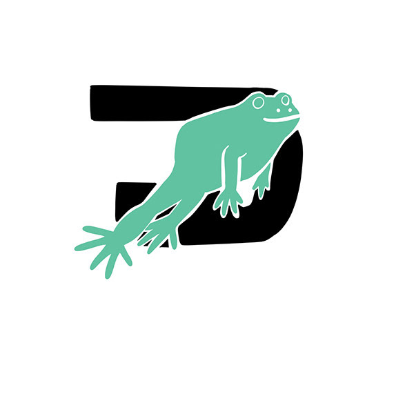
The former logo was a simplistic form between my two initials of my name. And then I realized that my logo looked too similar to a bigger company, Doordash, so I had to add some changes to my new logo. I decided to add a frog into my logo since frogs are my favourite animal and the leaping position symbolizes moving forward into new opportunities. I wanted to simplify my logo even more from my previous logo and make the logo look ambiguous and more clean. I wanted to redesign the logo and have certain features that the original logo had.
A lot of the rough ideas that I drew out kept the original logo, but implemented frogs in various ways and positions including the frog holding the logo, the frog as the original logo, or have the webbed foot of the frog stick out of the original logo.
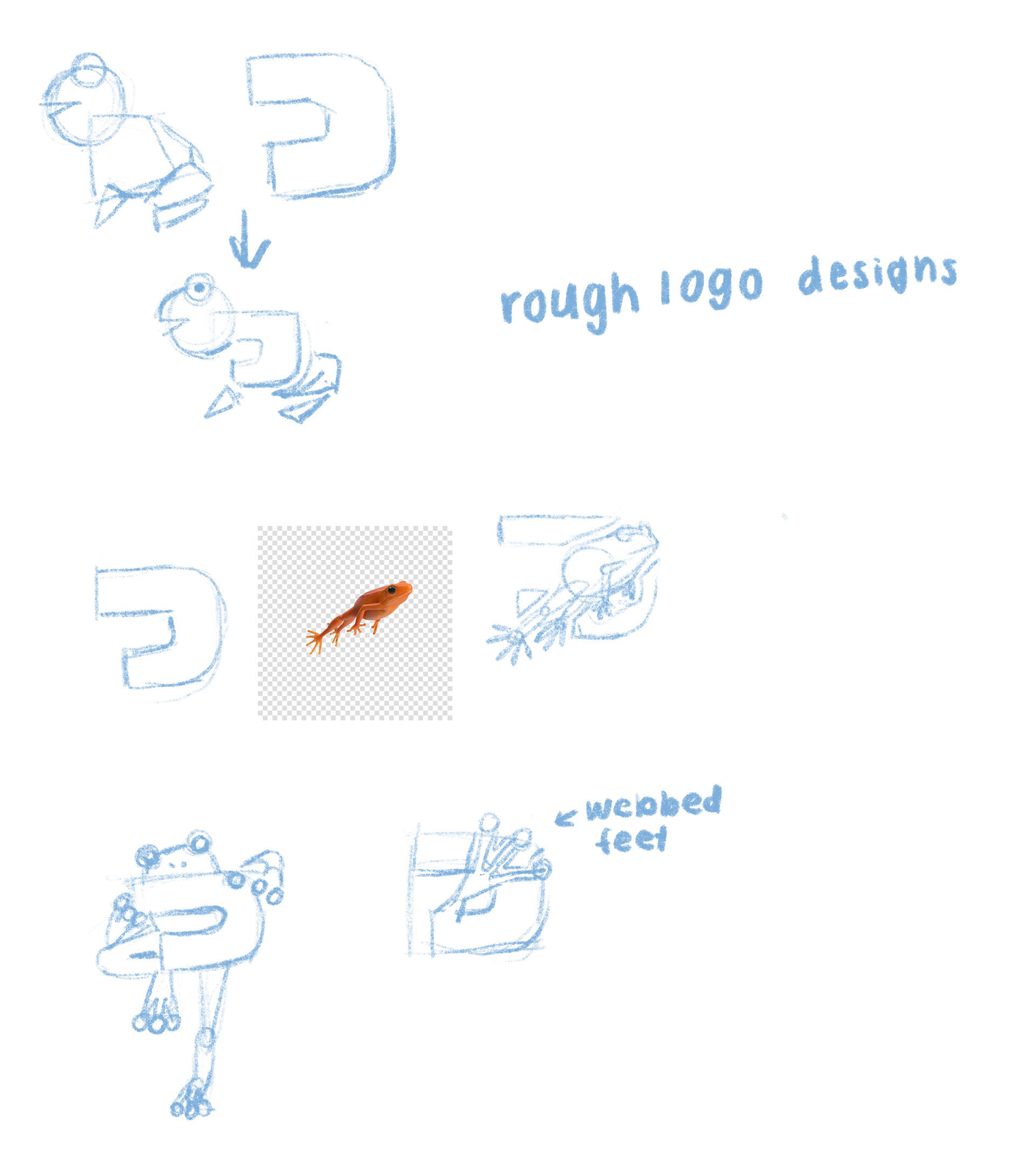
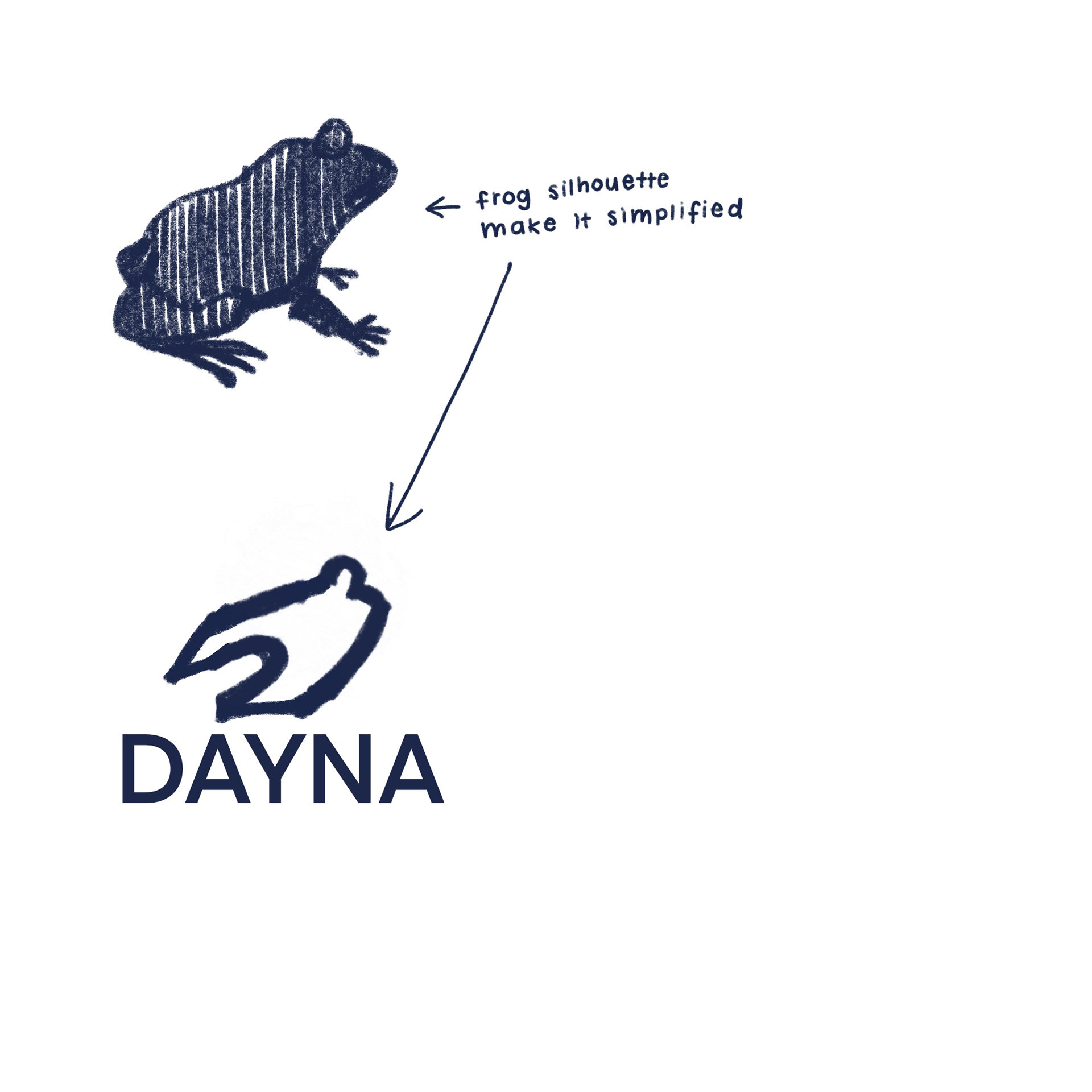
The original logo frog design (left) had a frog leaping which intersected with the original logo design. I enjoyed the concept of the idea when I roughly drew the logo design, but it did not look as clean as I expected on Procreate. The original logo was not as readable as a logo from afar and wanted to be able to translate the colour to black and white easier.
Ultimately, I went with a more simplistic logo (right) that kept its frog form and while keep the concept of the original logo. The sketching of this design was the frog was going to closed off all together, but then I wanted to keep a gap to make more distinguishment between the body and feet of the frog. I also used this logo design because it was easier to read the text from afar and was easier to convert colours to black and white.
Original Frog Logo
New and Official Frog Logo
