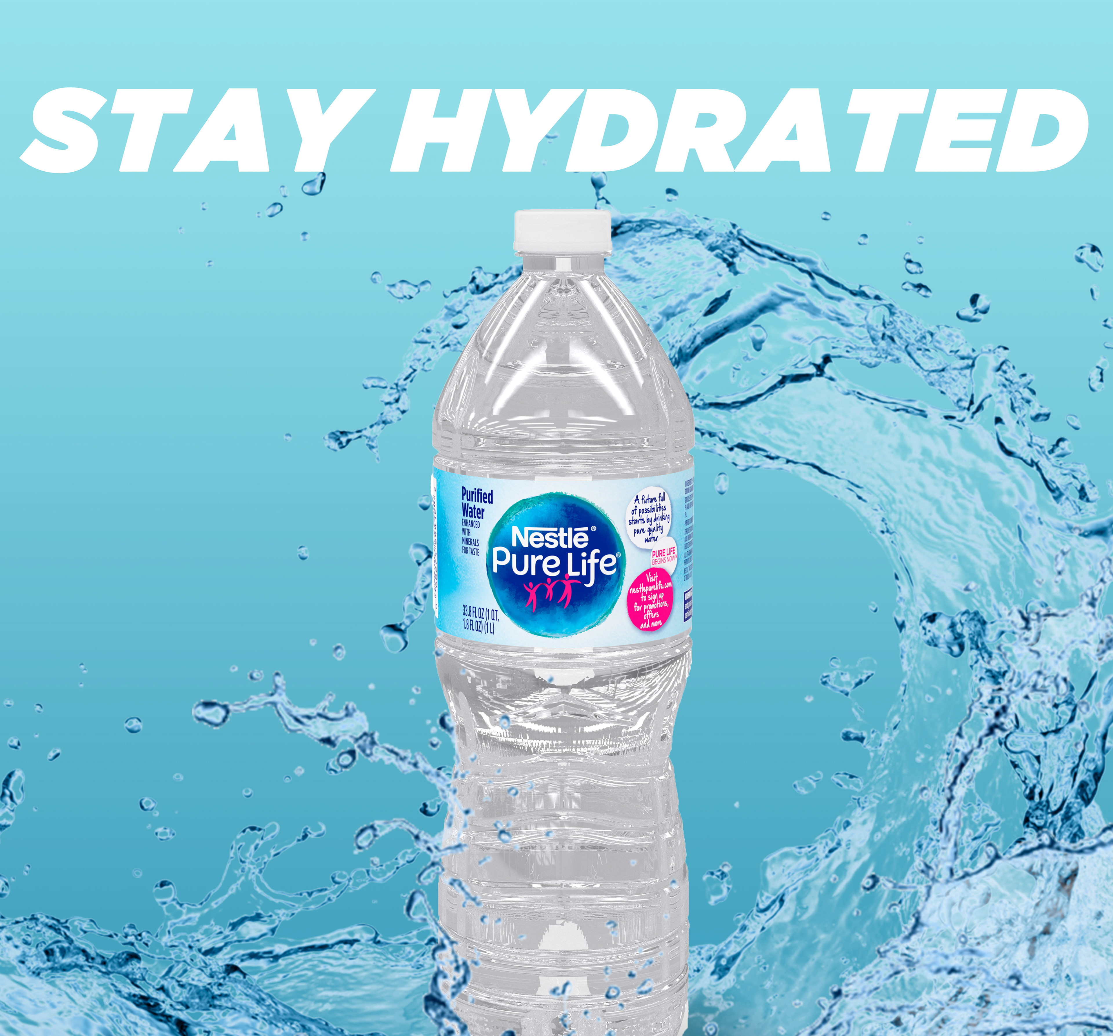
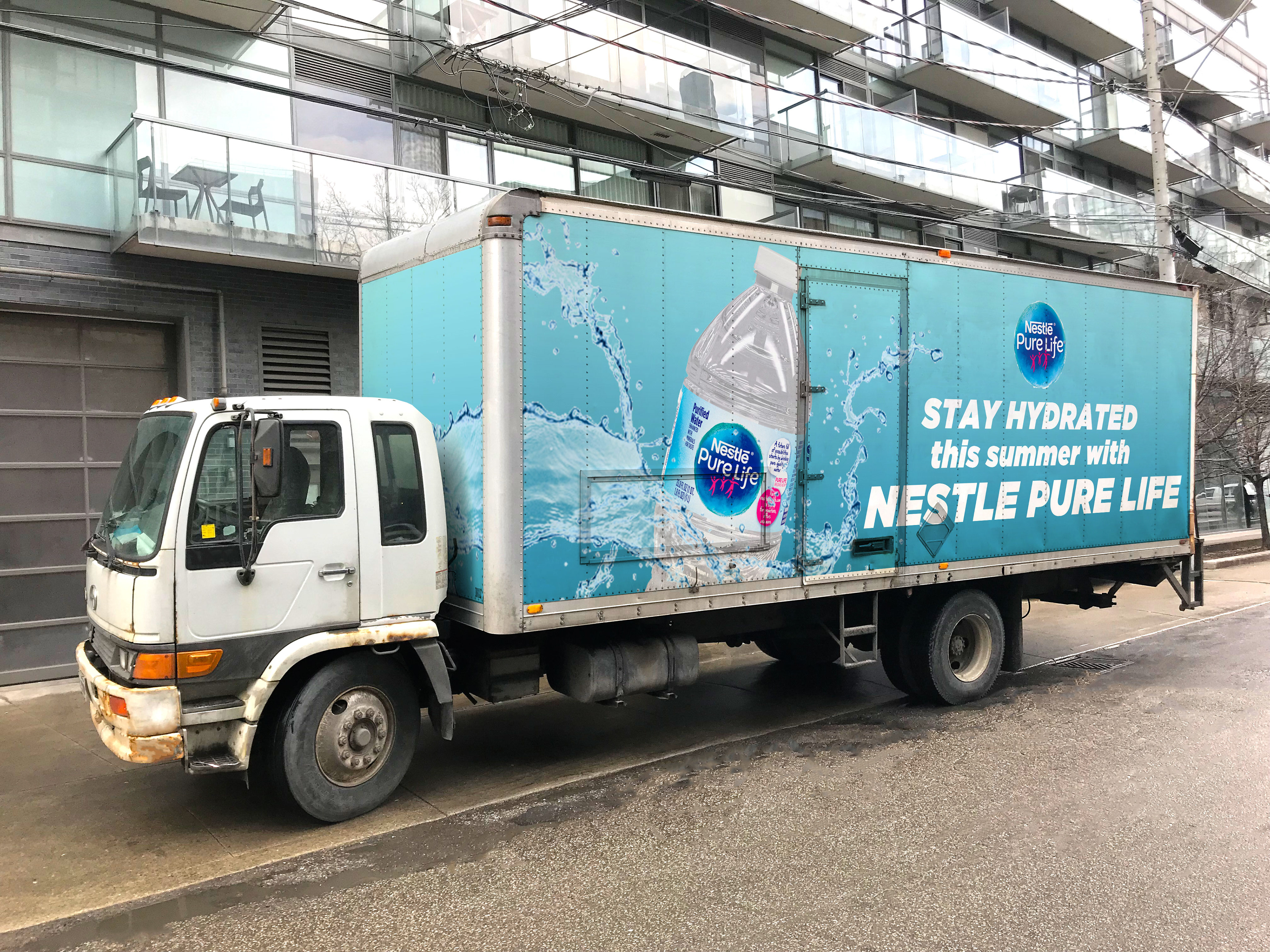
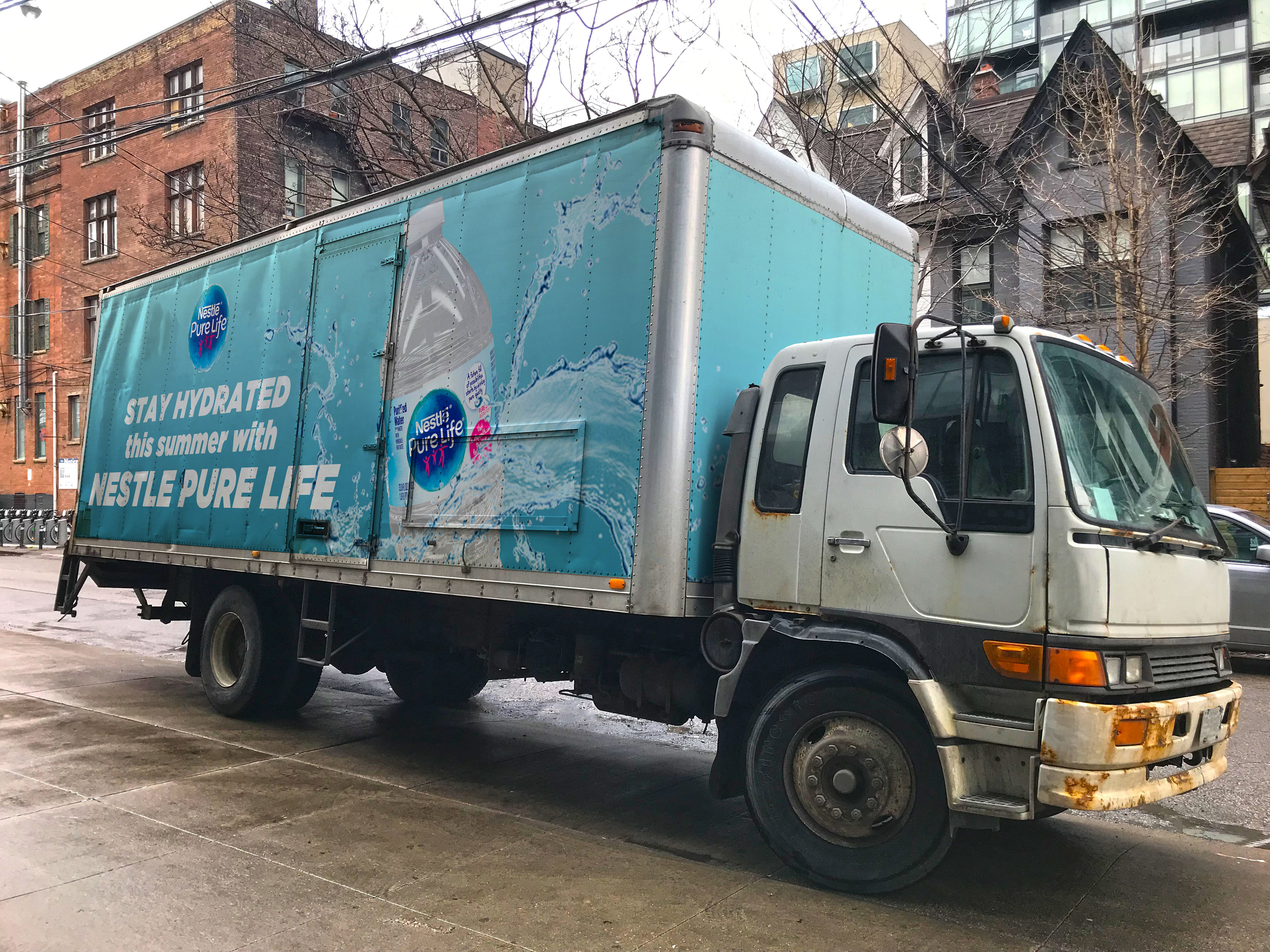
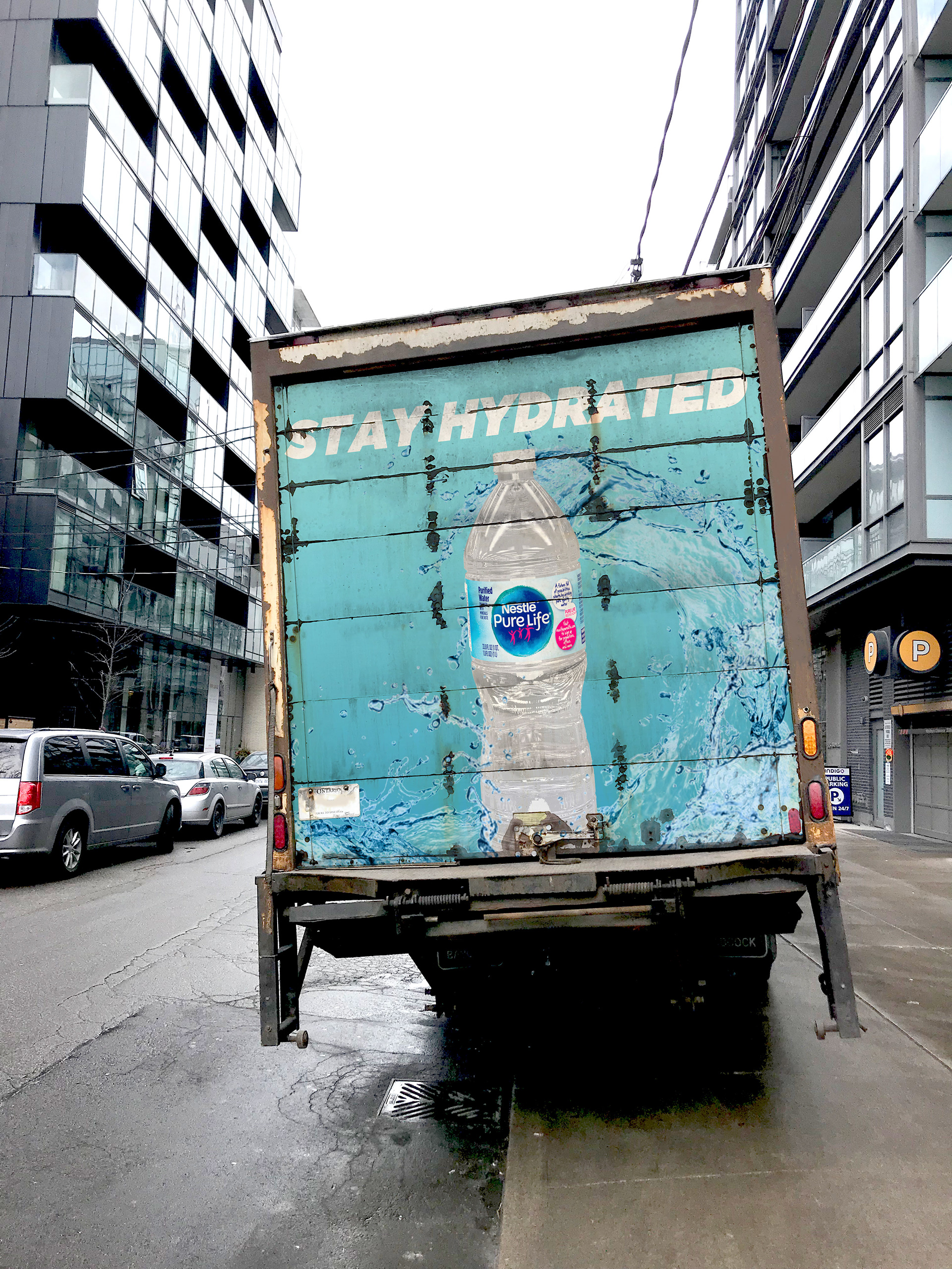
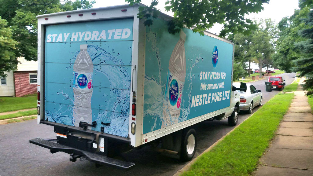
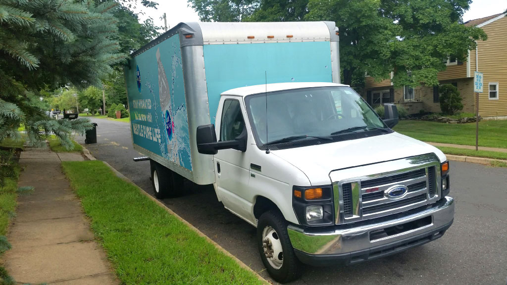
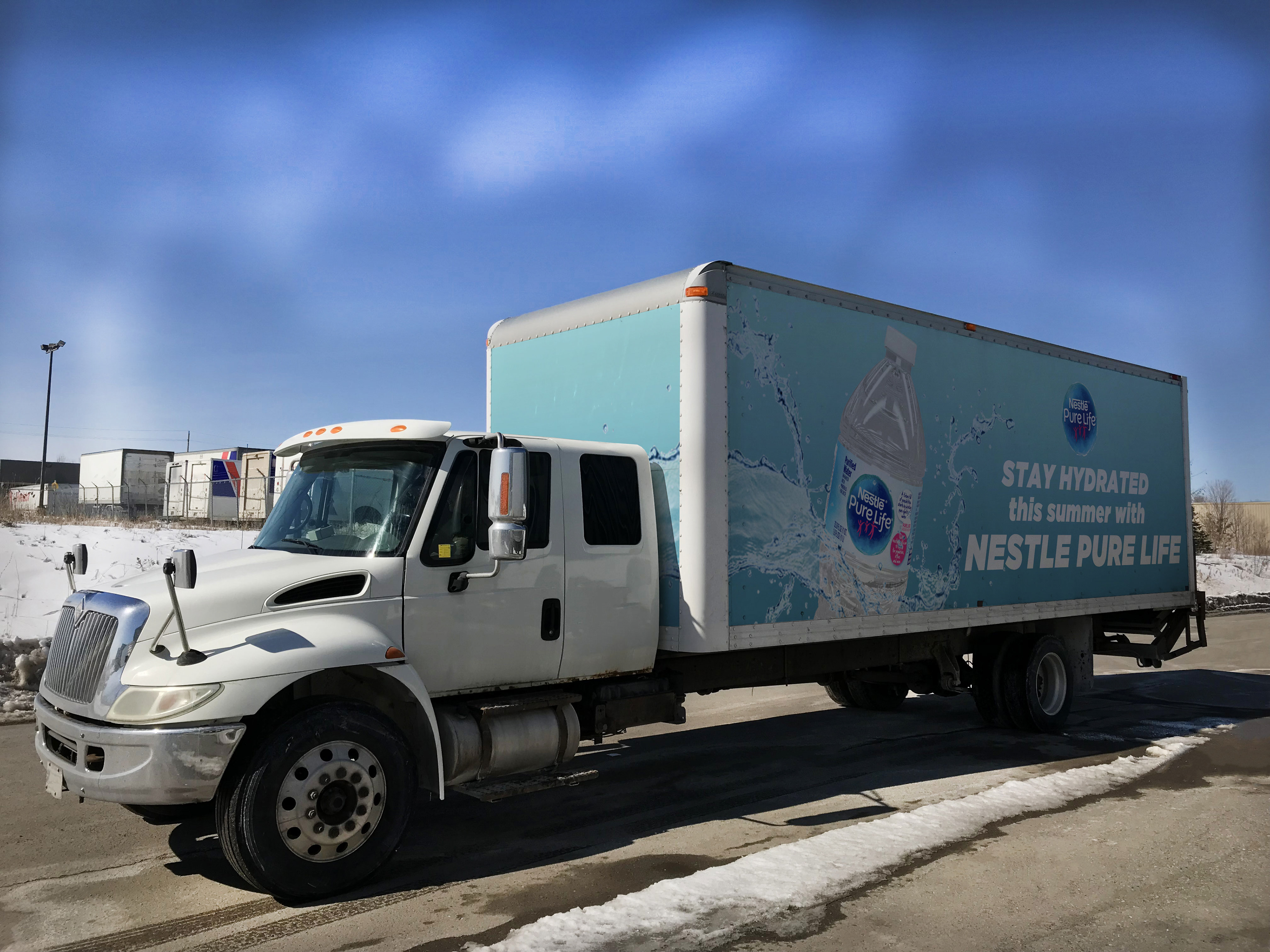
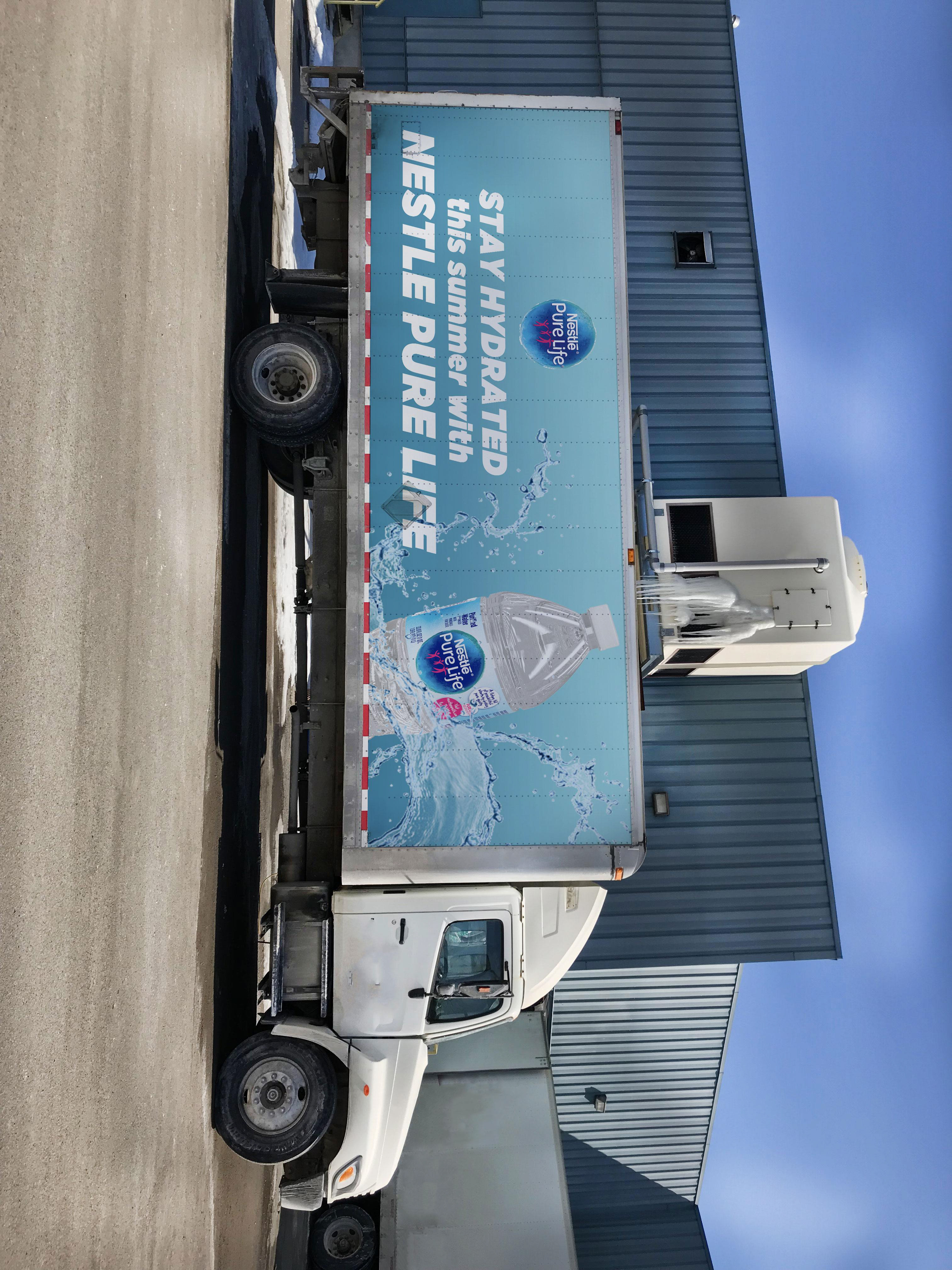
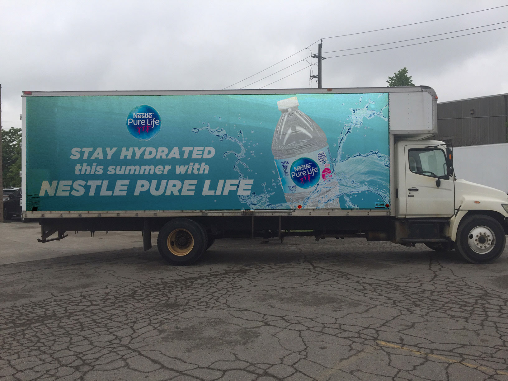
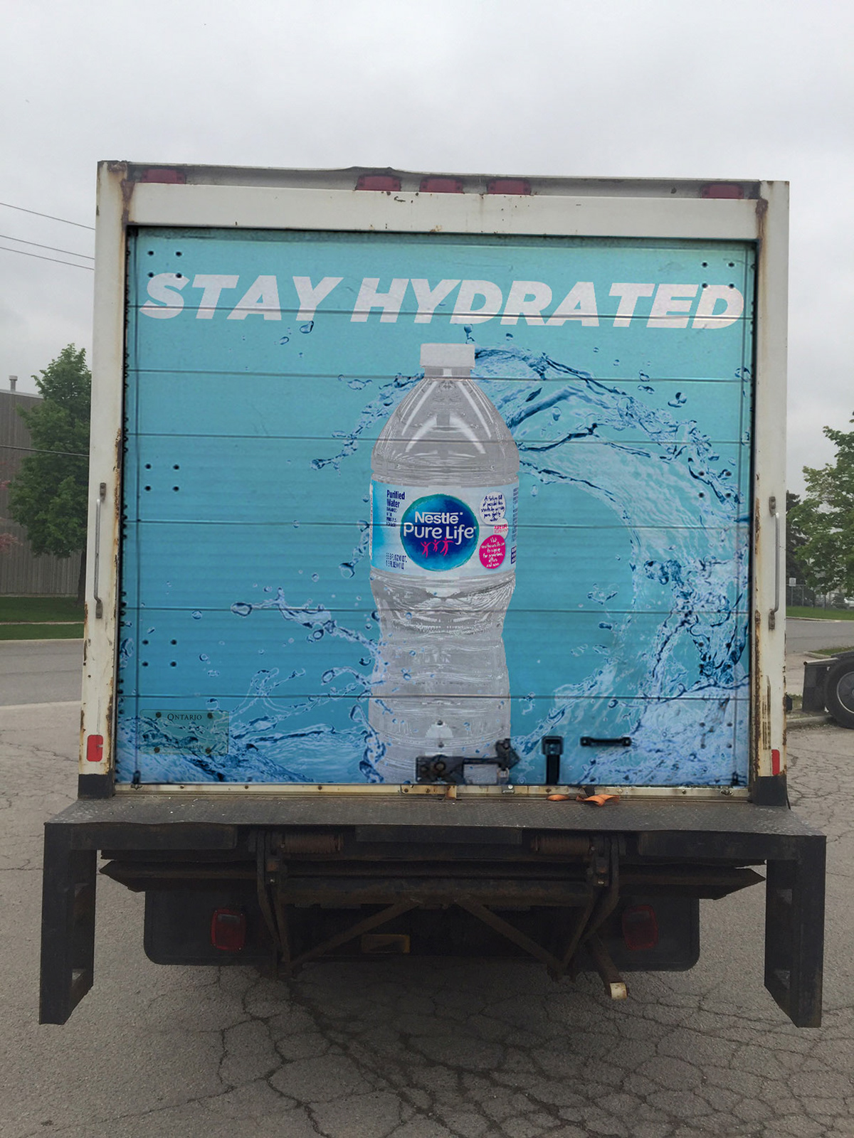
Created as a project for a truck advertisement, I've decided to create a truck for the company Nestle and promote their water. I wanted the truck to stand out and make something that I was really proud of.
I was inspired by the company's previous three-dimensional truck designs that they have marketed in person and online, so I wanted to create my own twist with this design. The design itself is very simplistic, and the subtle blue gradient is one of the main things that help the design stand out. The main part of the design that I wanted to emphasize is the water itself. I used the water splash since water is versatile in design and it can create different forms. When Photoshopping the design, I wanted to make sure that the water bottle flowed with the water, so I adjusted with multiple layers to create a more dimensional feel. I made sure the adjust the water splashes to make sure that the splashes look cohesive and look like the water is connected together.
