For my class, we were assigned to create a non-existent restaurant and design a website as well a logo for the company. Went through a process of logo & website prototypes and the brands moodboard.
Lily's Green Restaurant Interactive Website Prototype
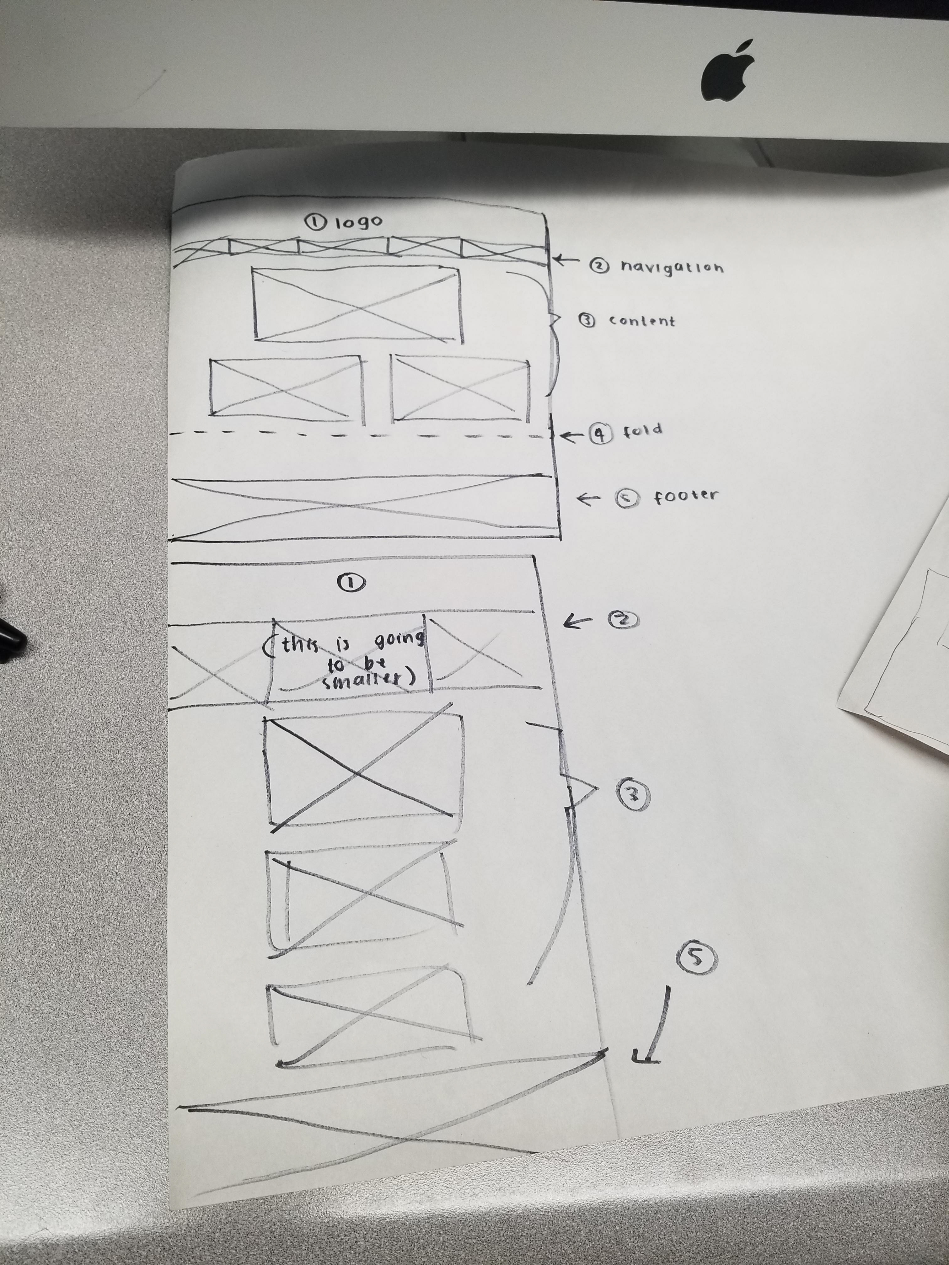
When creating the paper prototype of the Lily's Green Restaurant website, I took inspirations and researched on websites that had a similar organic food concept or just any website that had a similar green food concept and implemented some of the elements into my own design. The main objective of the design was to create an easy to use and accessible website for people to use on both the desktop and mobile.
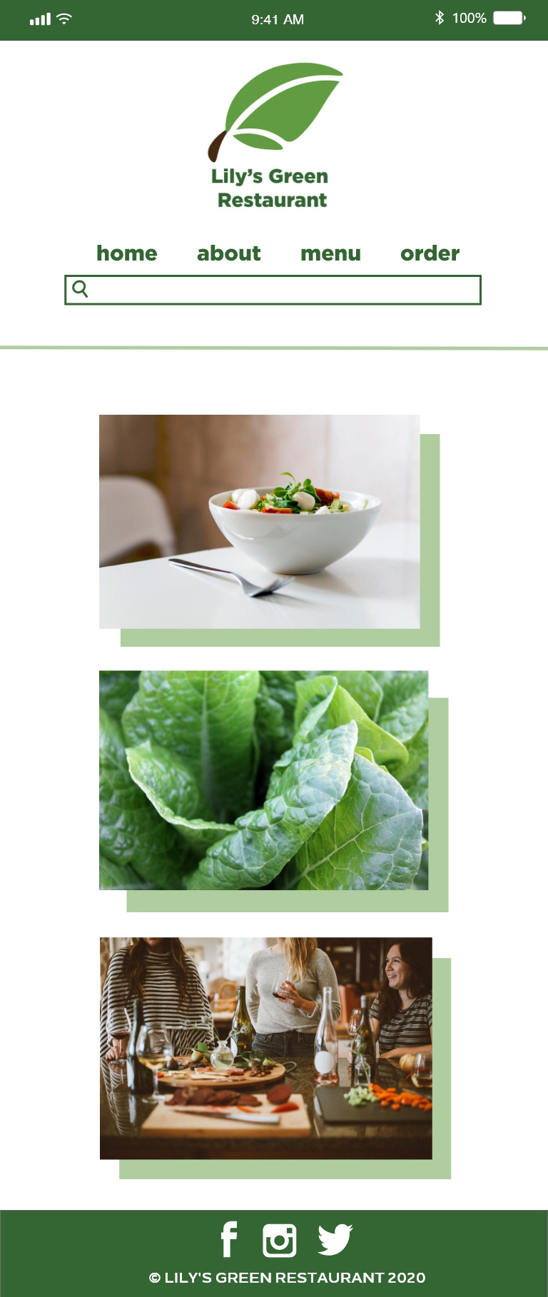
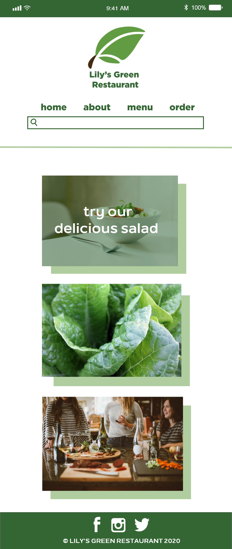
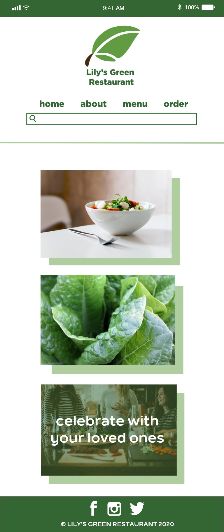
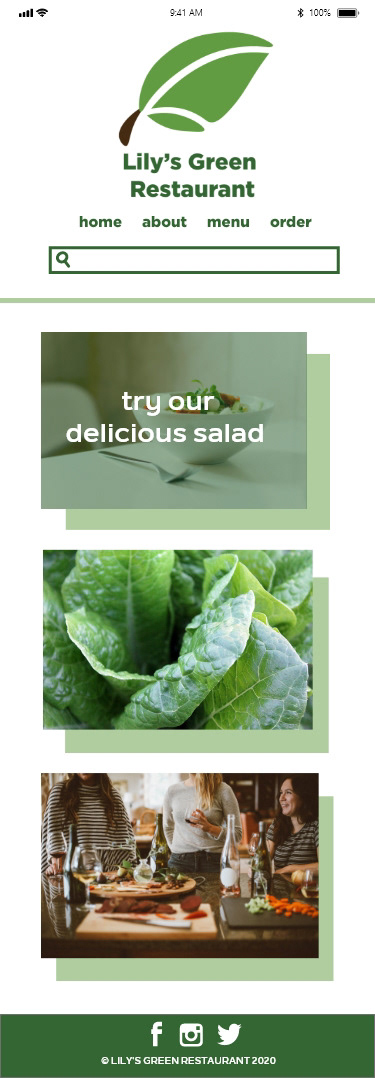
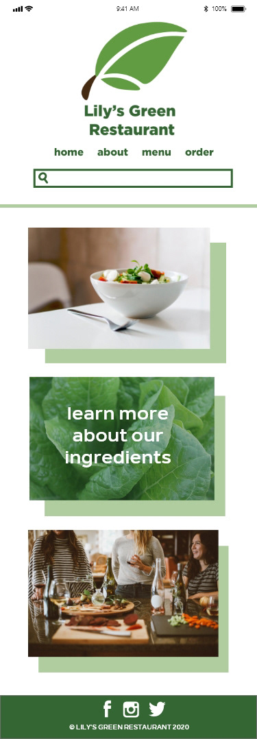
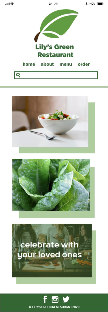
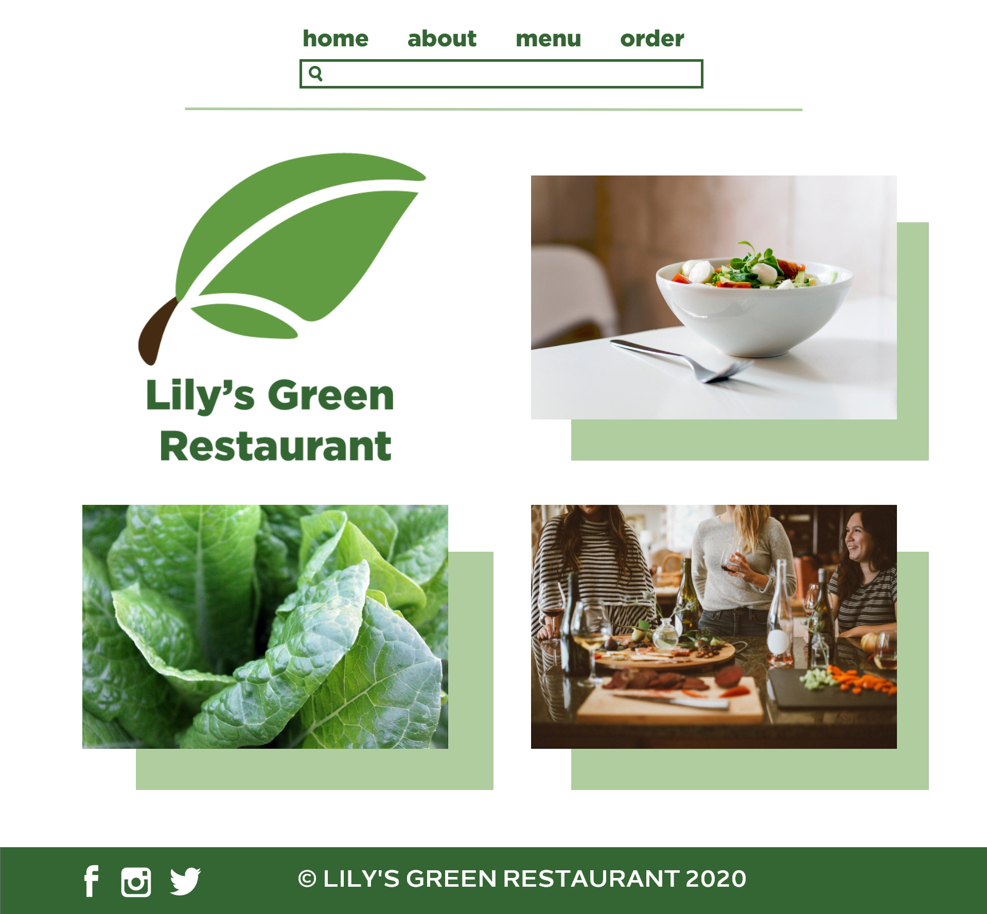
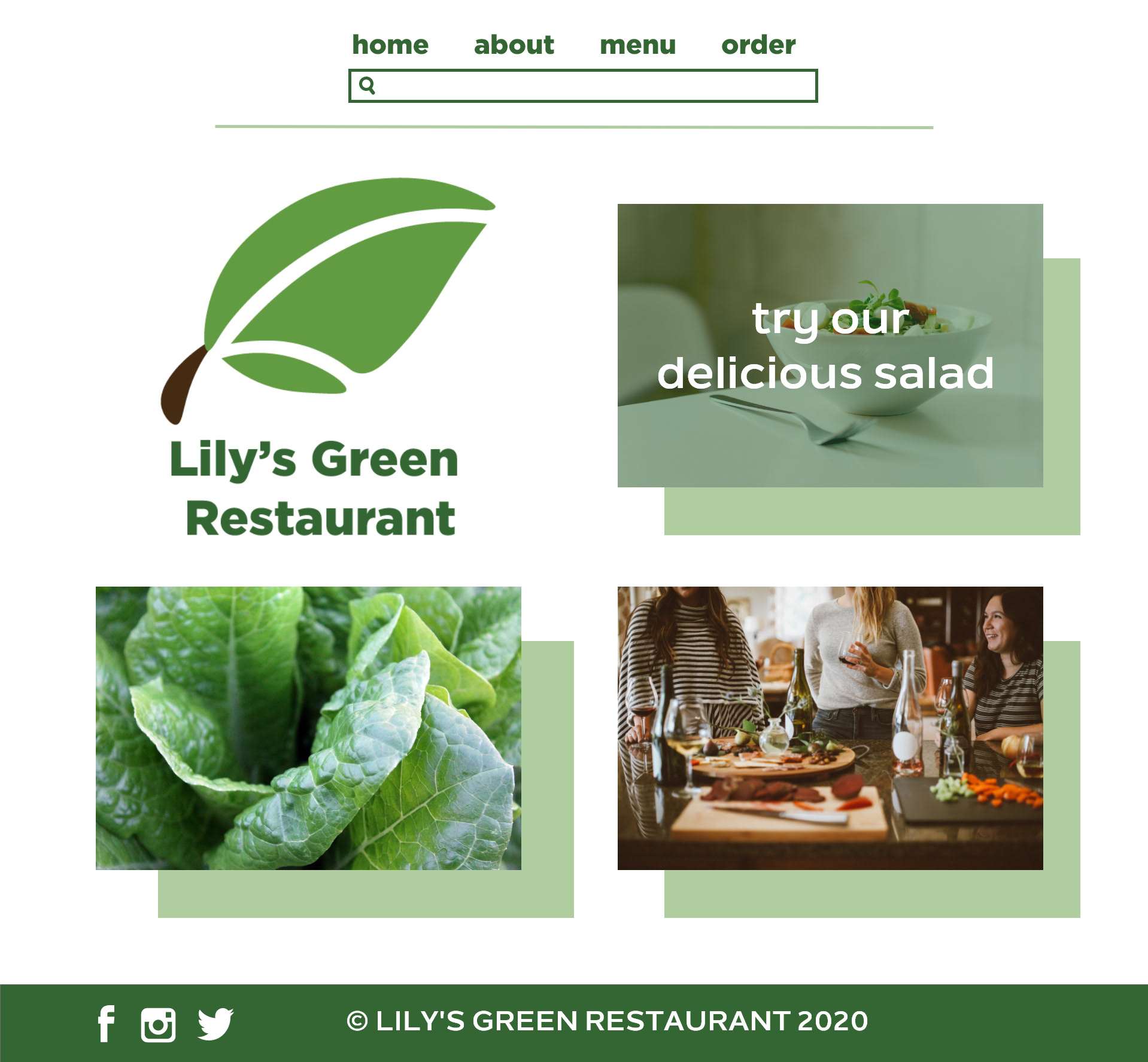
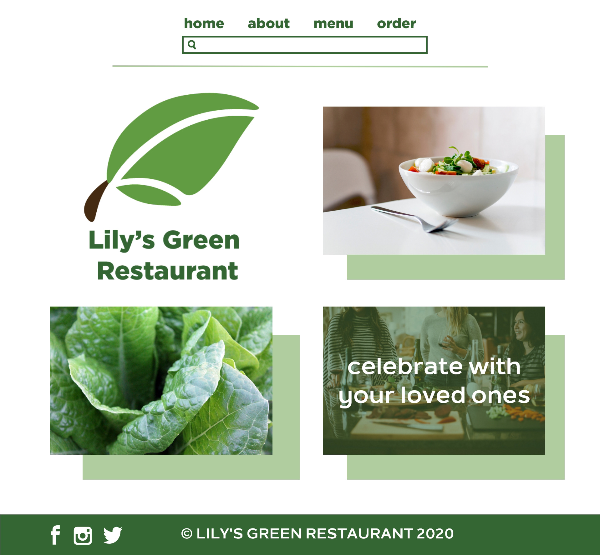
I designed the main page with the three images for people to learn more and to click on the pages to get to know this company more. I wanted everything to be minimal design so that the main focus is to find the menus and information that they need.


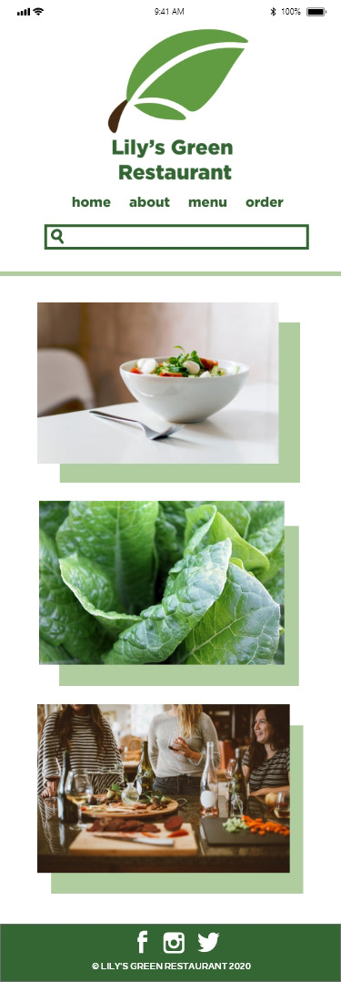
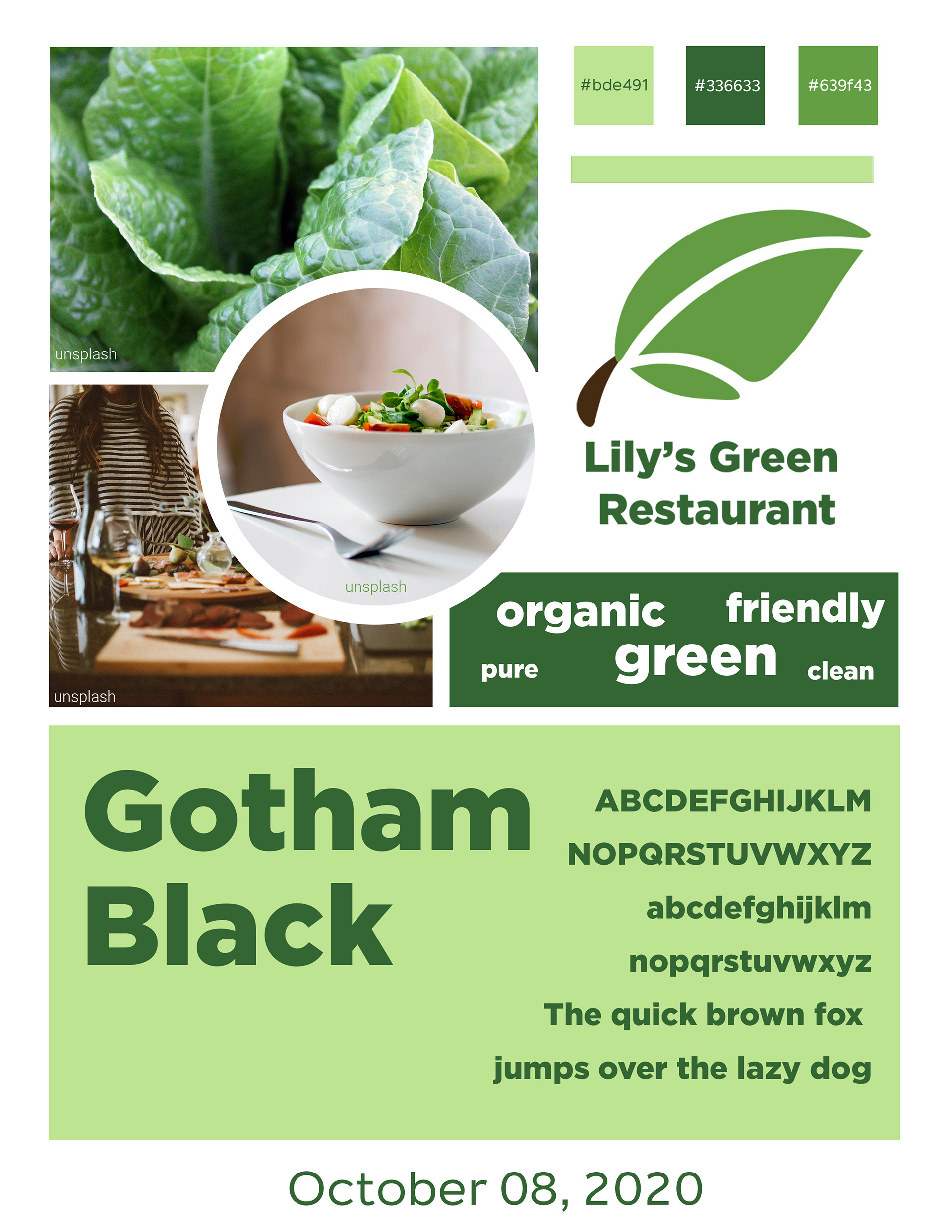
When designing the digital prototype of the website, I stuck with the white and two different hues of green since it matches the theme of the organic/ healthy food concept and matches the name of the made up company. I wanted the design of the digital prototype to be clean, slick, and easy to navigate around.
Sticking with the original concept of the rough concept, I kept the how the images were laid out, but made some adjustments compared to the older design.
The first thing that I wanted to adjust is how the search page and navigation bar menu were placed. I added a green solid shadow to create a better contrast and composition on the website, to prevent the website design from being plain.
The original plan was to align the search and navigation bar on the right side of the screen since when users go through websites and search for anything, they would try to look on the right side. The reason why I centered the search and navigation bar is to match with the mobile version of the screens and the center placement helps the composition of the logos and images that are displayed on the screen. The other adjustment that I revised in the digital prototype was where the social media icons were placed. The original idea was to have the social media icons along with the home screen, but the problem with having the social media icons with the homepage is that they interfere with the main focal points of the homepage. So I ended up adjusting the social media icons on the footer because it helps make the composition, the homepage, stand out on its own and still maintaining to find all of the information you need, including the social media icons.
Lily's Green Restaurant Desktop Version

Lily's Green Restaurant Tablet Version
Lily's Green Restaurant Phone Version