A group project for my Emerging Multimedia class. We were assigned to create an AR furniture app where you can display how the furniture would look before you purchase.
Furture Interactive Prototype App
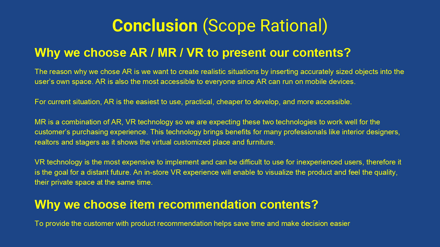
My group was assigned to create an augmented reality furniture app. We were brainstorming on different possible ideas that everyone came up with to make the app. We were narrowing down some of the brainstorming ideas that came up with and merging the best ideas that we though would be essential to the augmented furniture app.
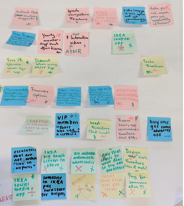
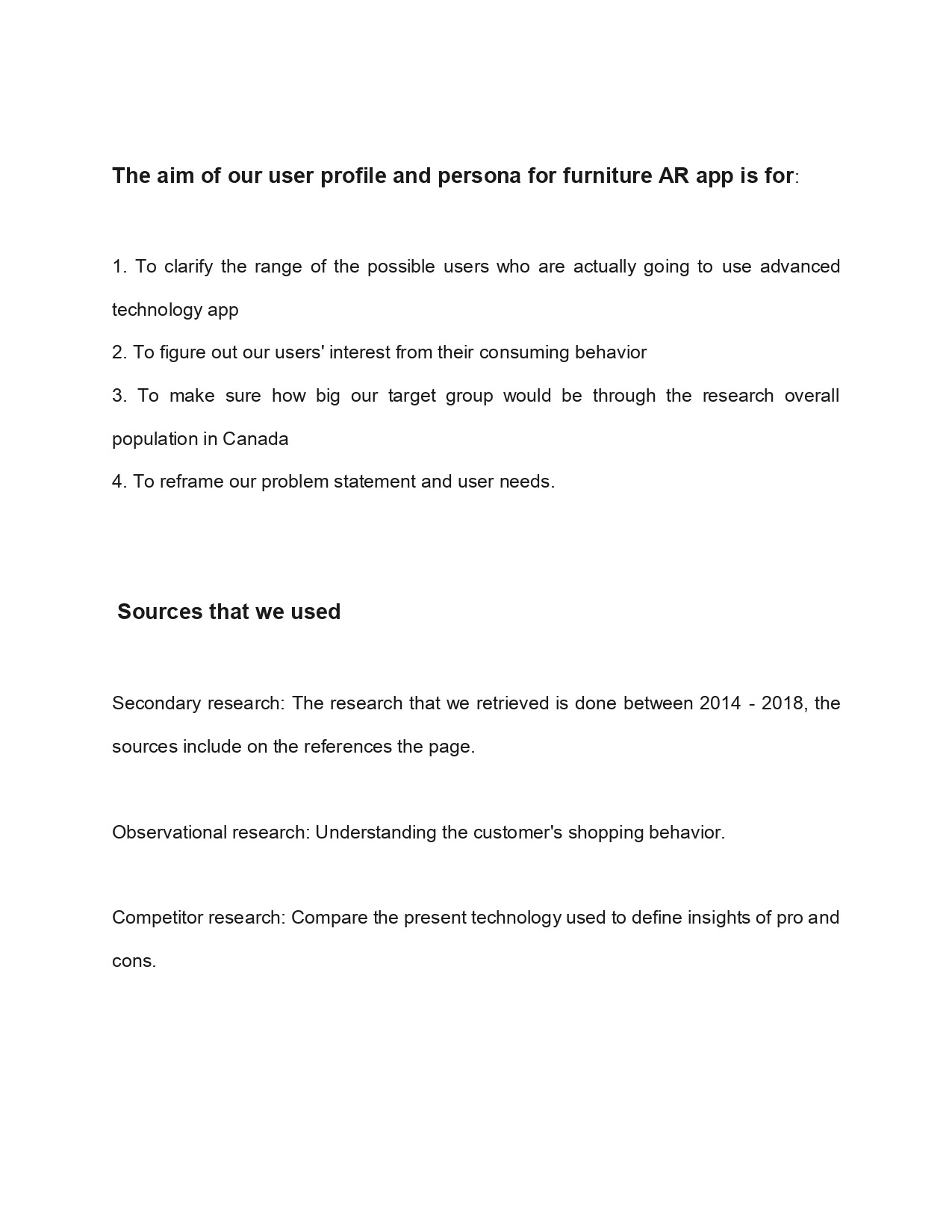
We started to do research to see what various furniture companies were doing involving AR to analysis what are the advantages and disadvantages of the main augmented reality furniture apps. Our main object was for users who are interacting with this app to compare the quality of the product while improving the online shopping and delivery experience. We wanted users to measure the furniture in accurate measurements while in the comforts of their home and augmented reality will help users find the right furniture for them without the hassles of going back and forth of going to a furniture store in person.
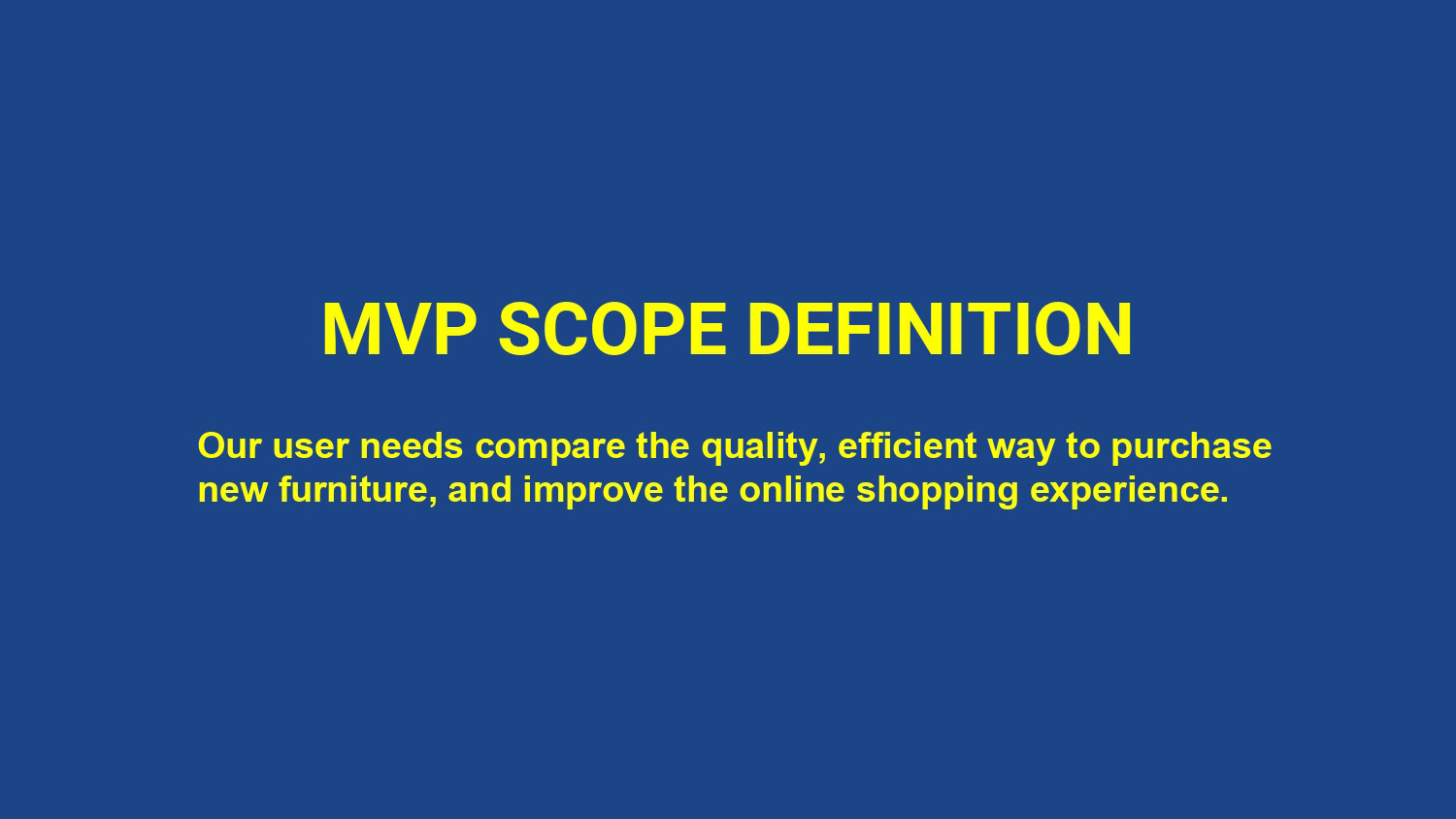
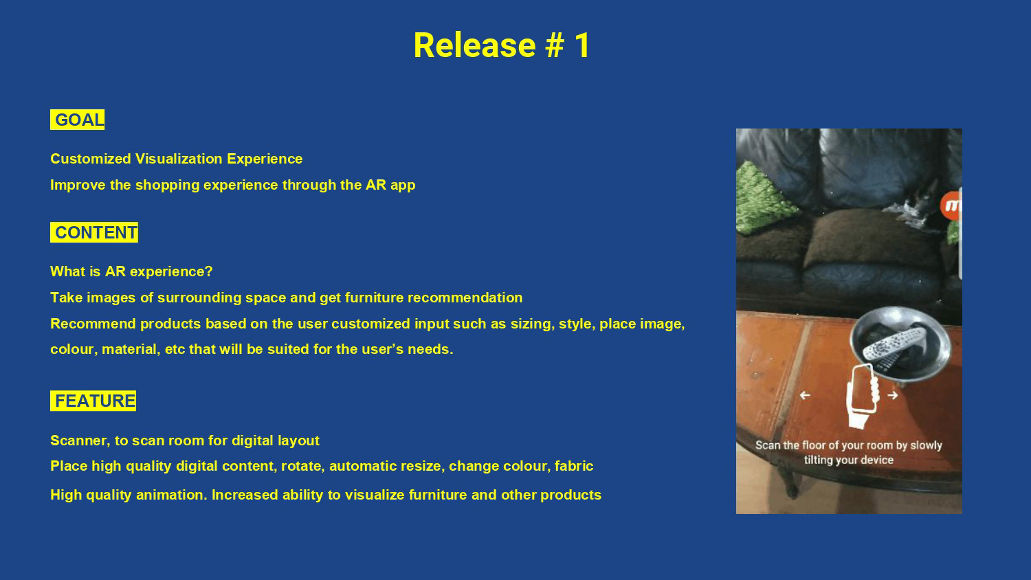
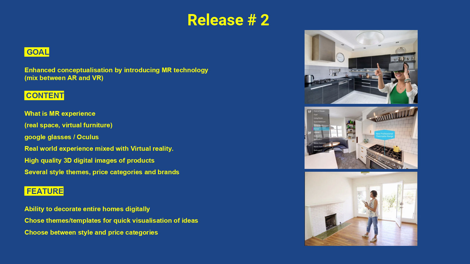
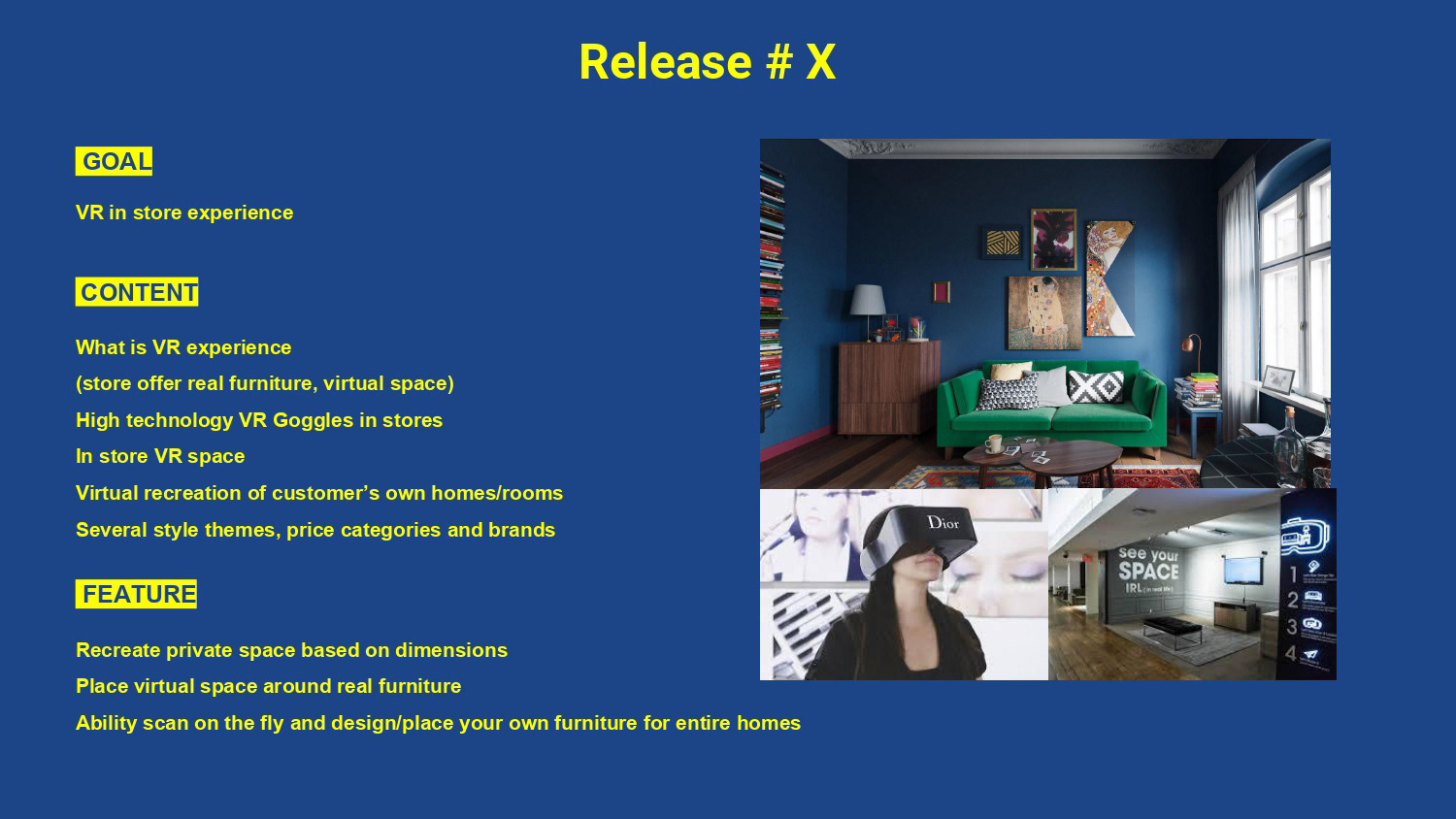
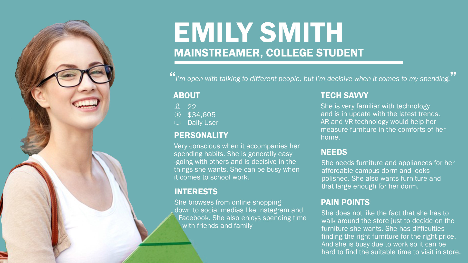
To figure out who our main target target audience consists of, we decided to visit an Ikea to analyze that main target demographics of the people visiting Ikea and writing out the main interactions of people that we interacting with the products, furniture, and the employees. We also looked at some of the main features that Ikea has in their in-person store that we can implement with the augmented reality app.
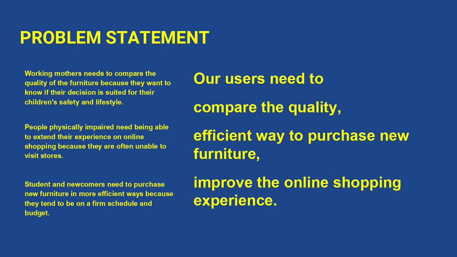
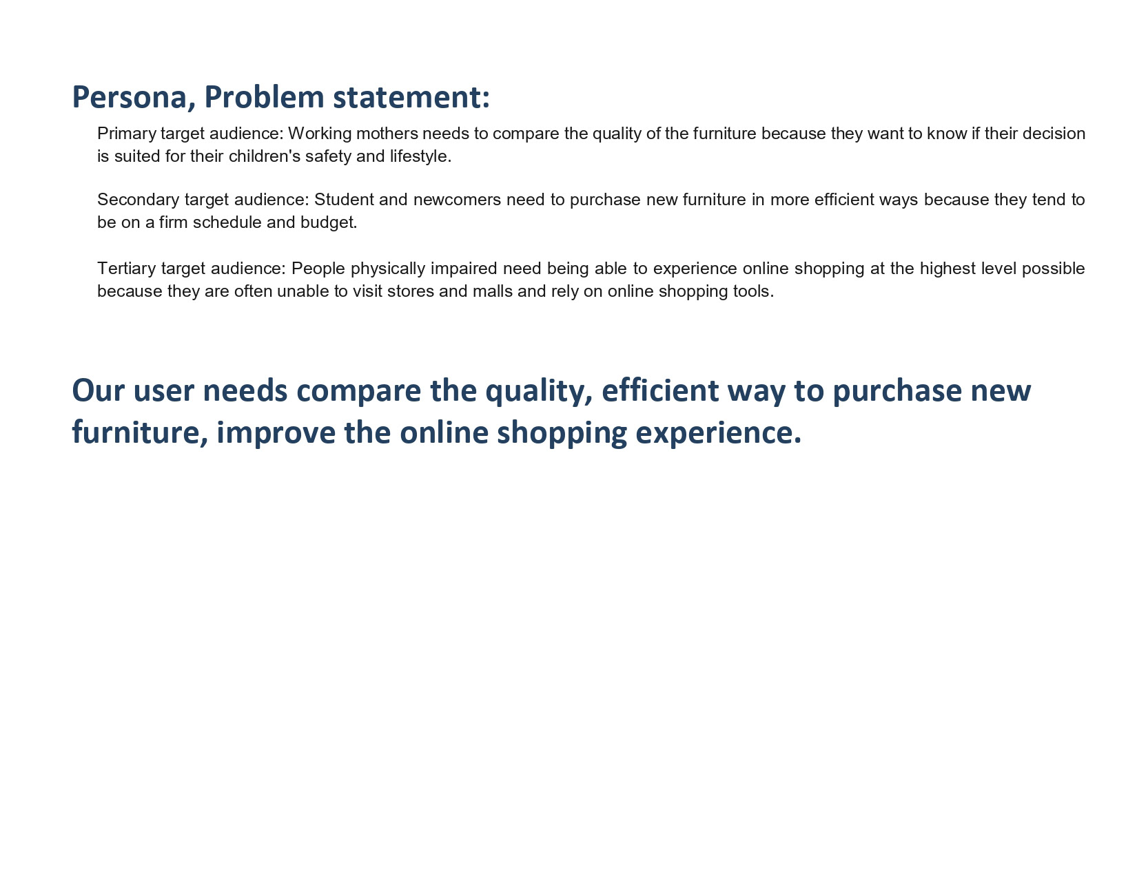
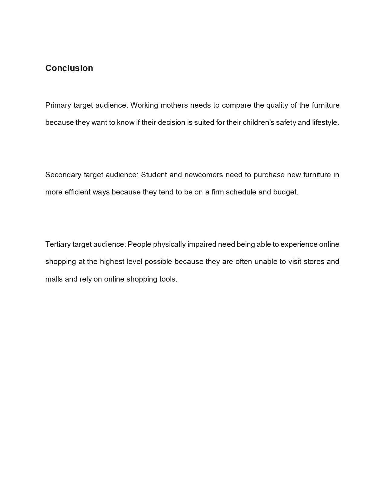
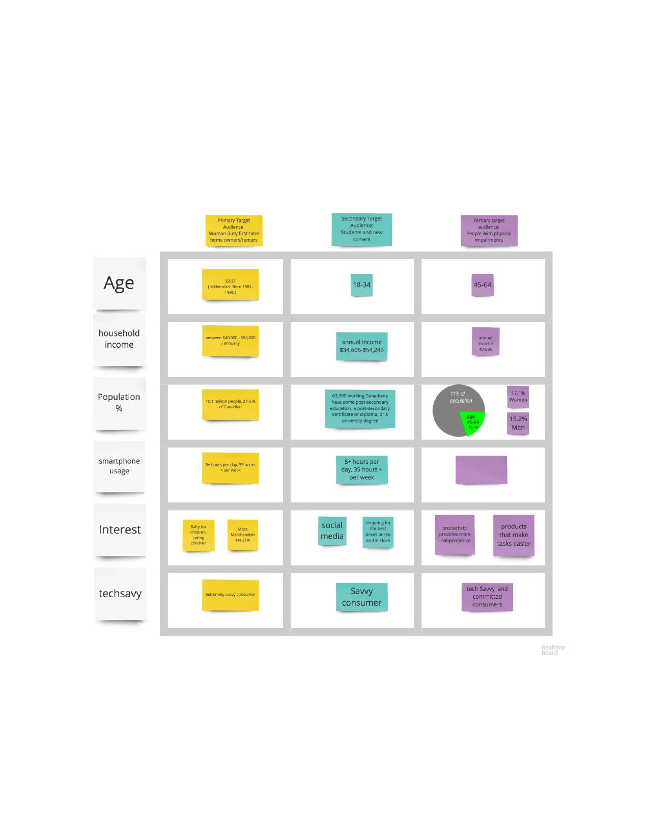
Our main target audience of the furniture consists of:
• Working mothers because they need to compare and contrast the quality of the furniture to make sure that it safe for their children and their environment
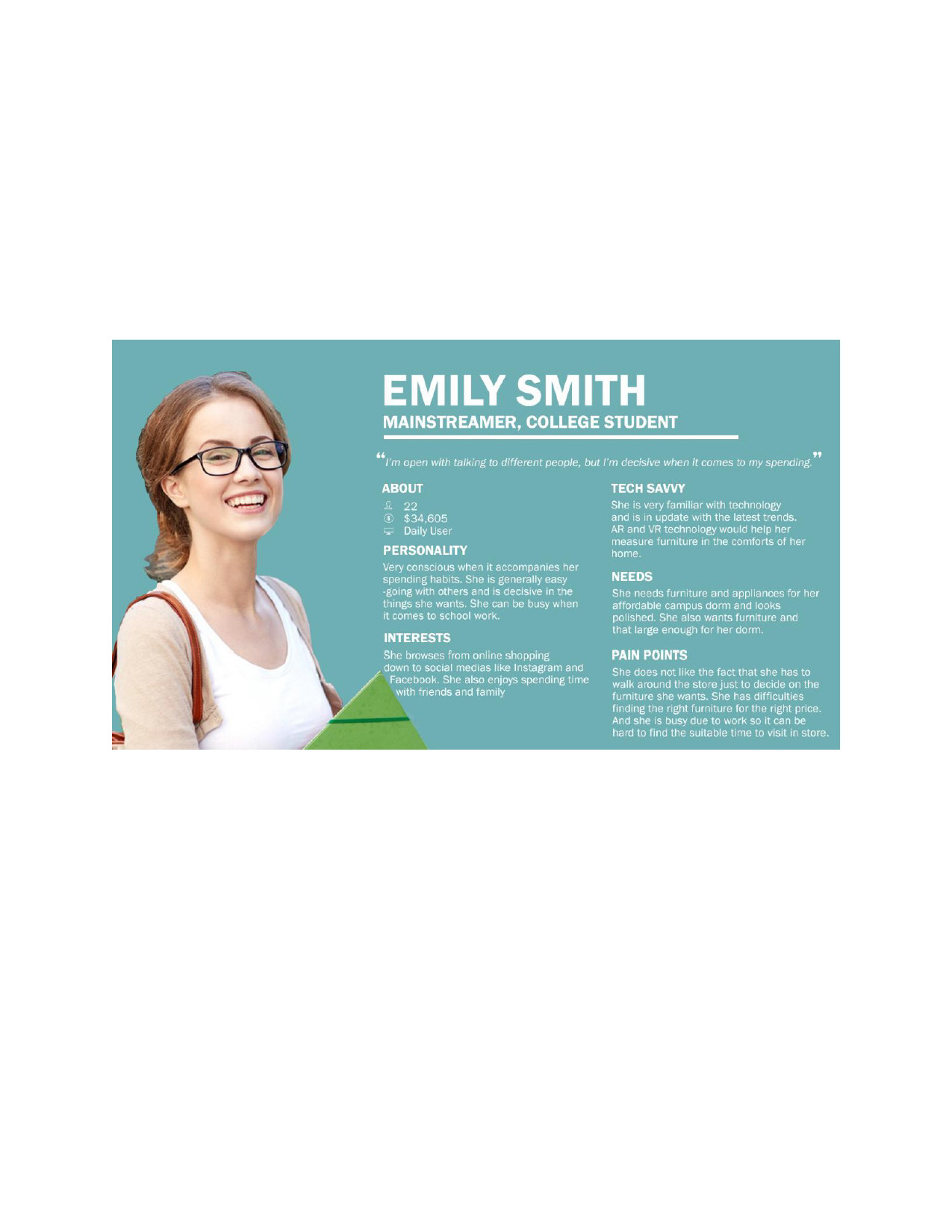
• Students and newcomers to Canada or the Greater Toronto Area to find a furniture in the most efficient way since both students and newcomers often come with a smaller budget and tight scheduling
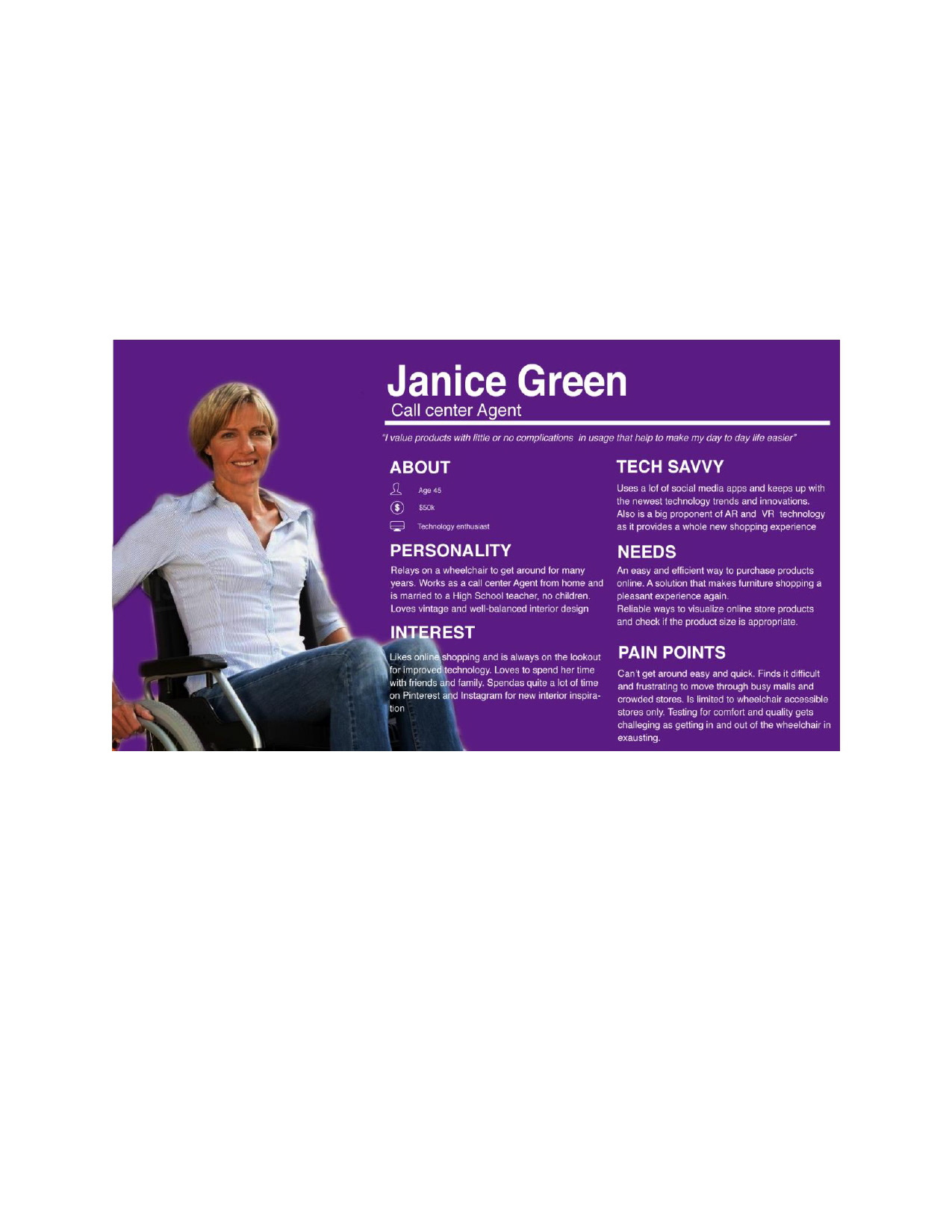
• People that are physically disabled since there is a lack of accessibility of going to furniture stores and other various shopping locations in-person and often rely on shopping online to help them run their errands.
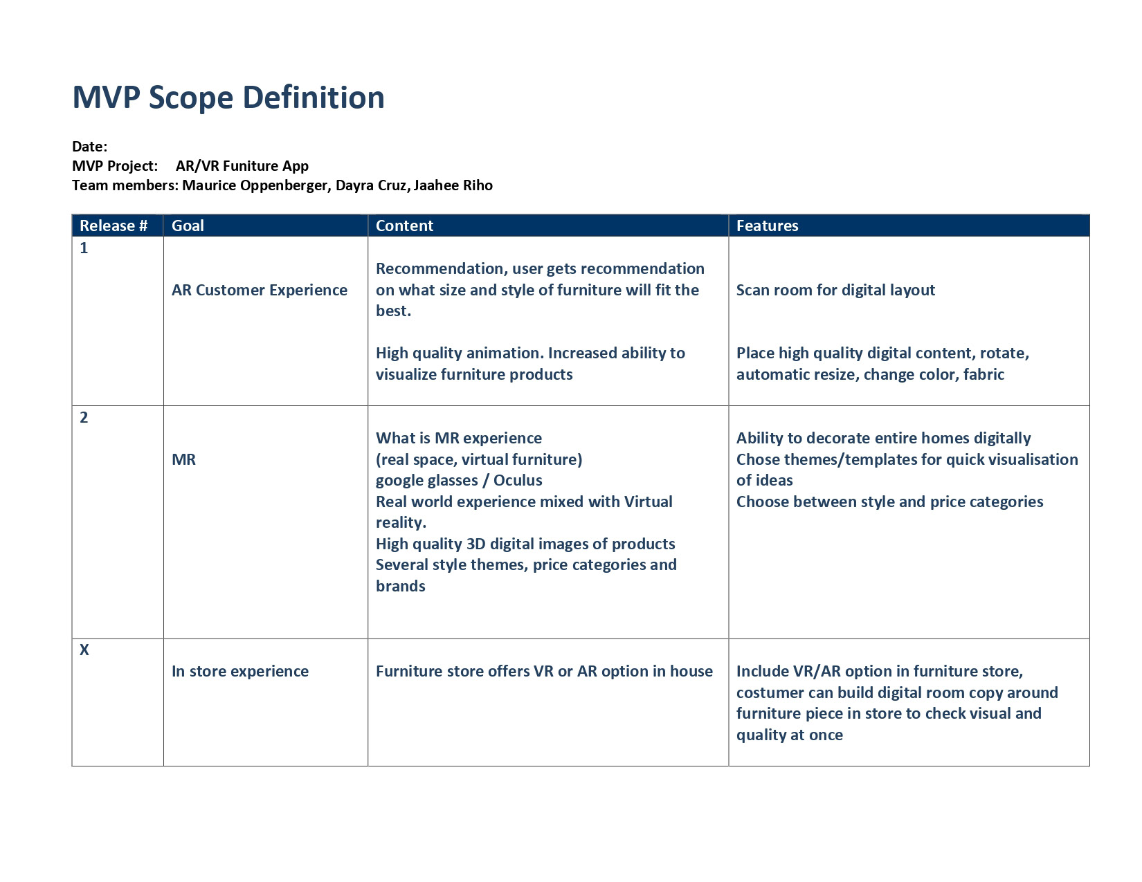




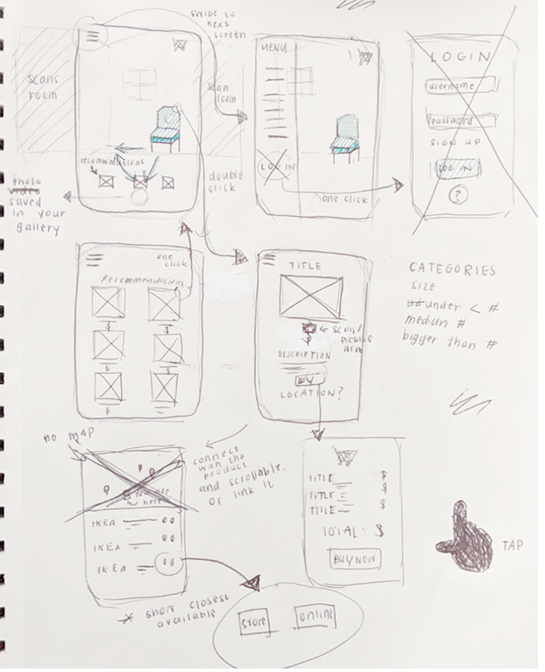
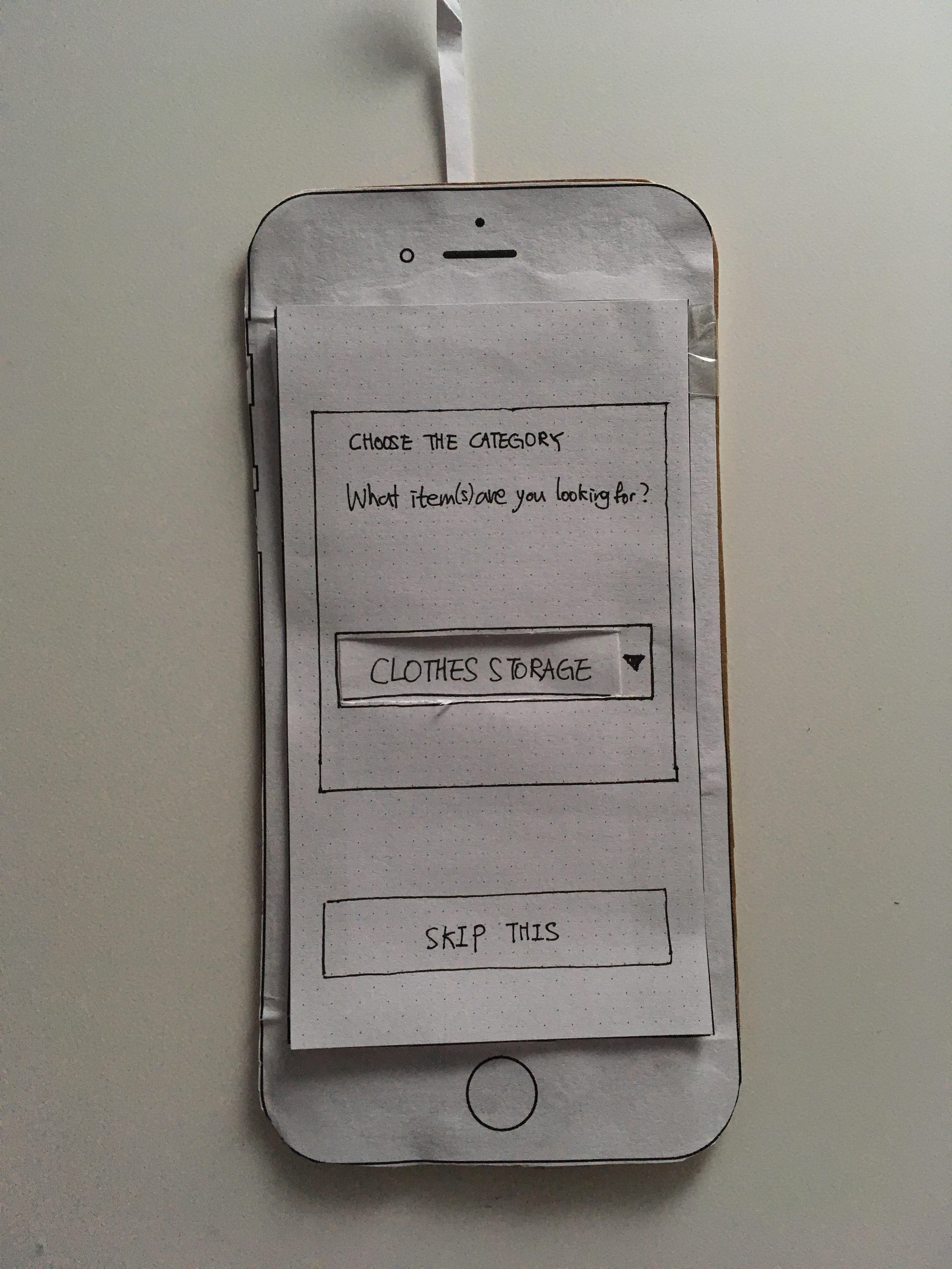
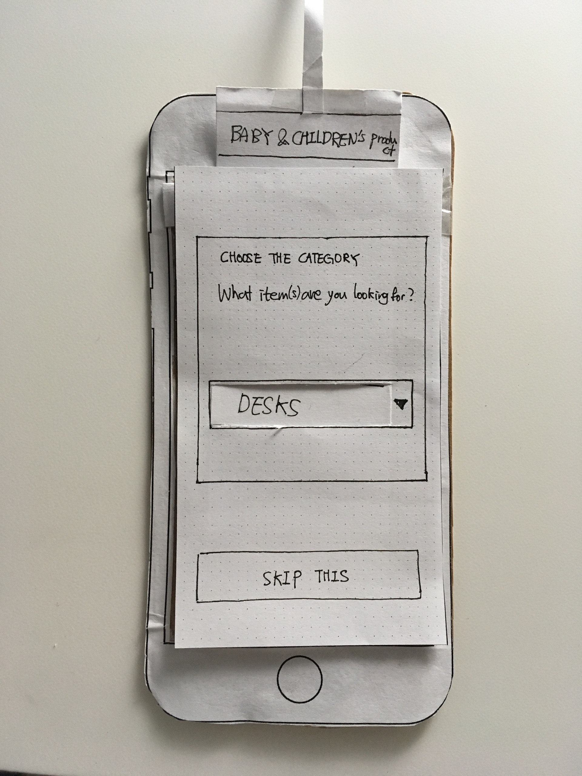
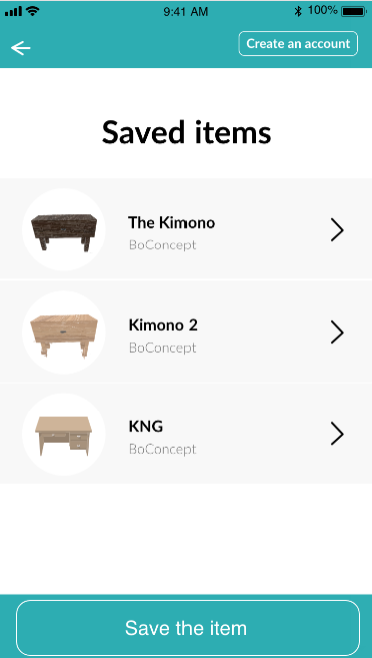
From the previous brainstorming and thorough research from analyzing competitor's marketing and app concepts, we started to create a paper prototype to see what it would be like if users we interacting with the augmented reality furniture app. We were inspired by some of the competitor's designs and making the user experience more simplified since some apps had too many features.
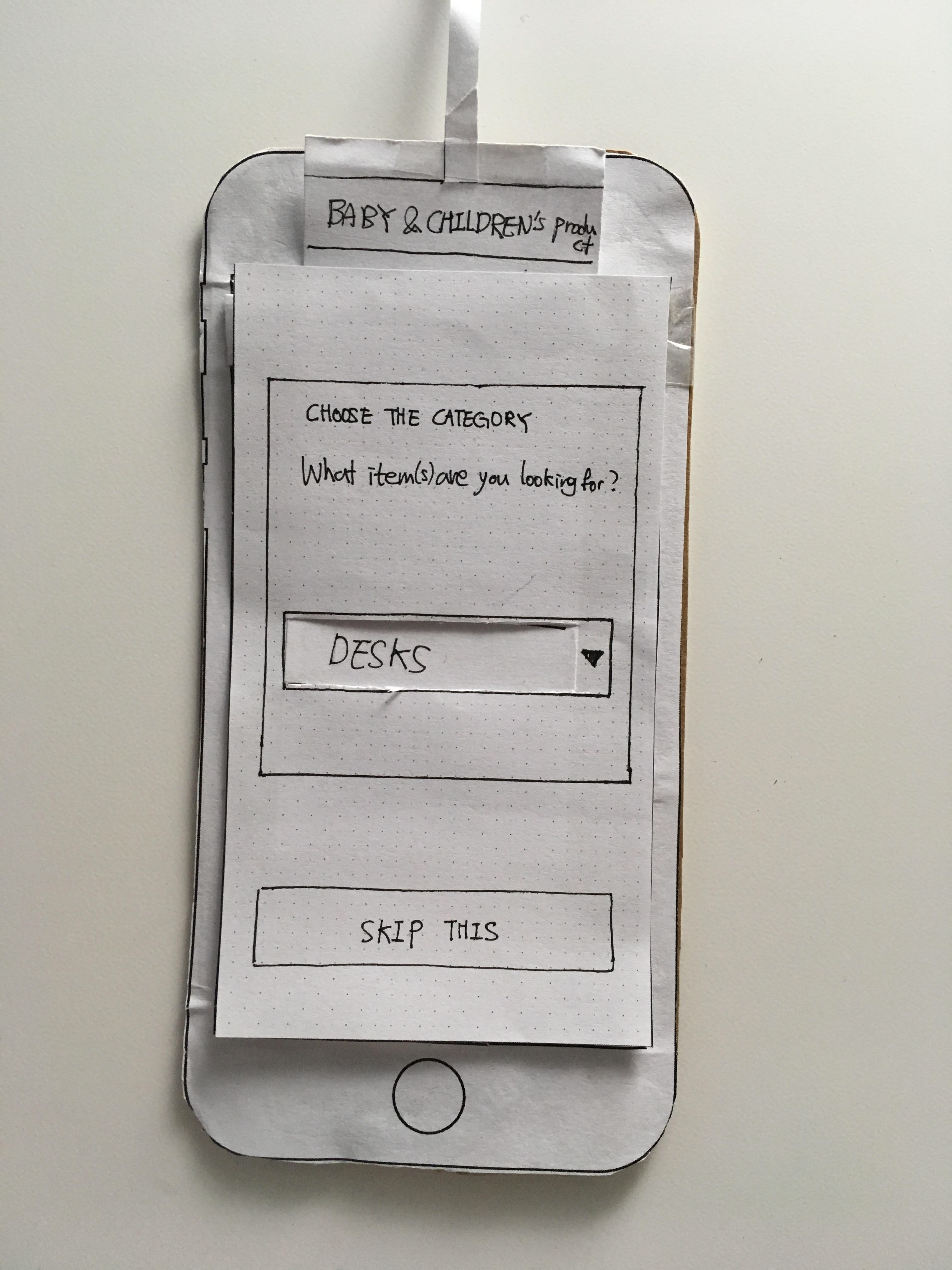
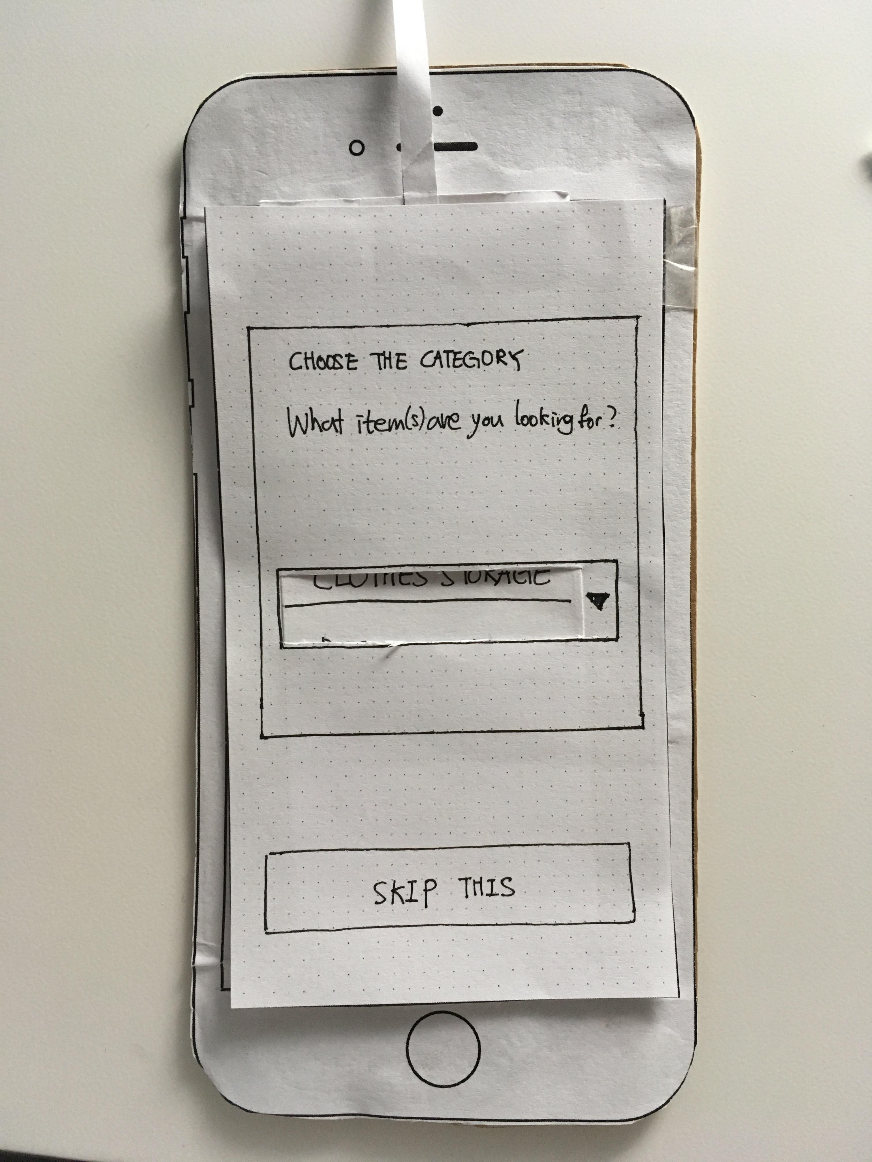
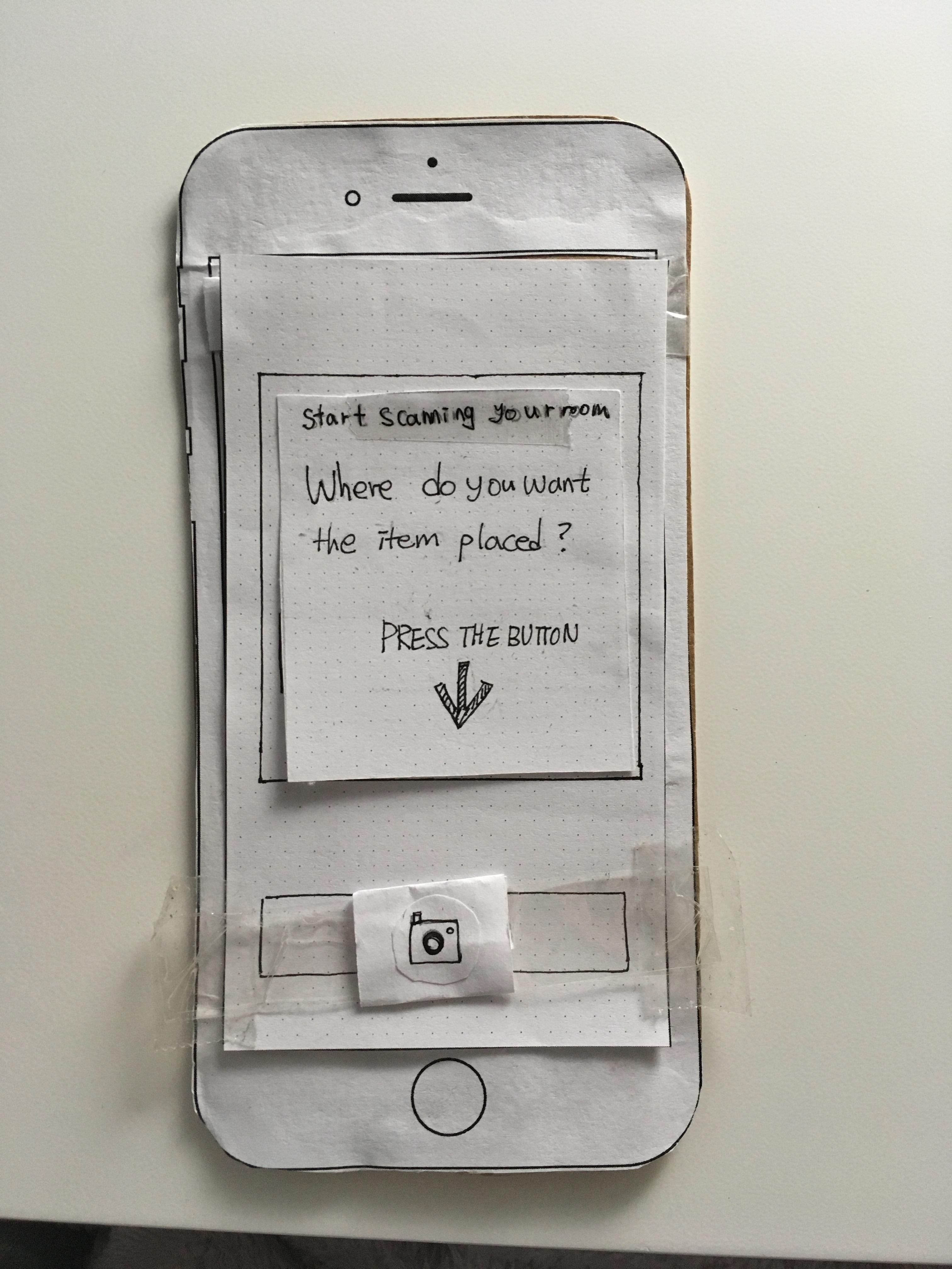
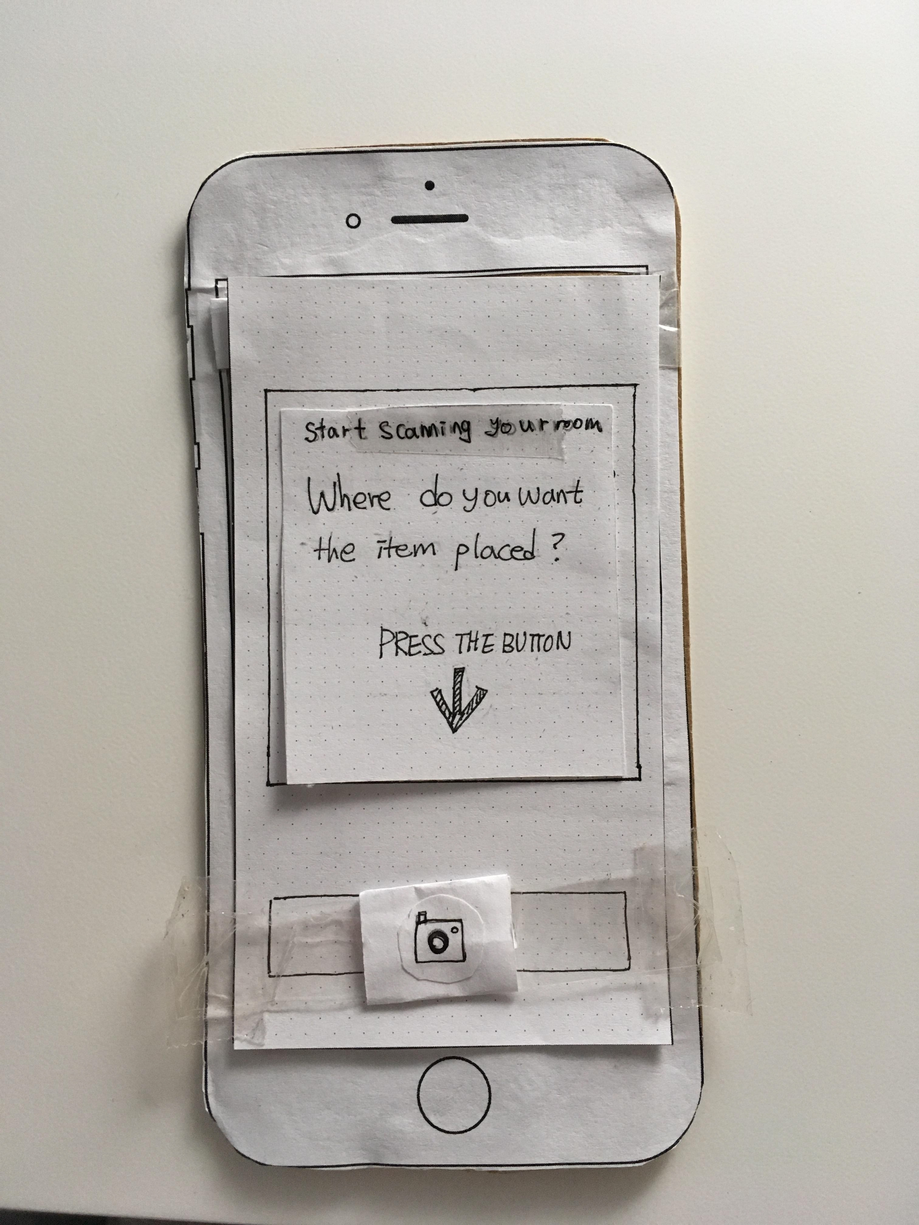
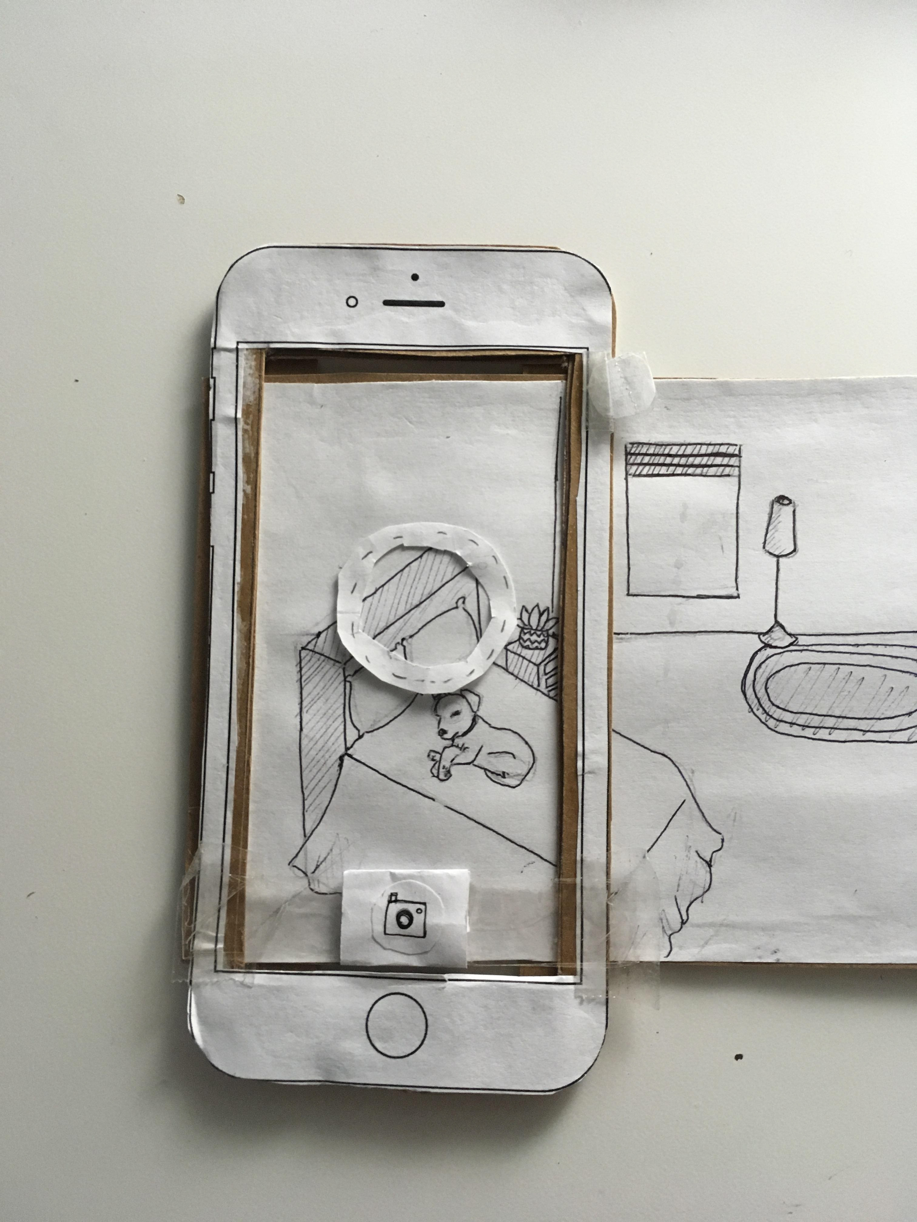
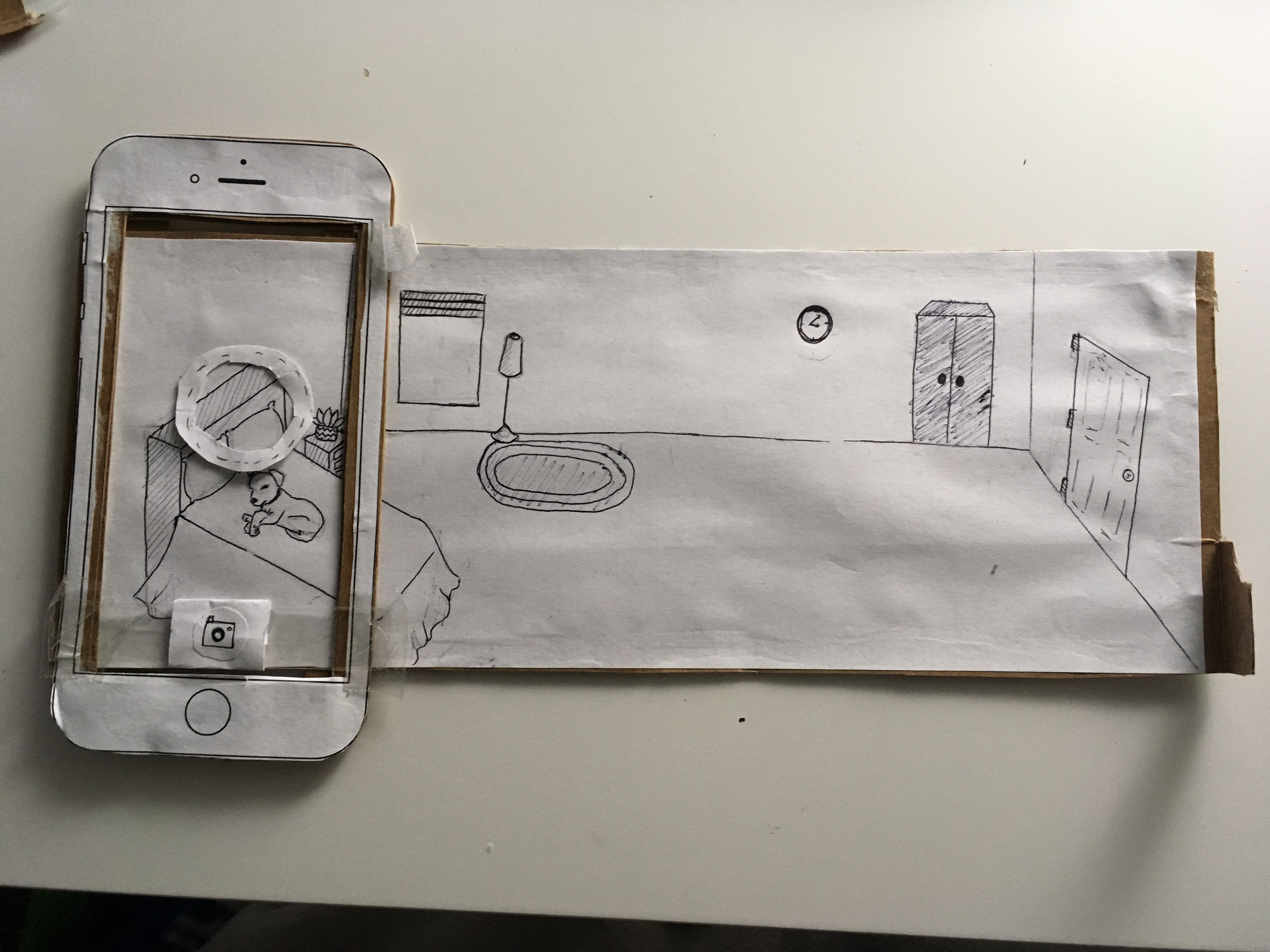
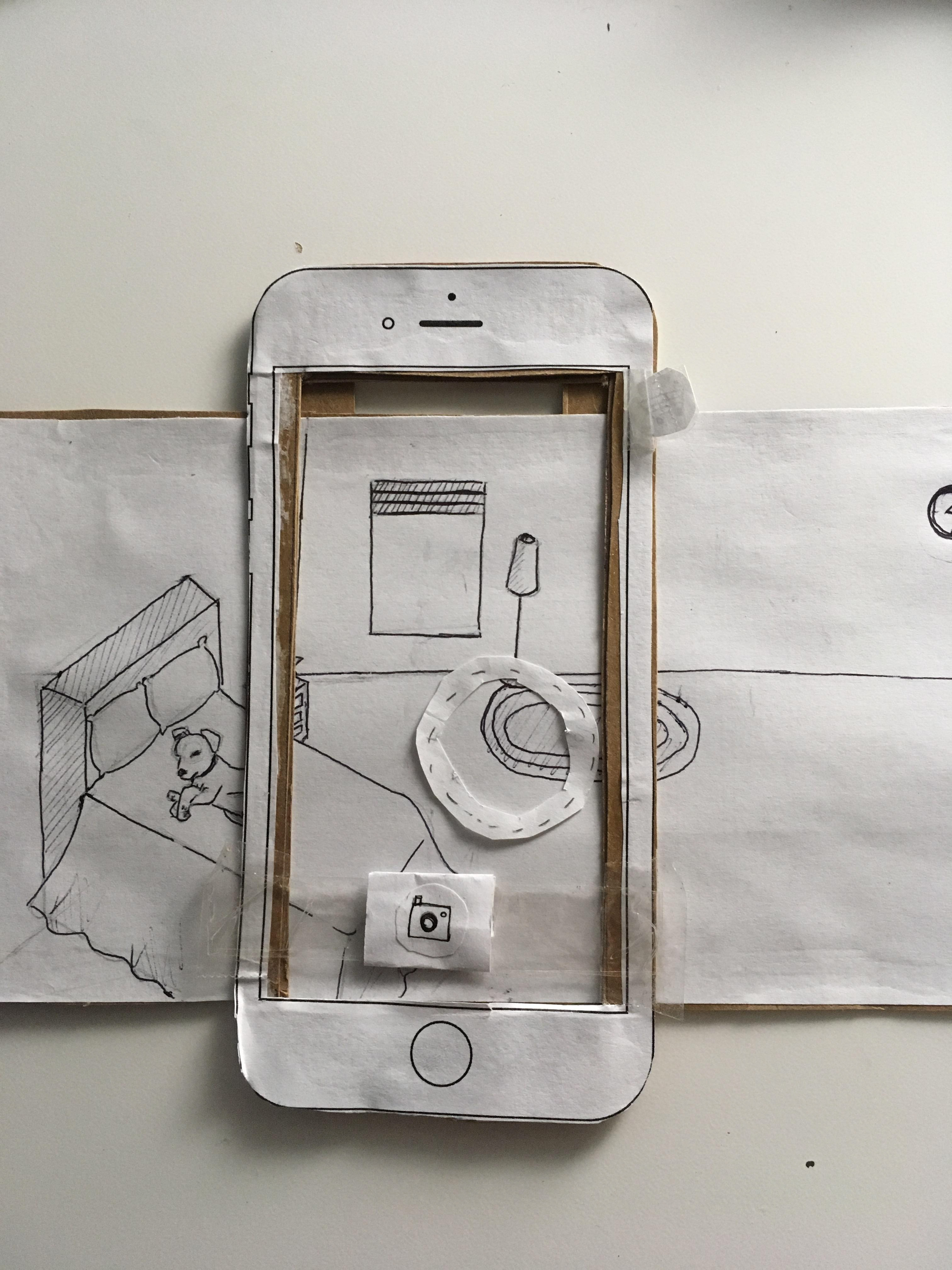
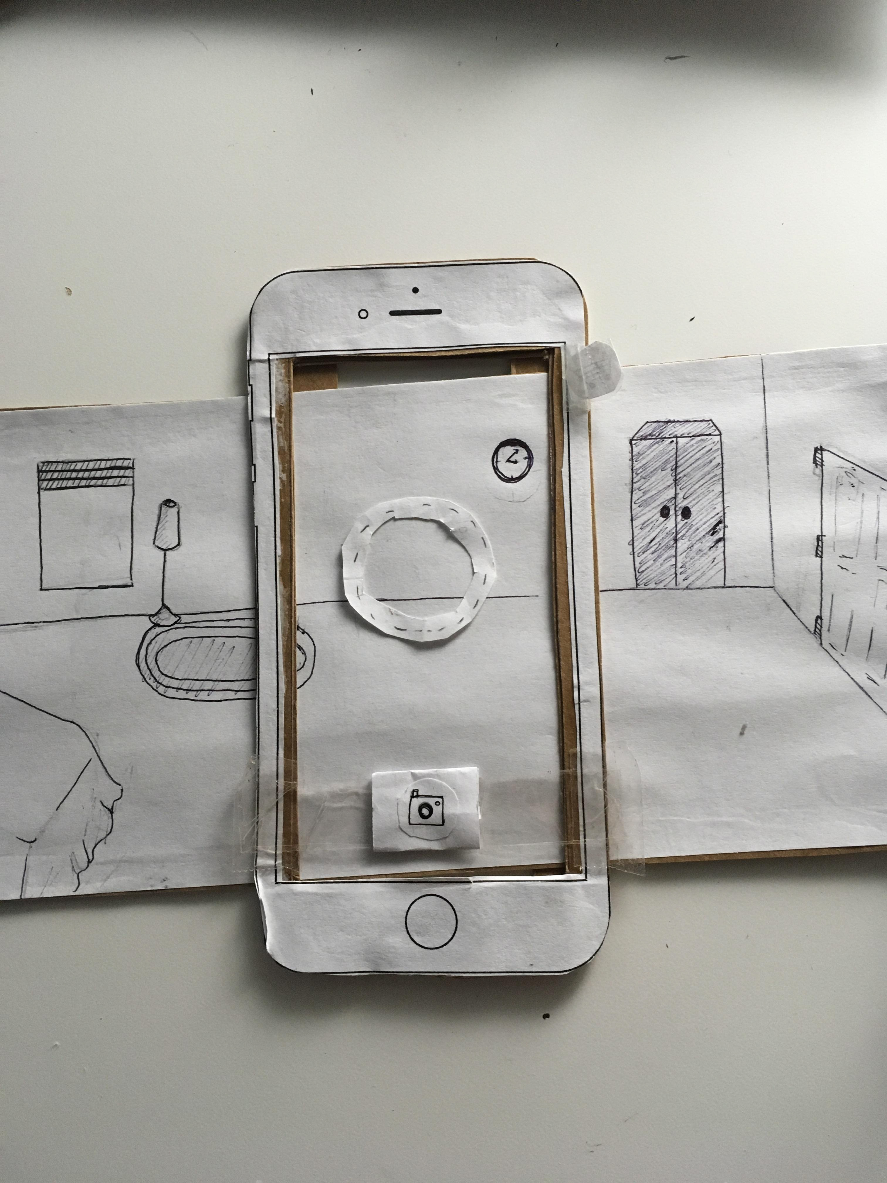
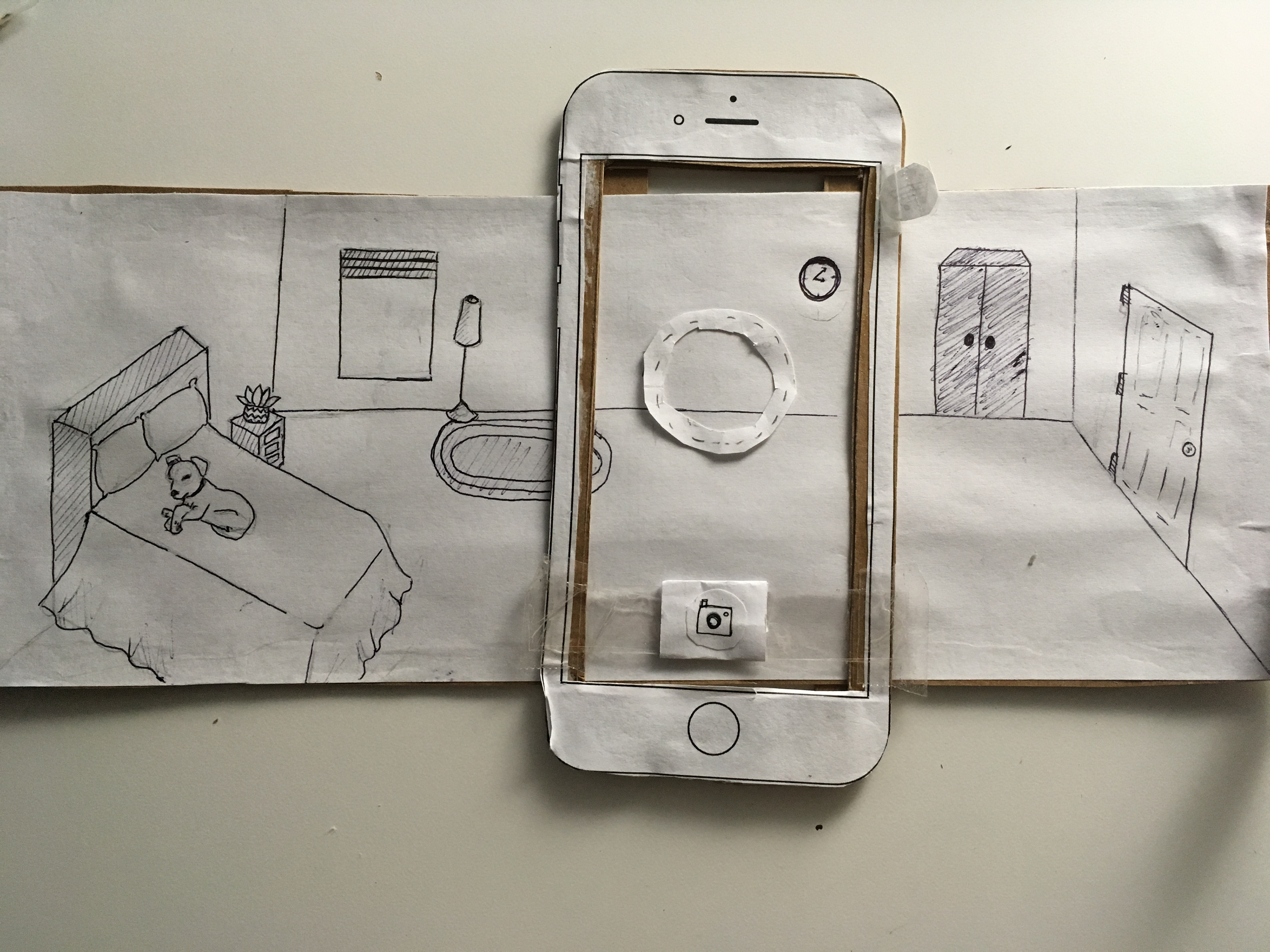
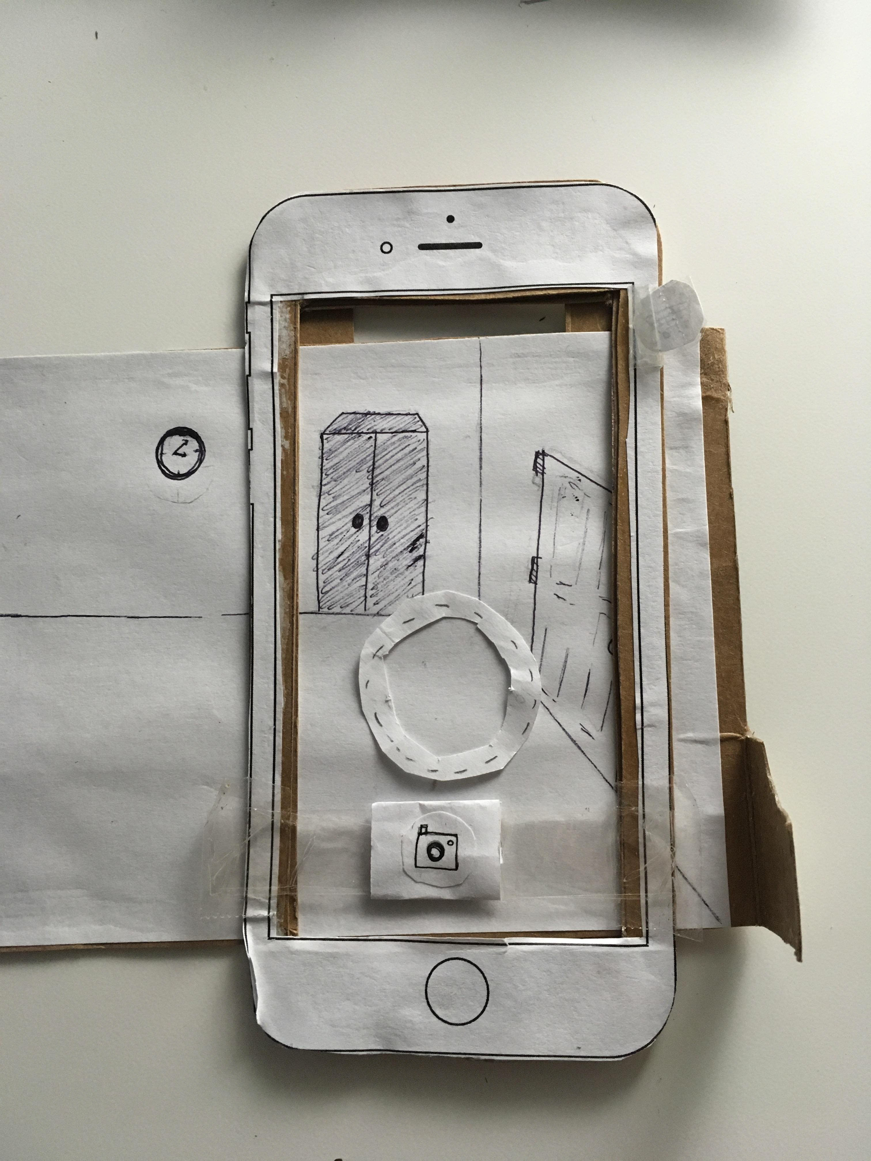
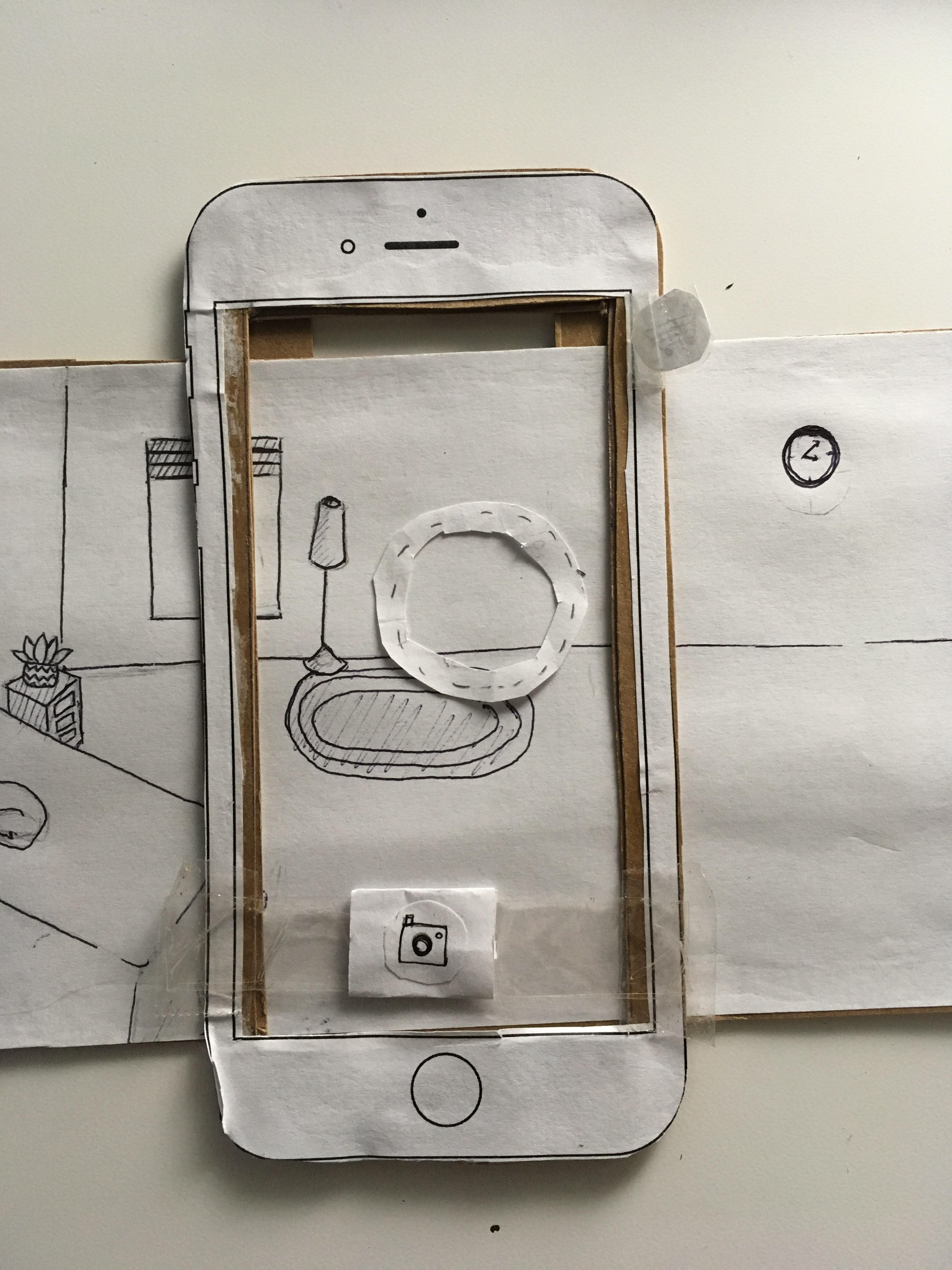
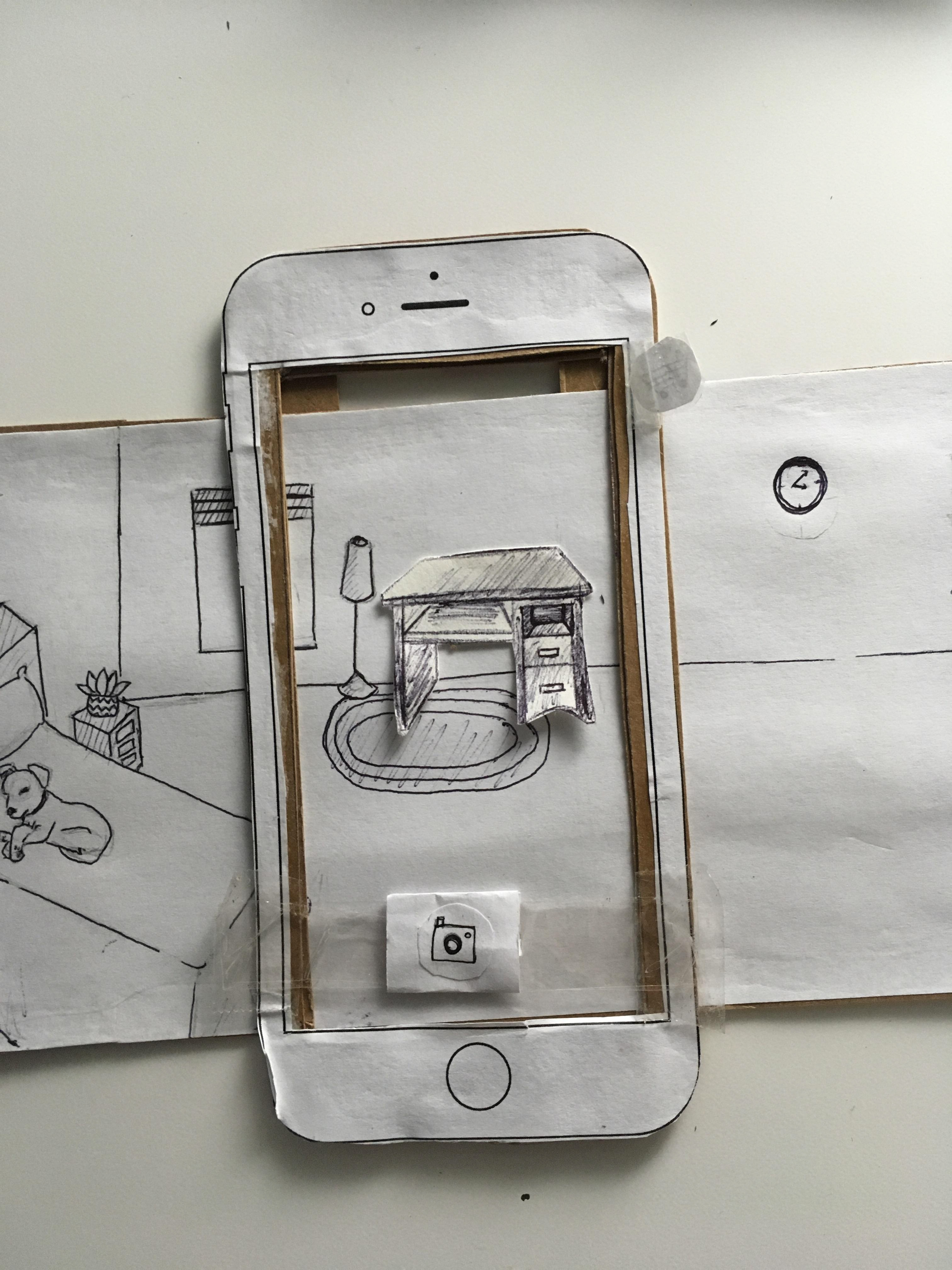
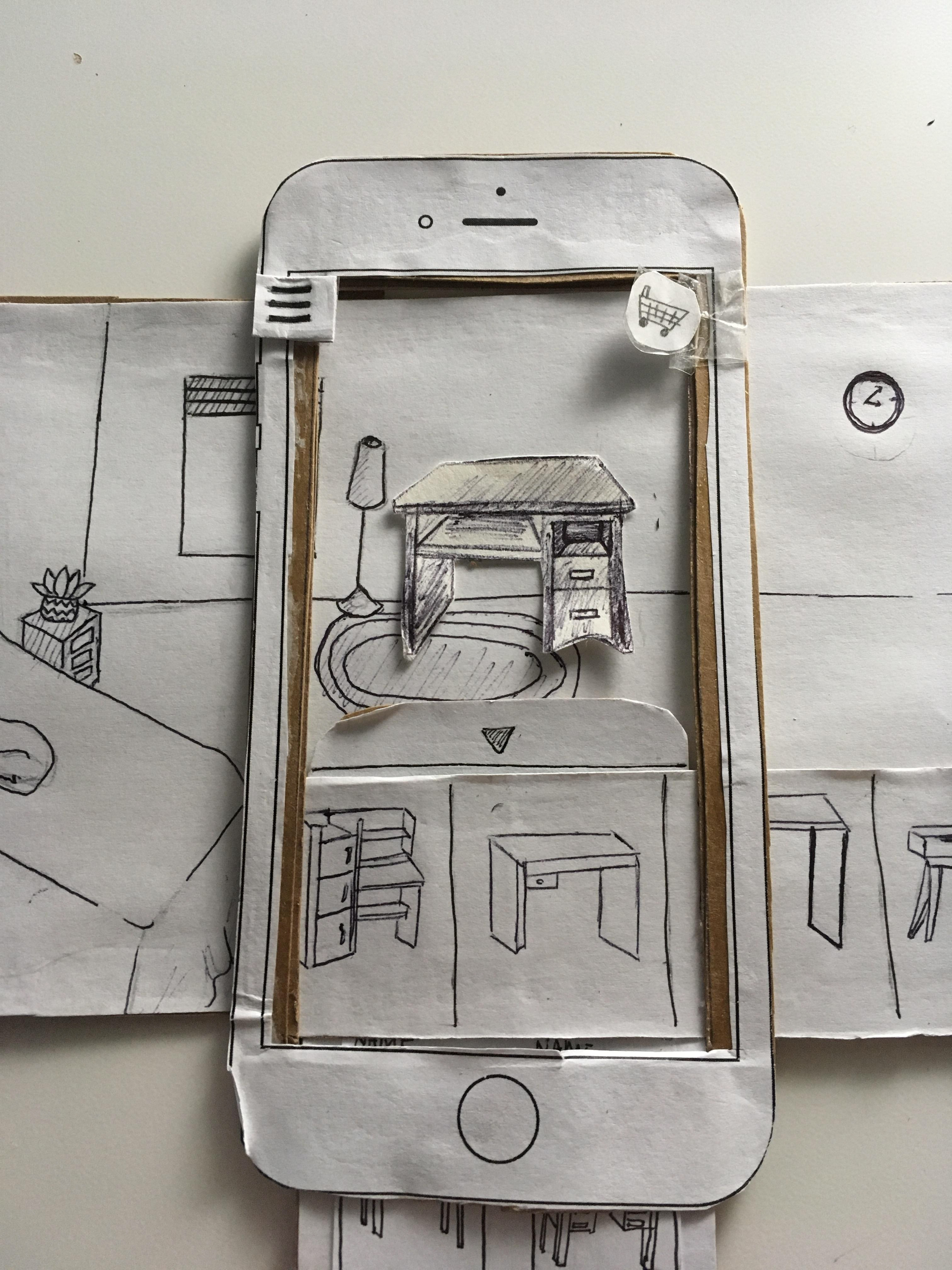
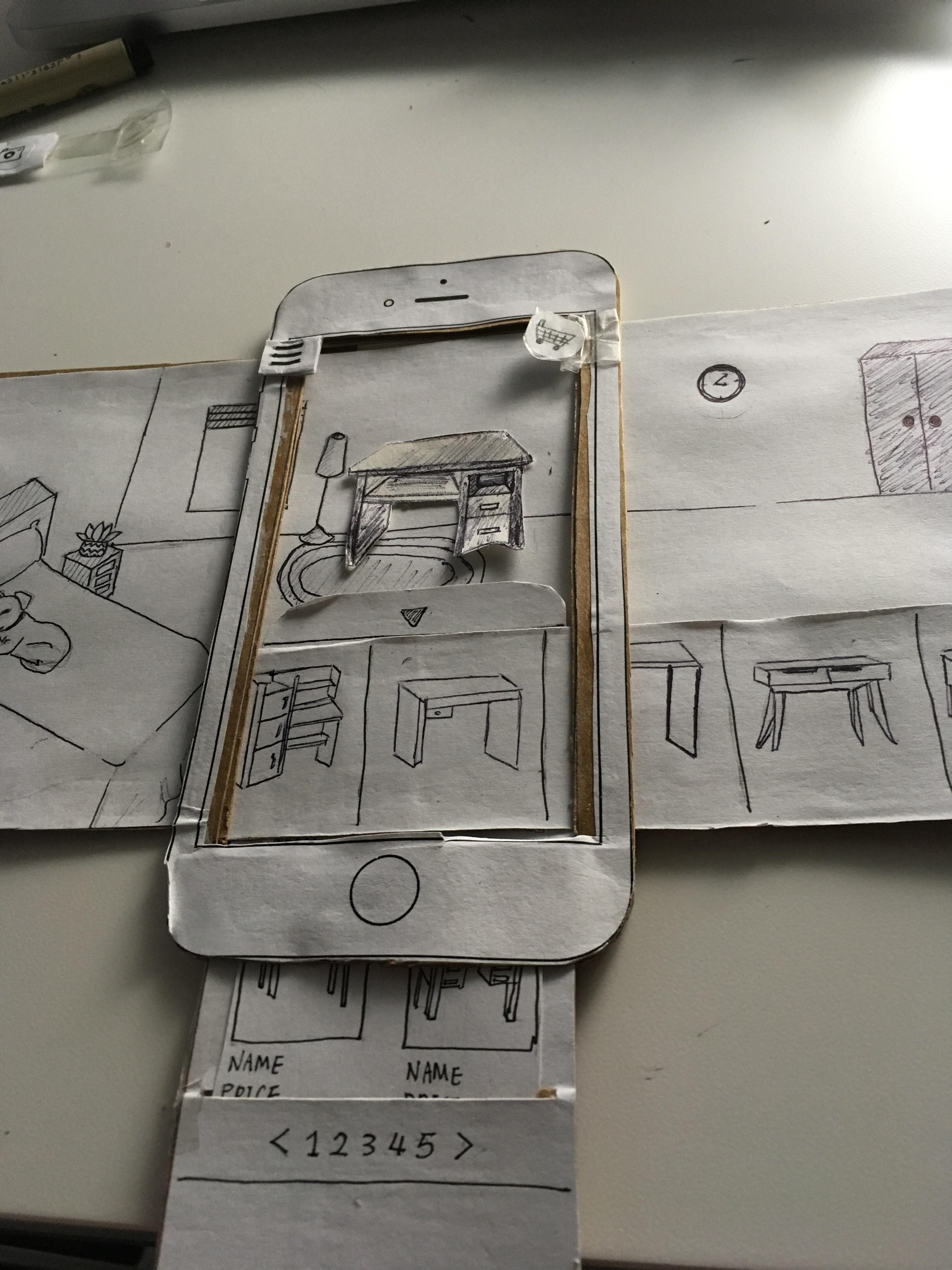
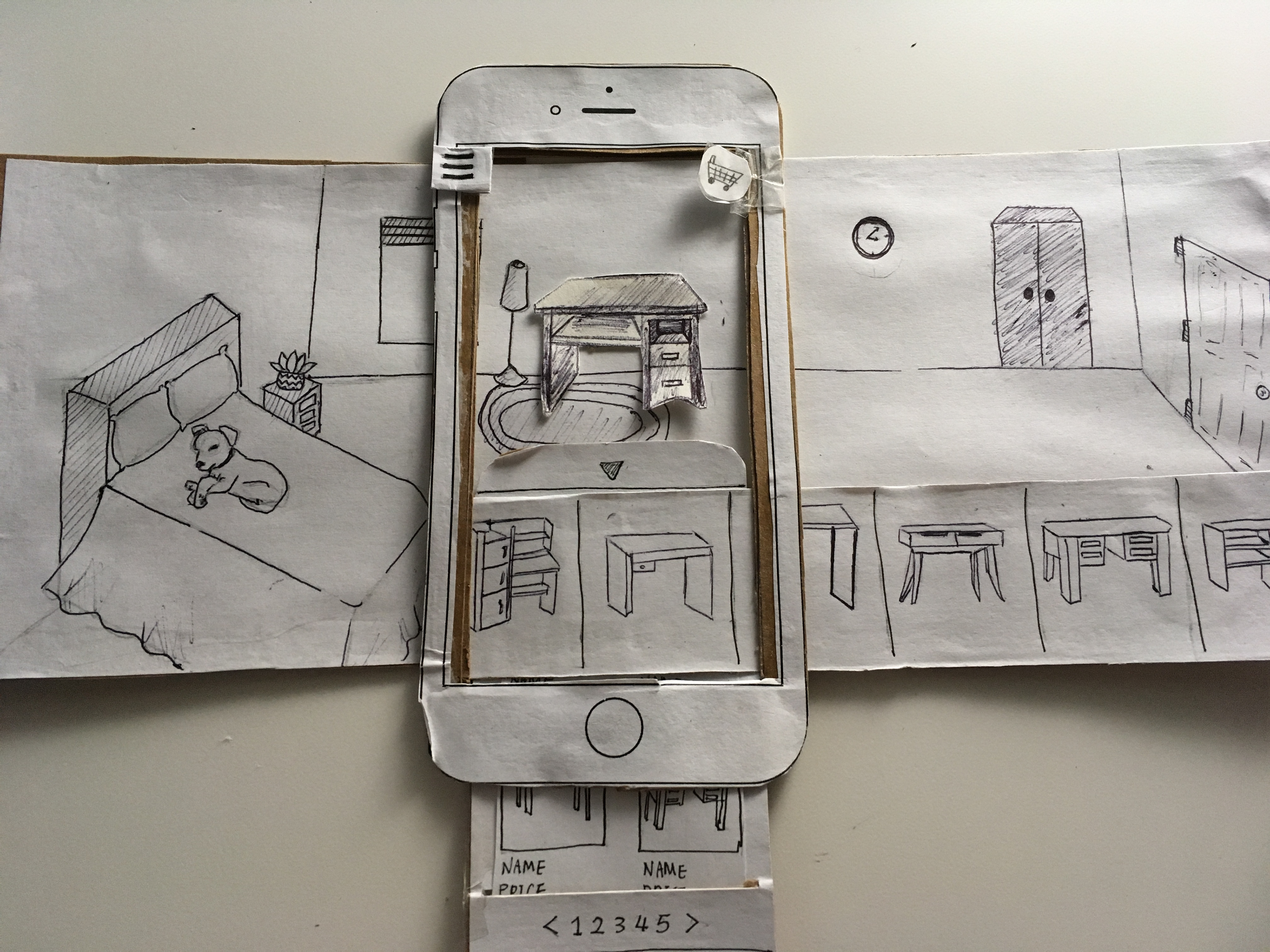
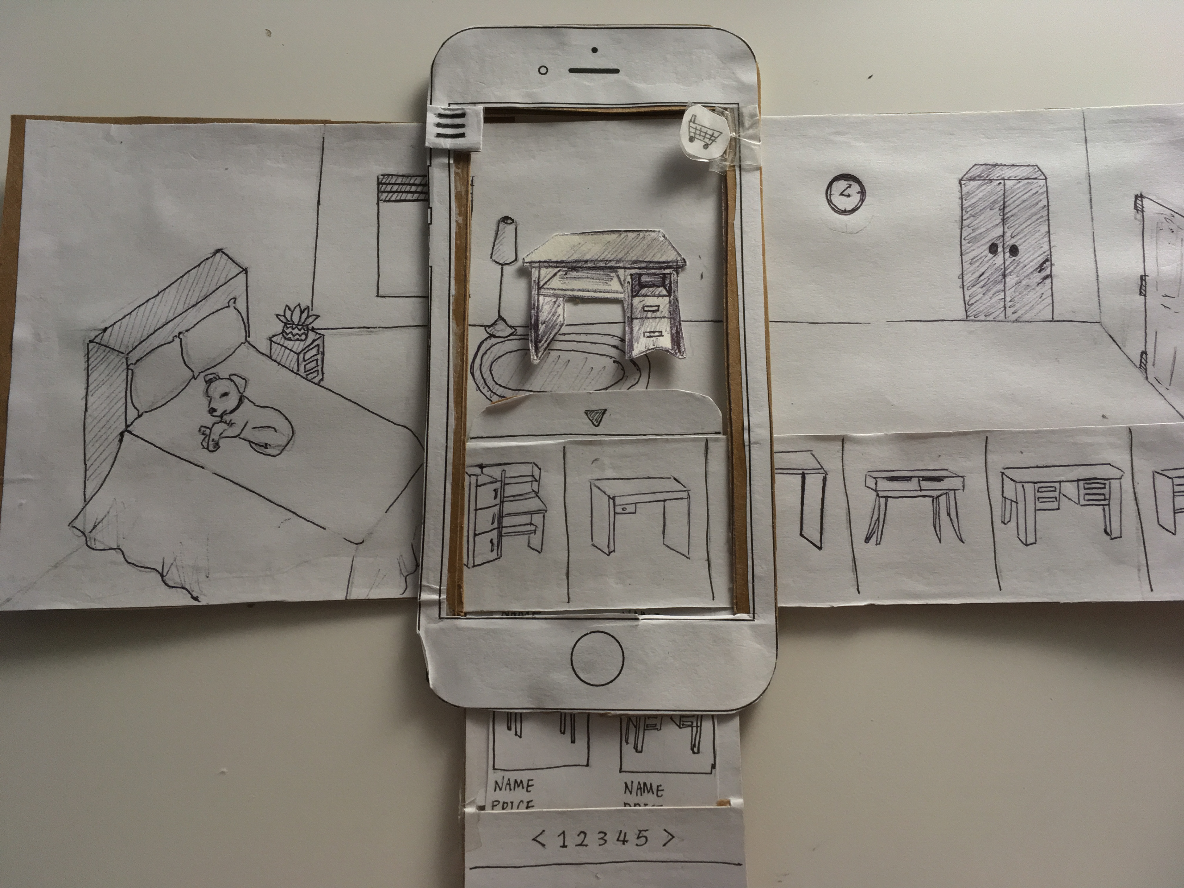
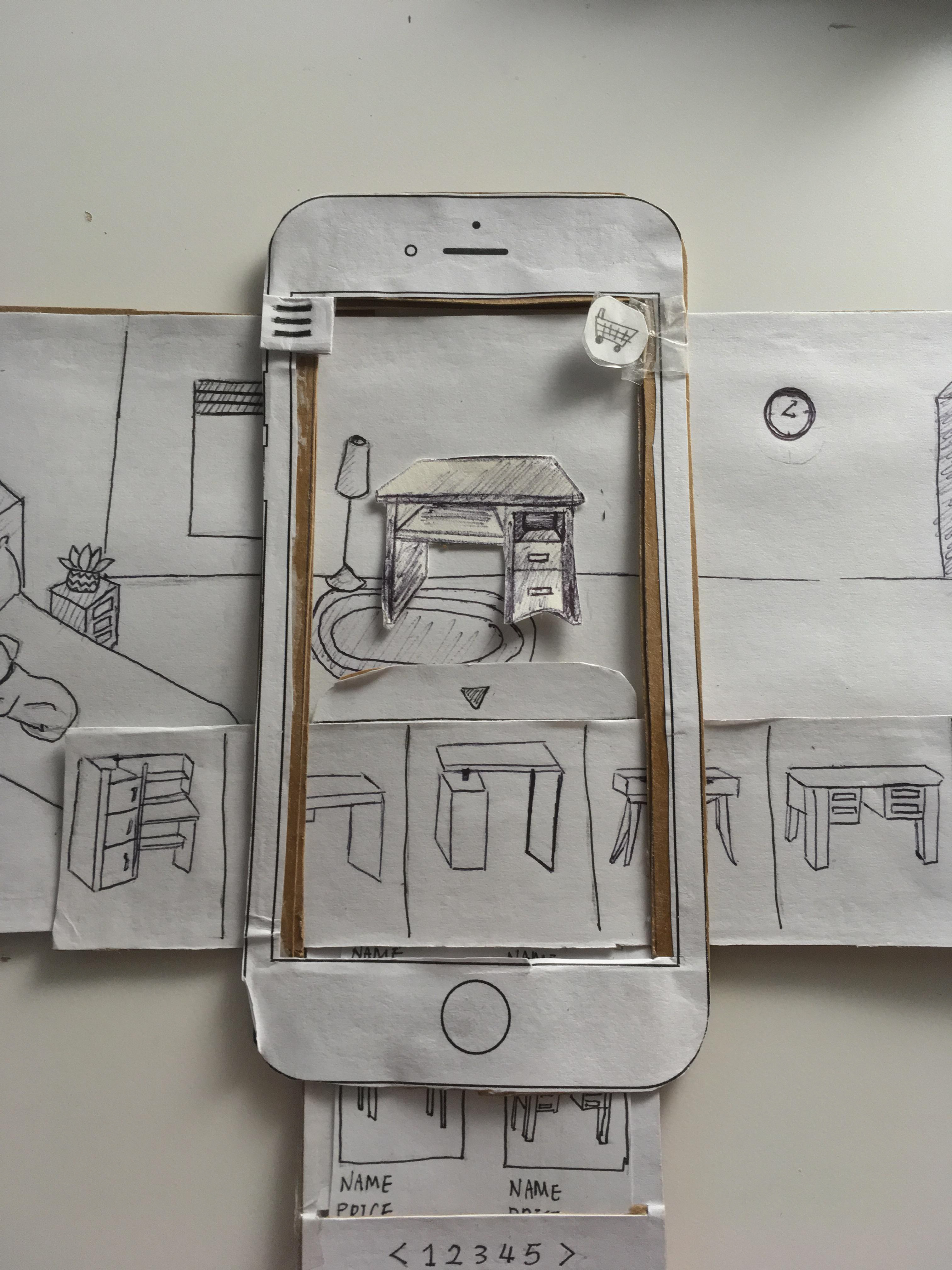
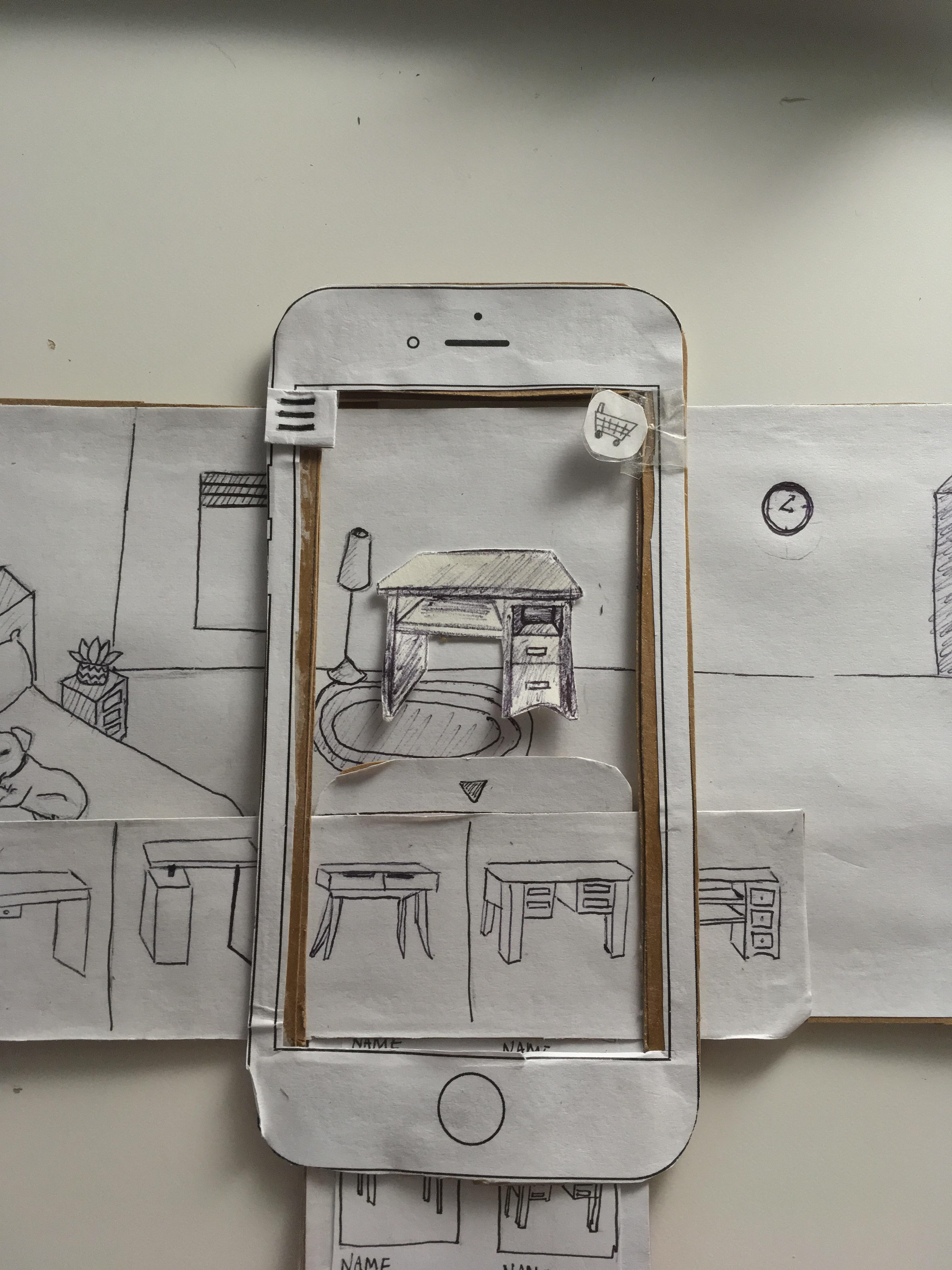
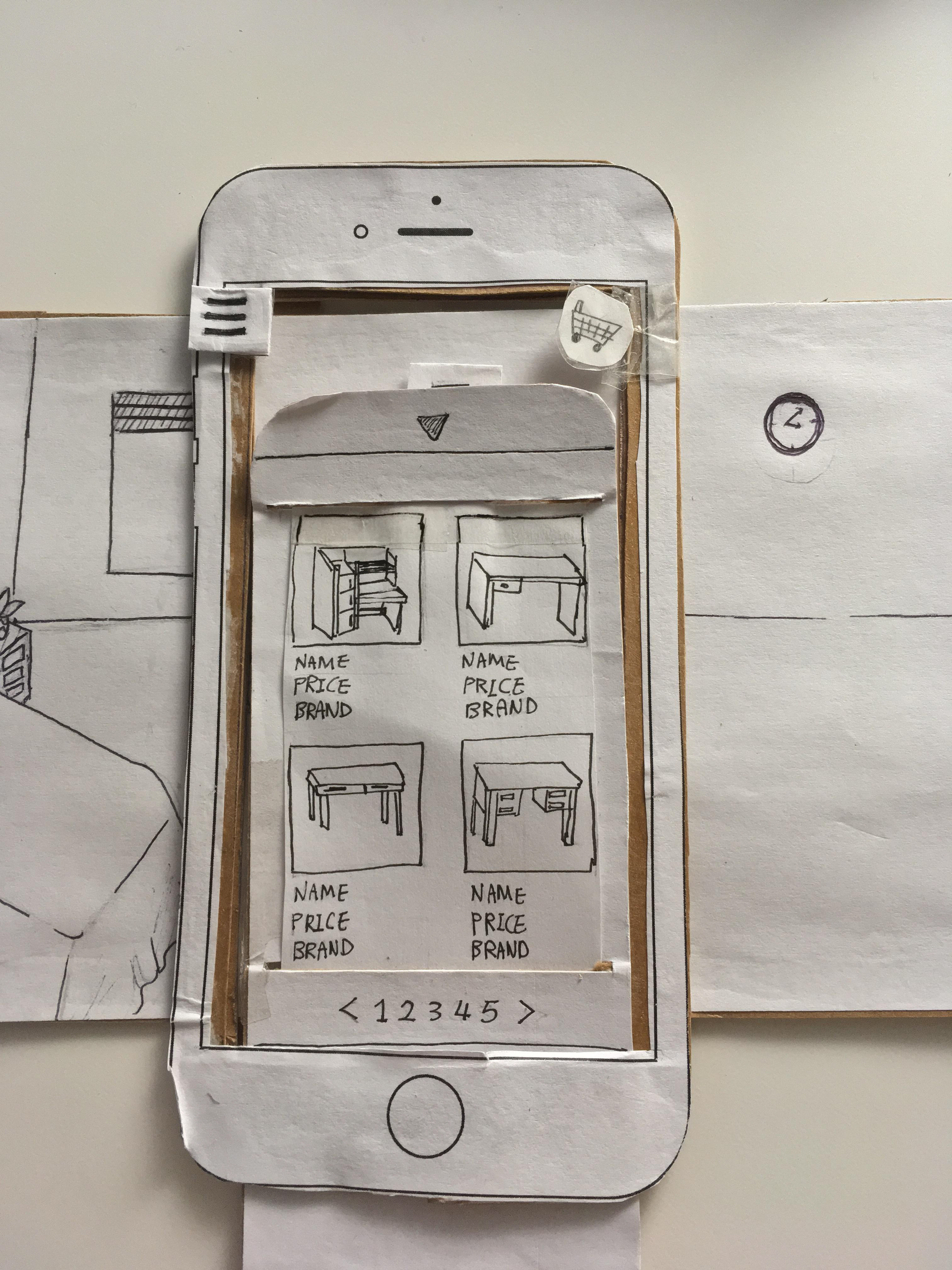
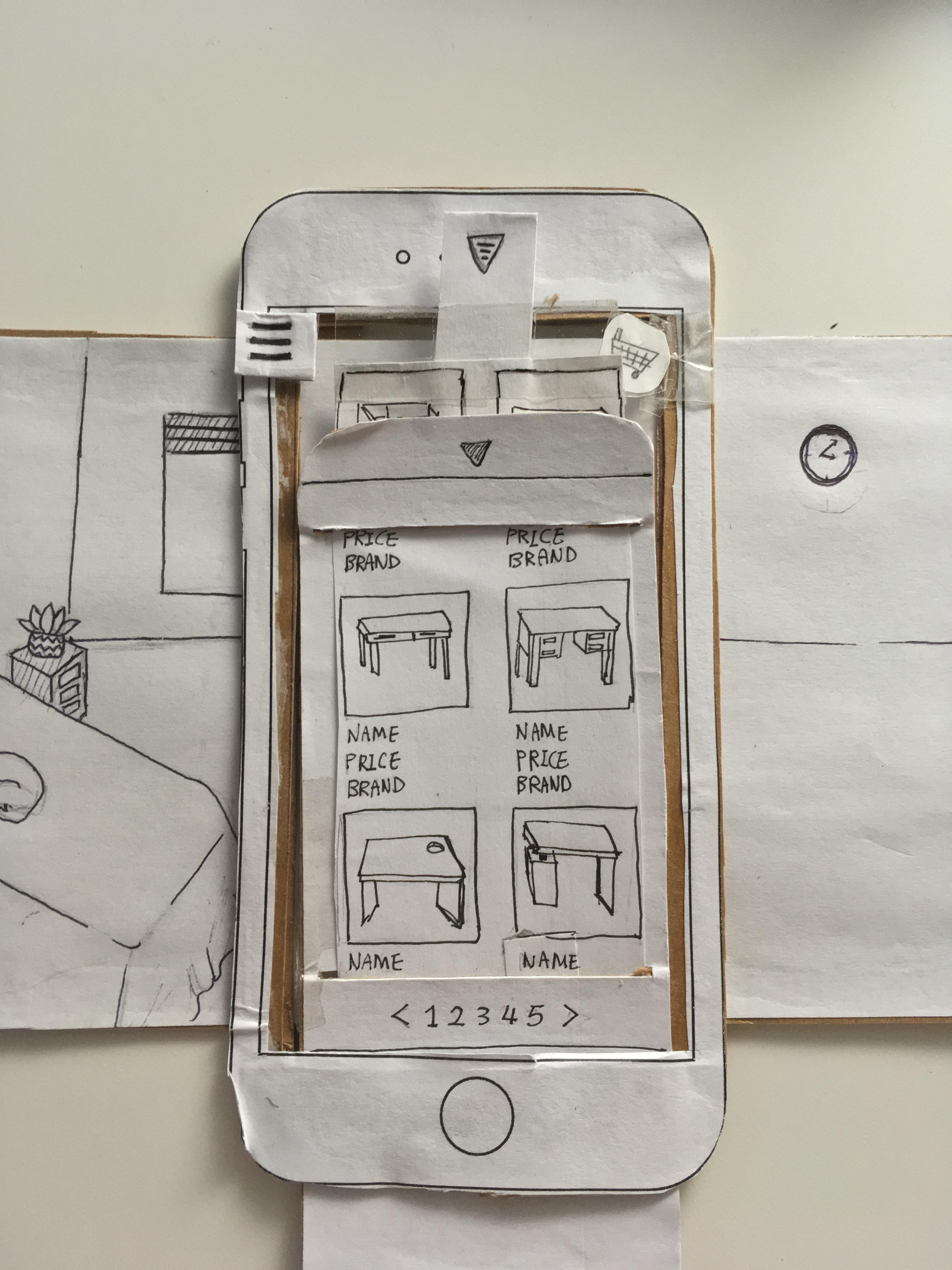
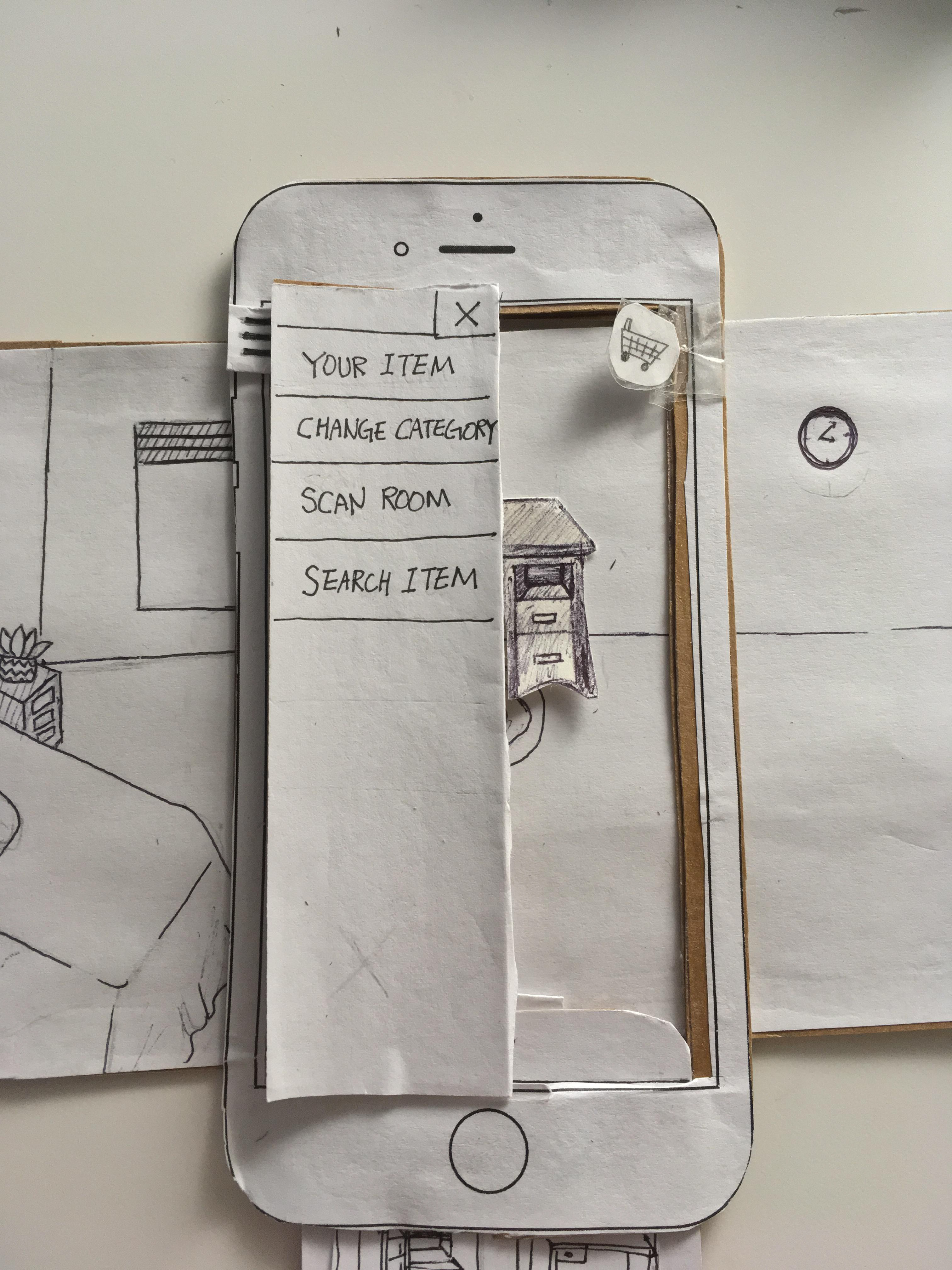
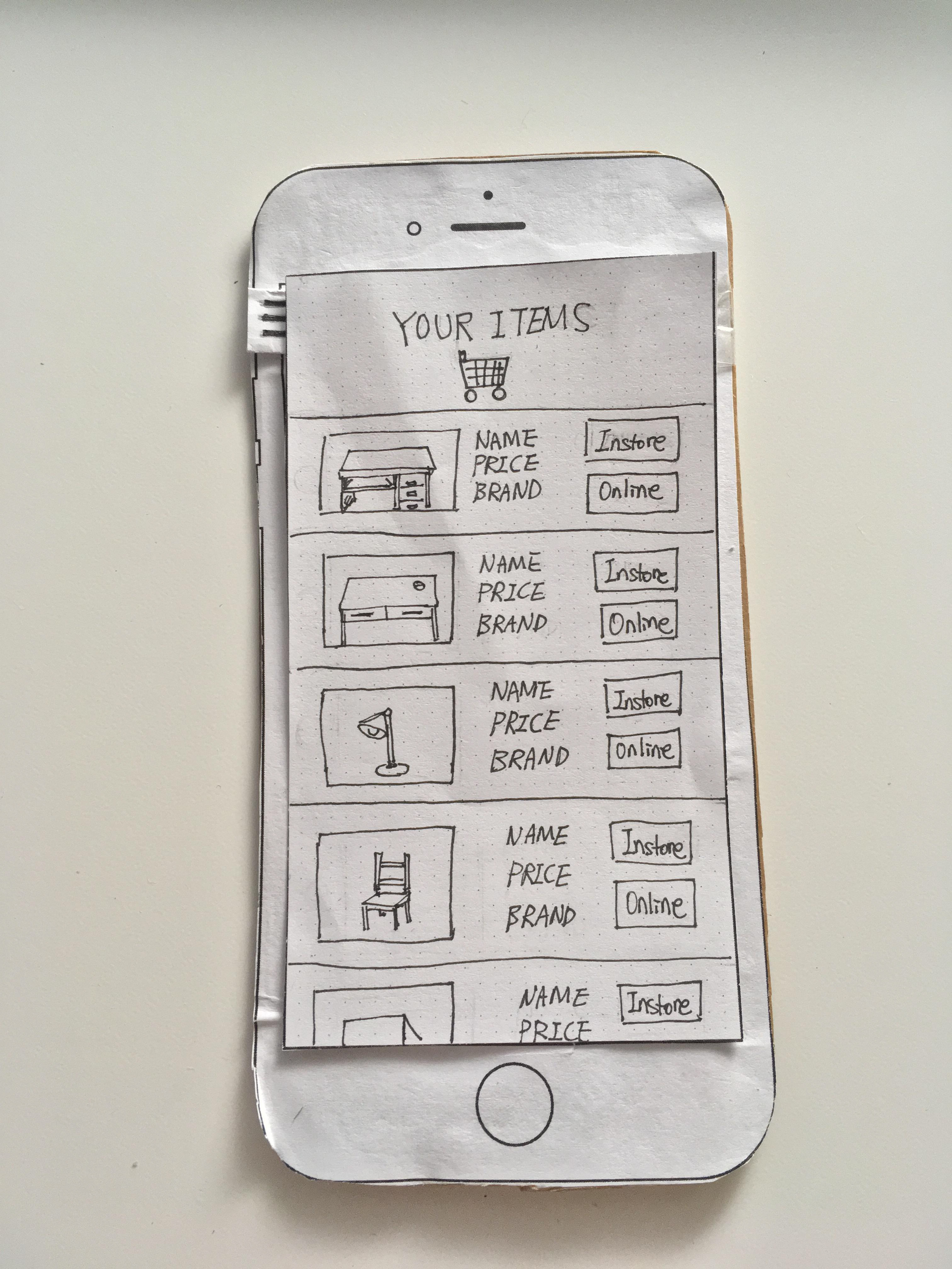
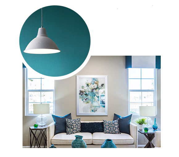
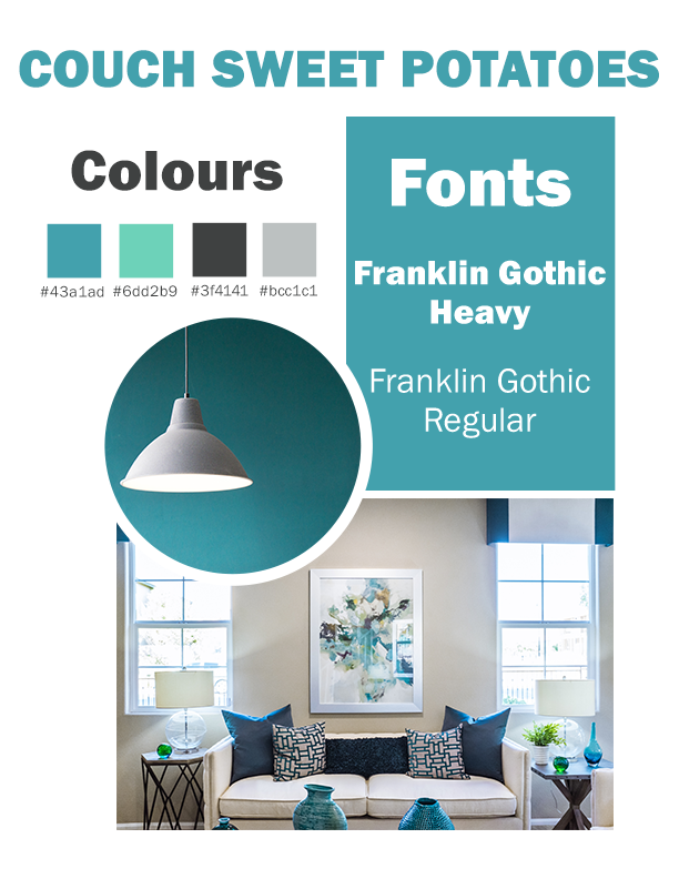
When converting then paper prototypes to a digitalize version, I was in charge of creating a colour palette and the moodboard for Furture. When picking a colour palette, I wanted colours that represented calm , reliability and convenience. And I wanted fonts and designs that target a younger target audience that want to look for furniture online. Originally, there were two different main colours that I wanted to use for the colour palette, one was a vibrant blue and the other colour is a slightly muted teal. my team decided to go to the teal since the teal is better with the furniture app since the blue was too bright and vibrant.

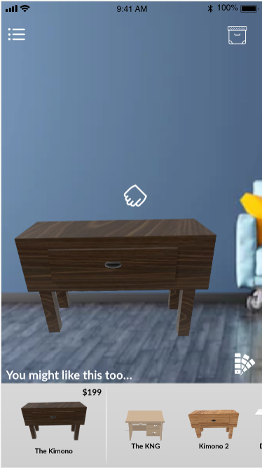
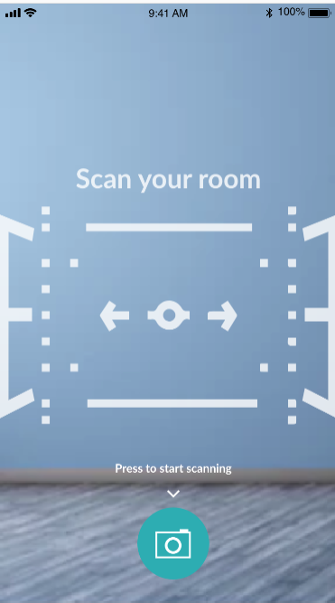
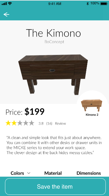
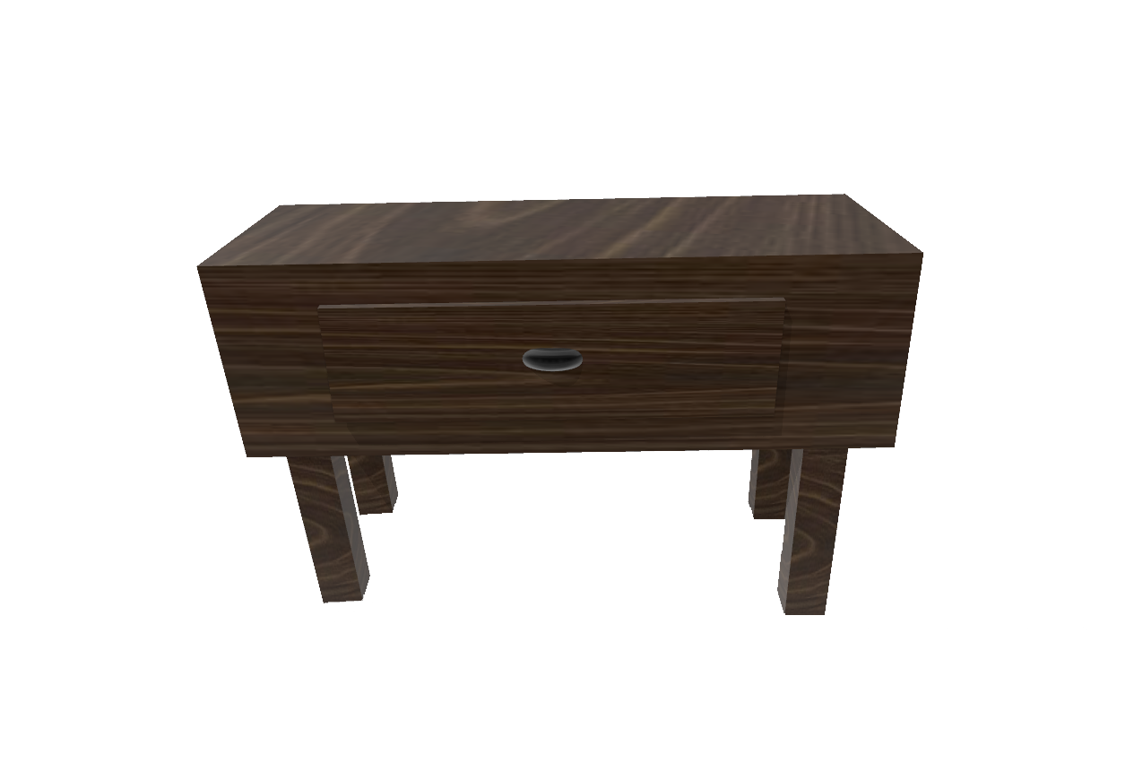
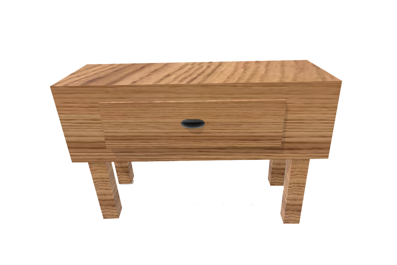
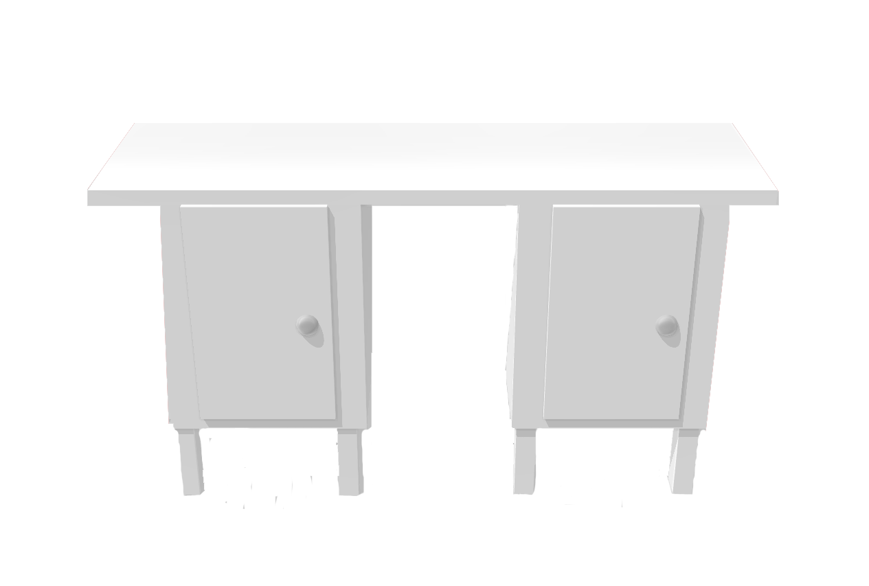
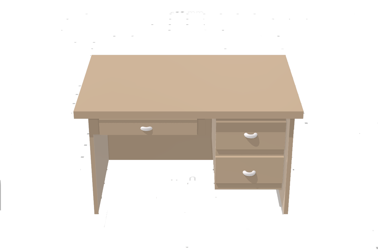
While everybody in the team collaborated with the digital app prototype, I created some the three-dimensional furniture so that we could be able to emulate the three-dimensional furniture that you see in augmented reality apps that you see in real life. We implemented the colour palette from the moodboard and incorporated elements from the paper prototype into the digitalize app.
Team Members: Jaehee Rho, Maurice Oppenberger