When coming up with the logo process, I was also coming with name ideas as well. One of the main original ideas that I had for Dutter was implementing the infinity symbol since the symbol represents the autism community and how everyone whether they are one the autism spectrum or not can use it.
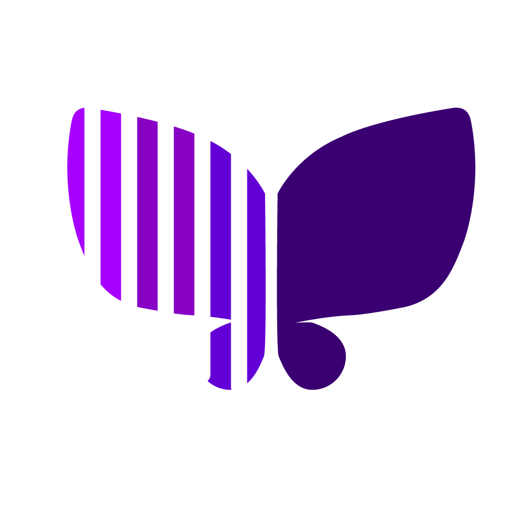
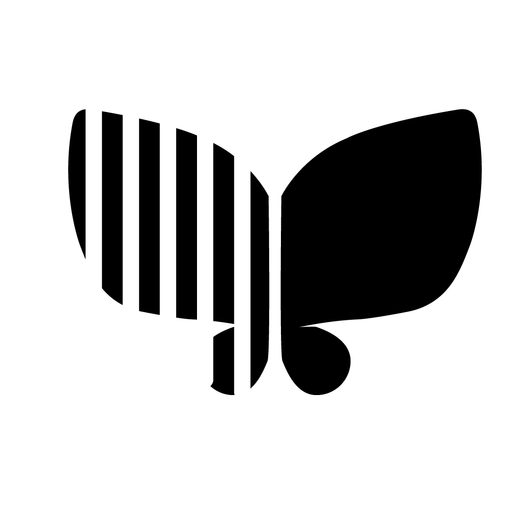
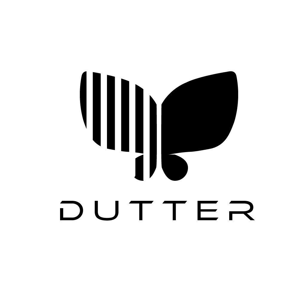
Ultimately, I went with the butterfly instead because as an experience as an autistic person, I often feel trapped by noises and sounds around me, something that neurotypical people do not often think about. By using Dutter, it would imply that I feel free to navigate around the real world because of using the device, and sharing this idea would help people with the same or similar disability feel free as well. There are few catchphrases that I created that mention the concept of hearing freely or comfortably alongside the logo.
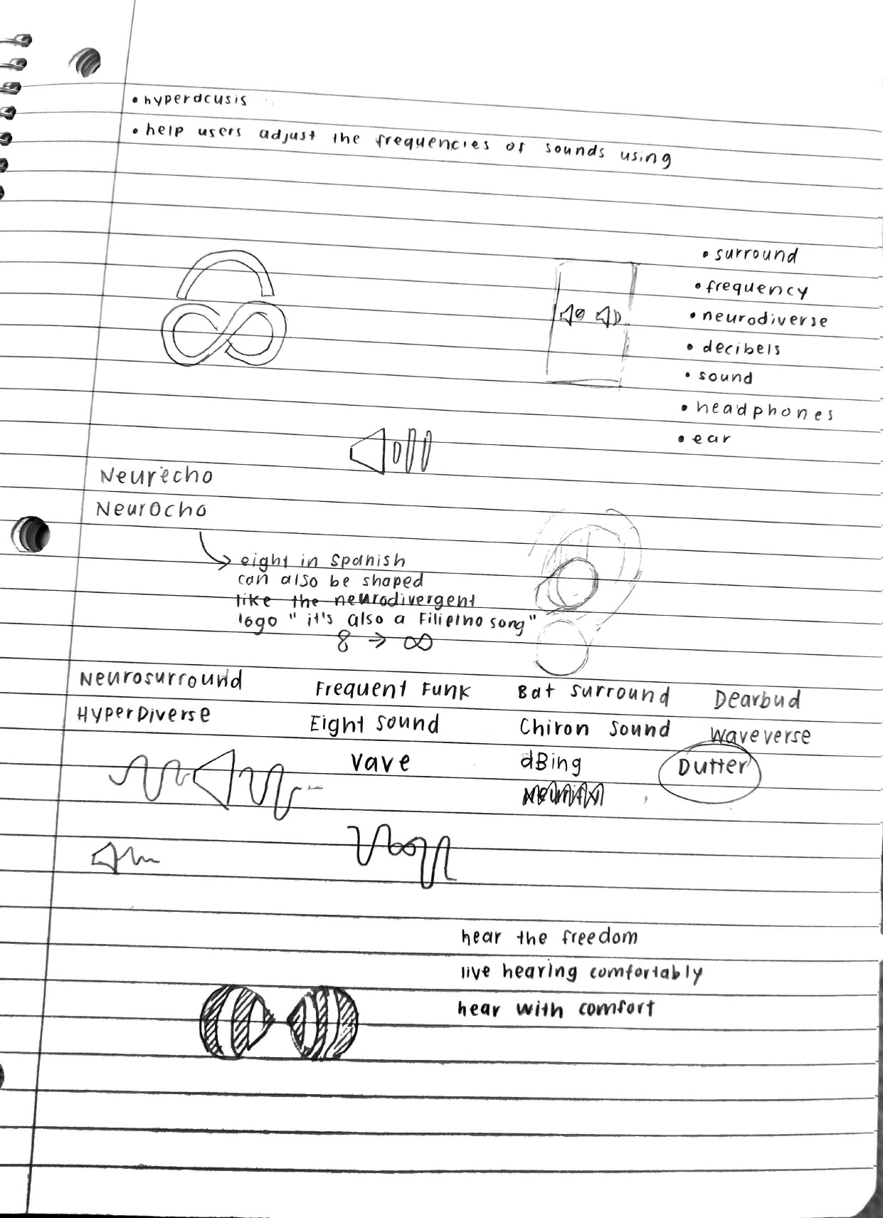
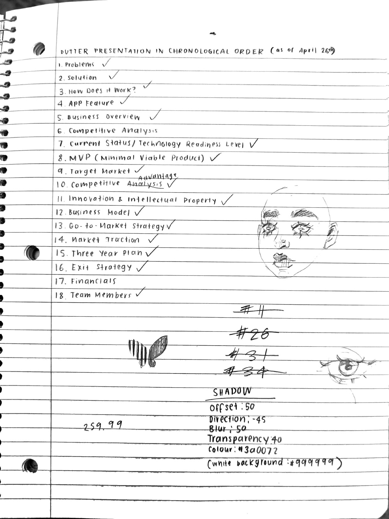
With the final revision of the Dutter Logo, I went with two different halves of the butterfly wings to represent the decibel waves that you see illustrated in sound. Because of the two wings having a different variation to each other, it makes it look like an ear hearing different frequencies. With the colour scheme of Dutter, I went with different hues and shades of violet and purple because it is a colour of uniqueness and differences, representing how autistic and disabled people have differences that make them unique. The colours purple and violet also represents that all people can use this device since many autistic women get underdiagnosed or misdiagnosed. Since blue (men) and pink or red (women) make purple, it makes sense to use this colour scheme throughout the whole branding.