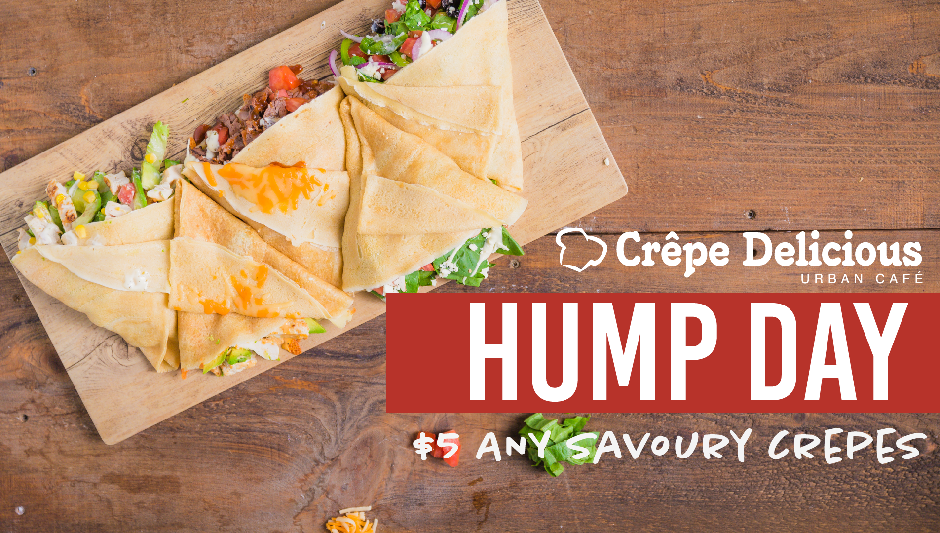
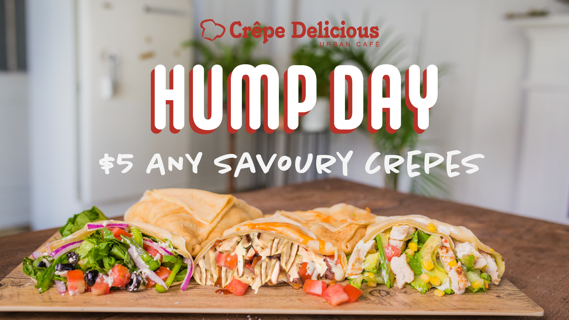
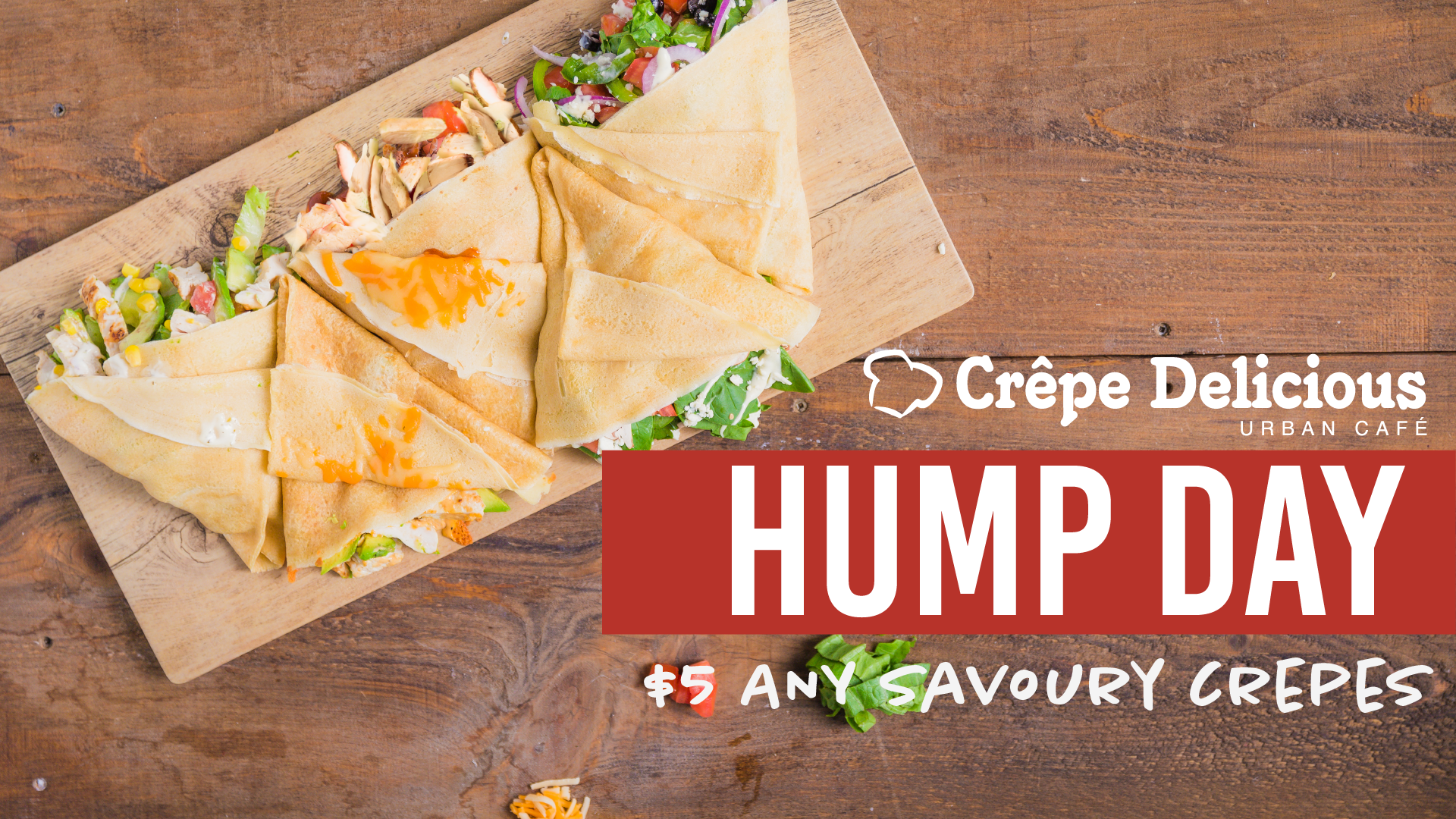
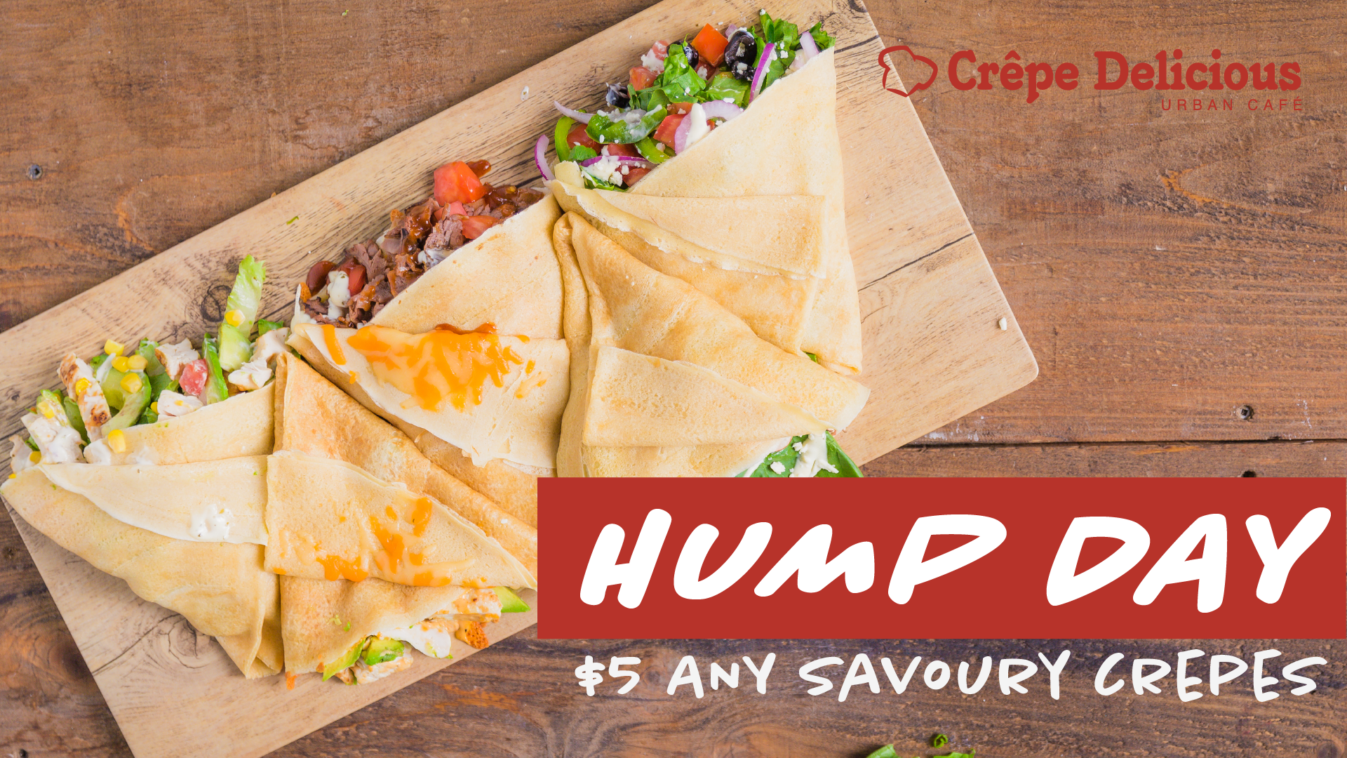
I was requested by Crepe Delicious to make a Hump Day promo. I was given two different photos of crepes. The company wanted some design inspired by modern day cafés. It was went to be a promotion that occurred on Wednesdays with discounted crepes.
There was several ideas that I wanted to experiment since there were two pictures that the company gave to me. I was experimenting with different font styles and ways of making the word Hump day stand out like adding a red (the official colour) box like a like a highlighter or creating that same red like a highlighter.
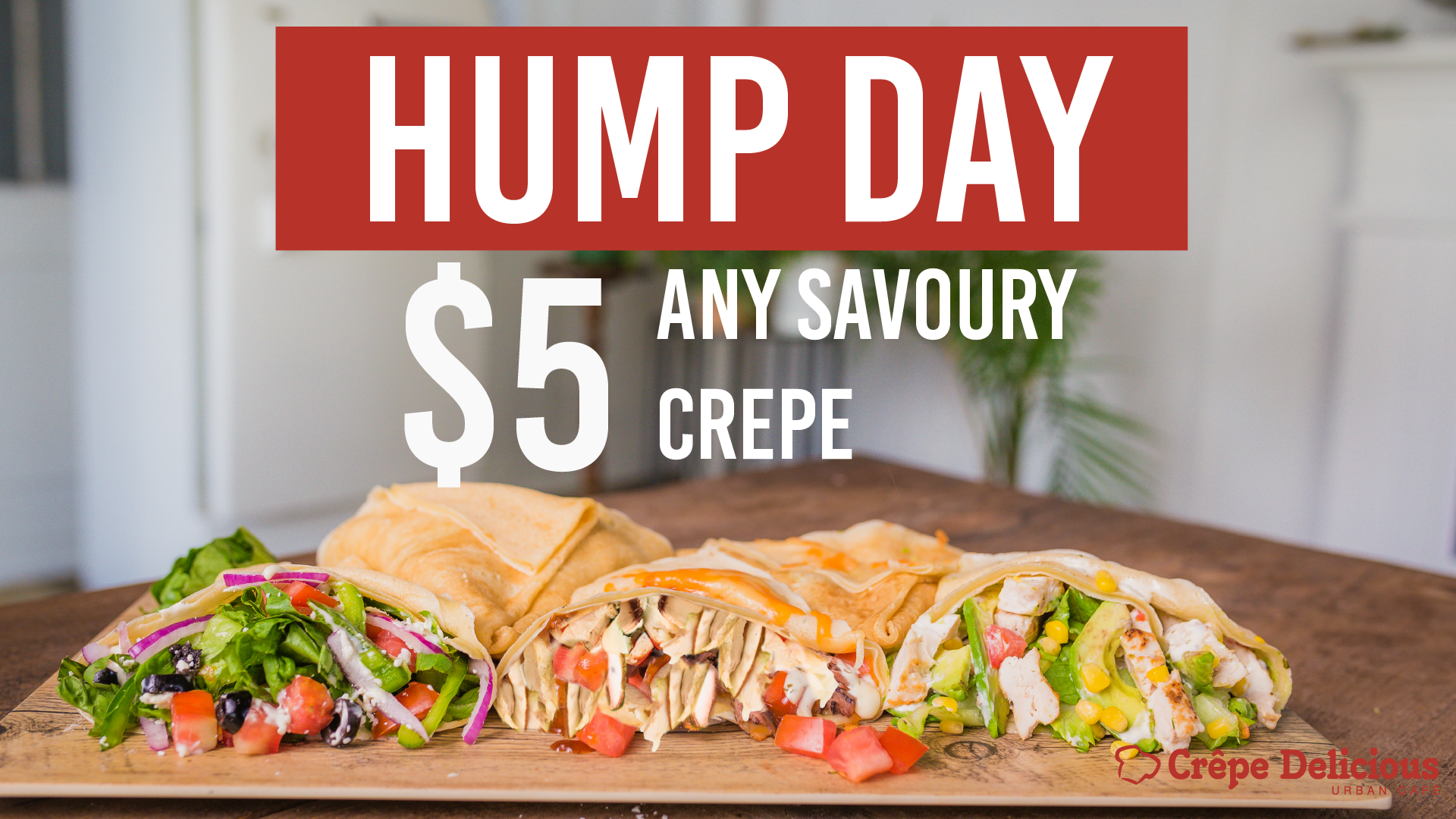


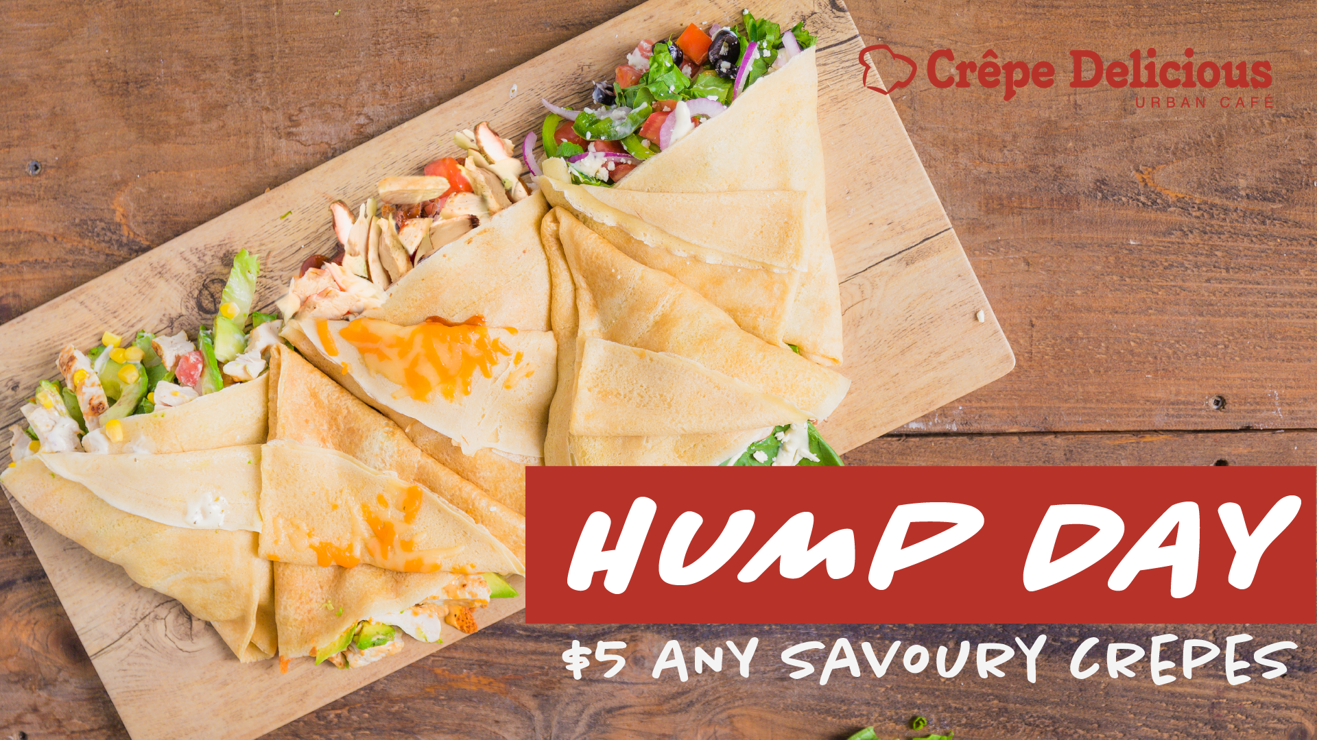
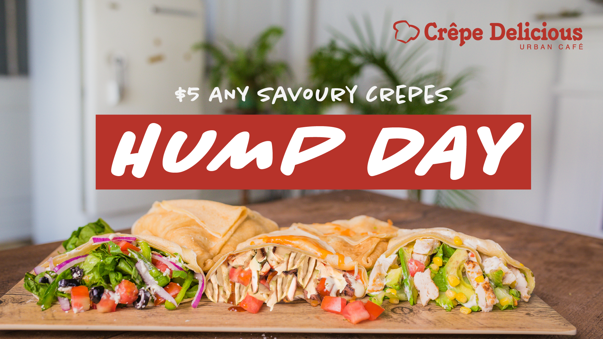

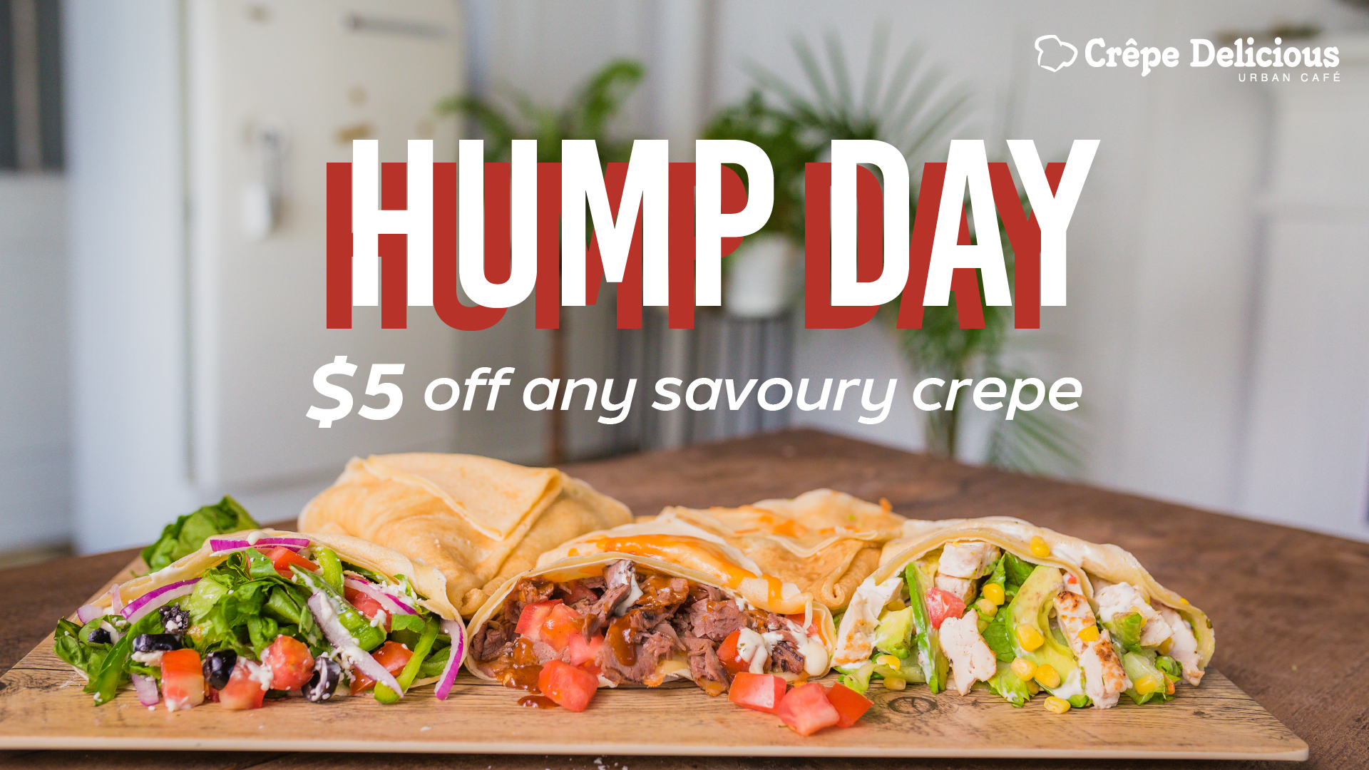
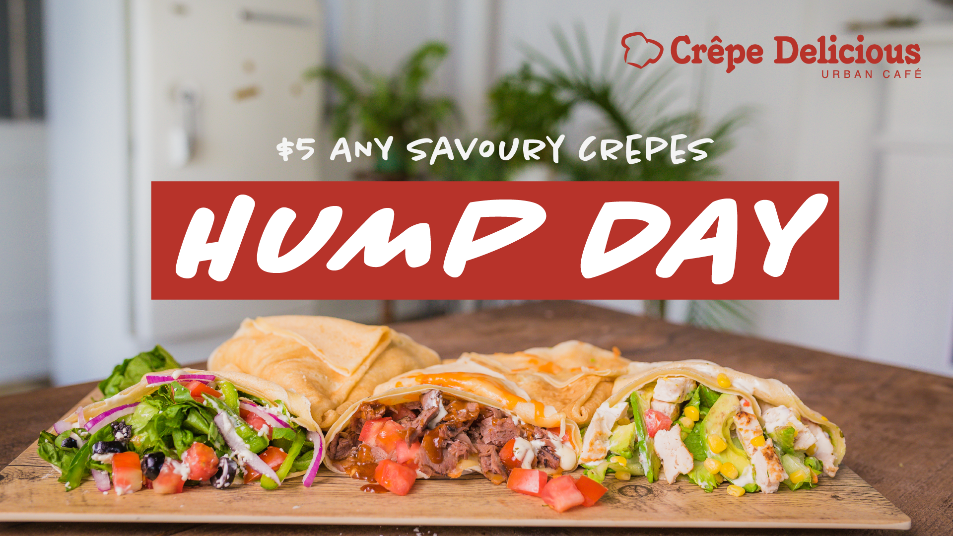
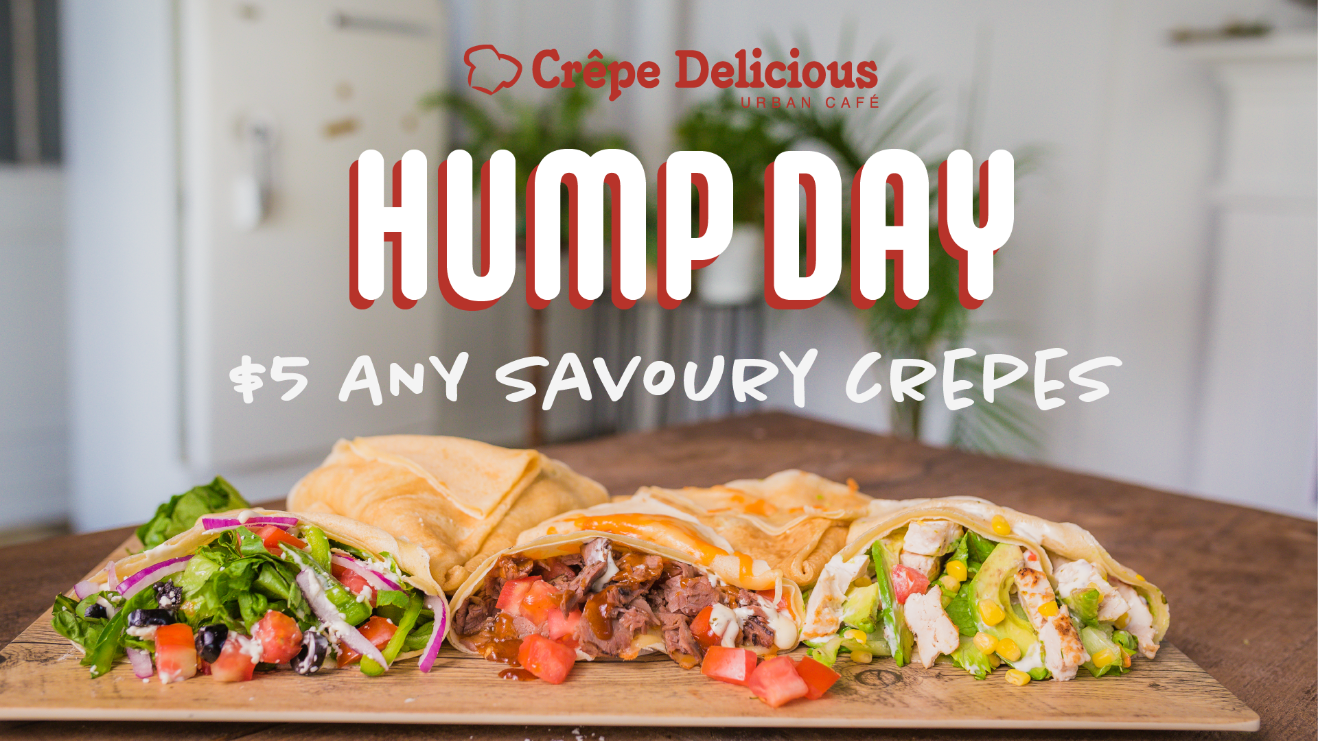
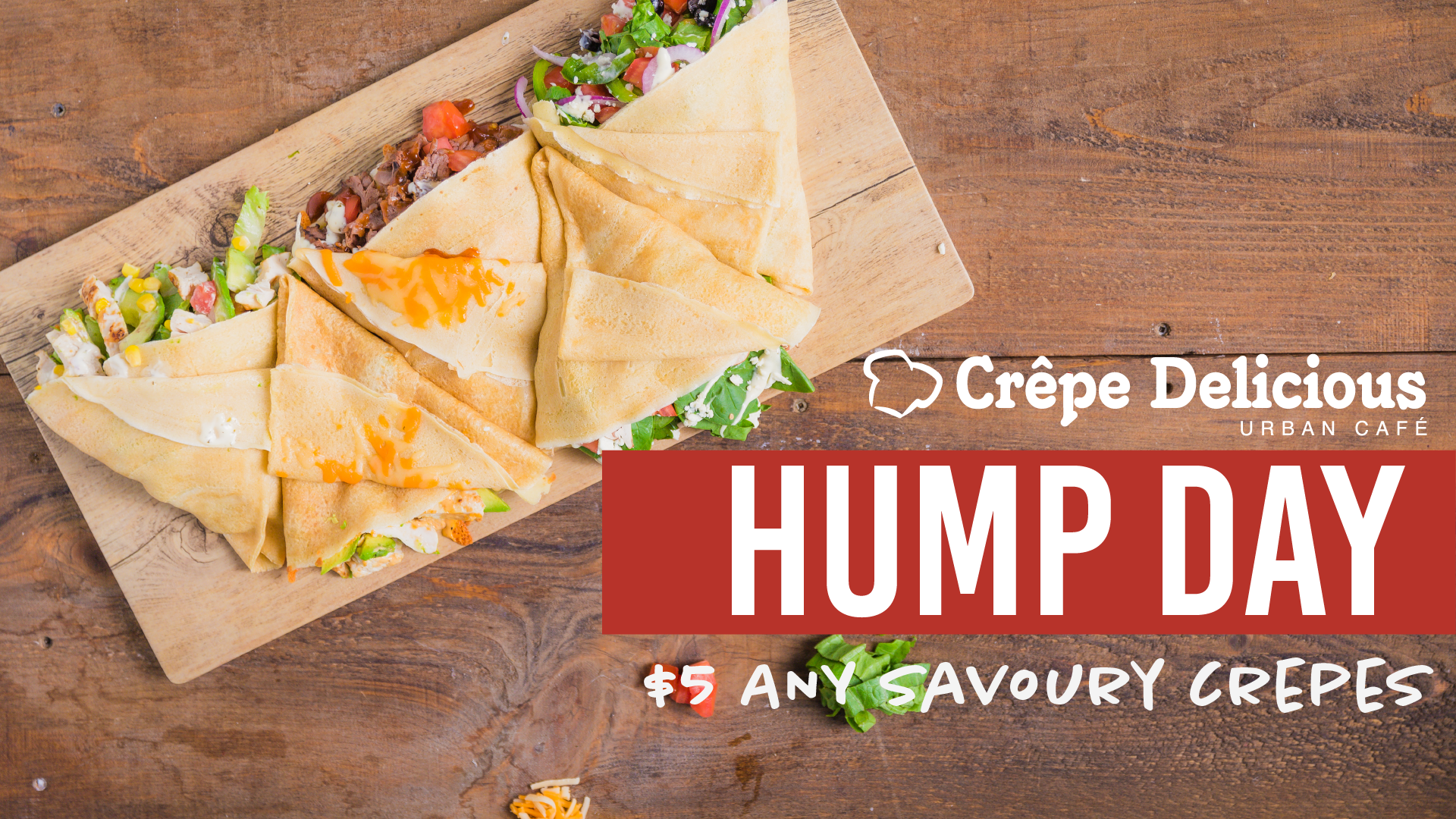
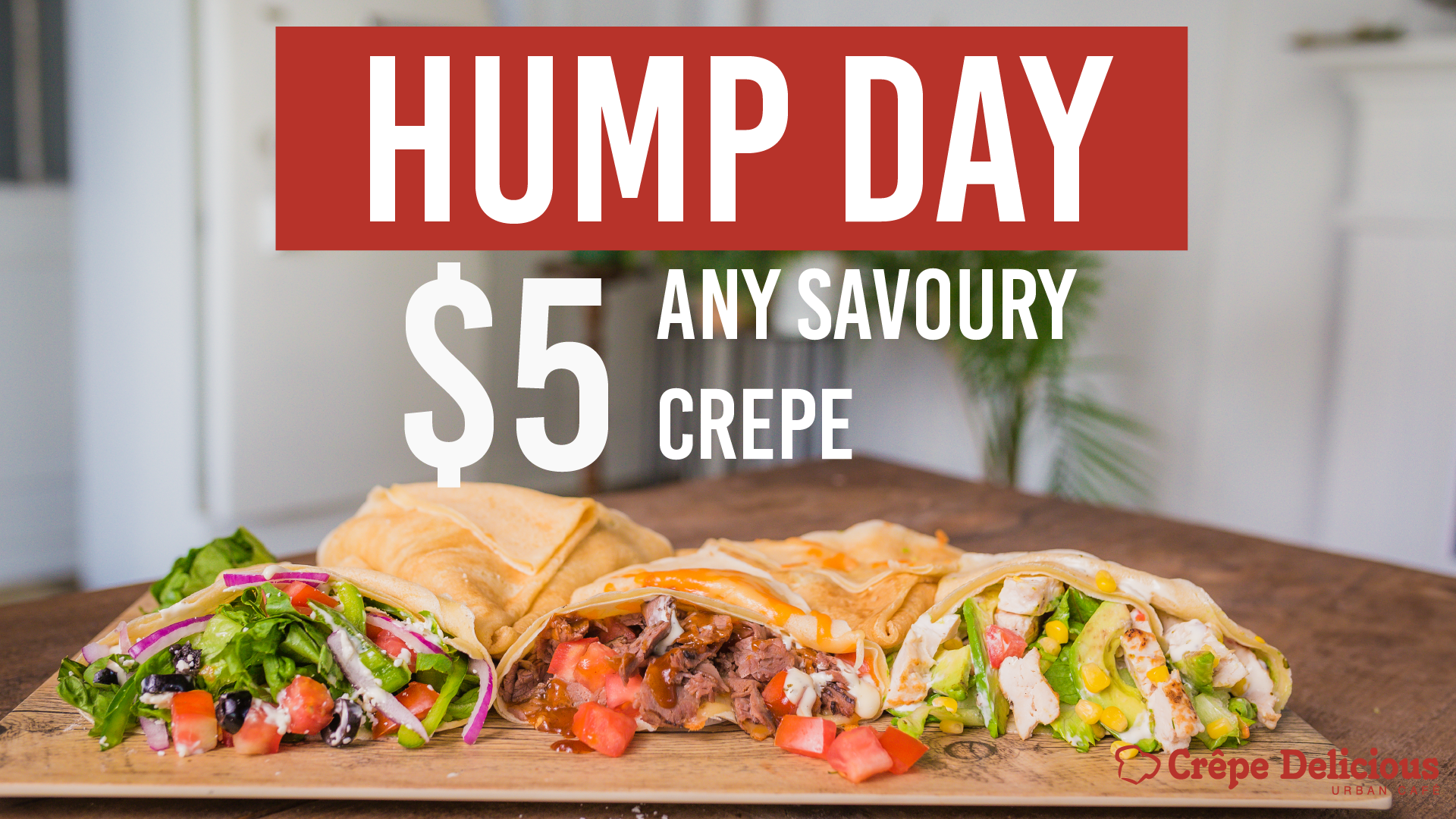
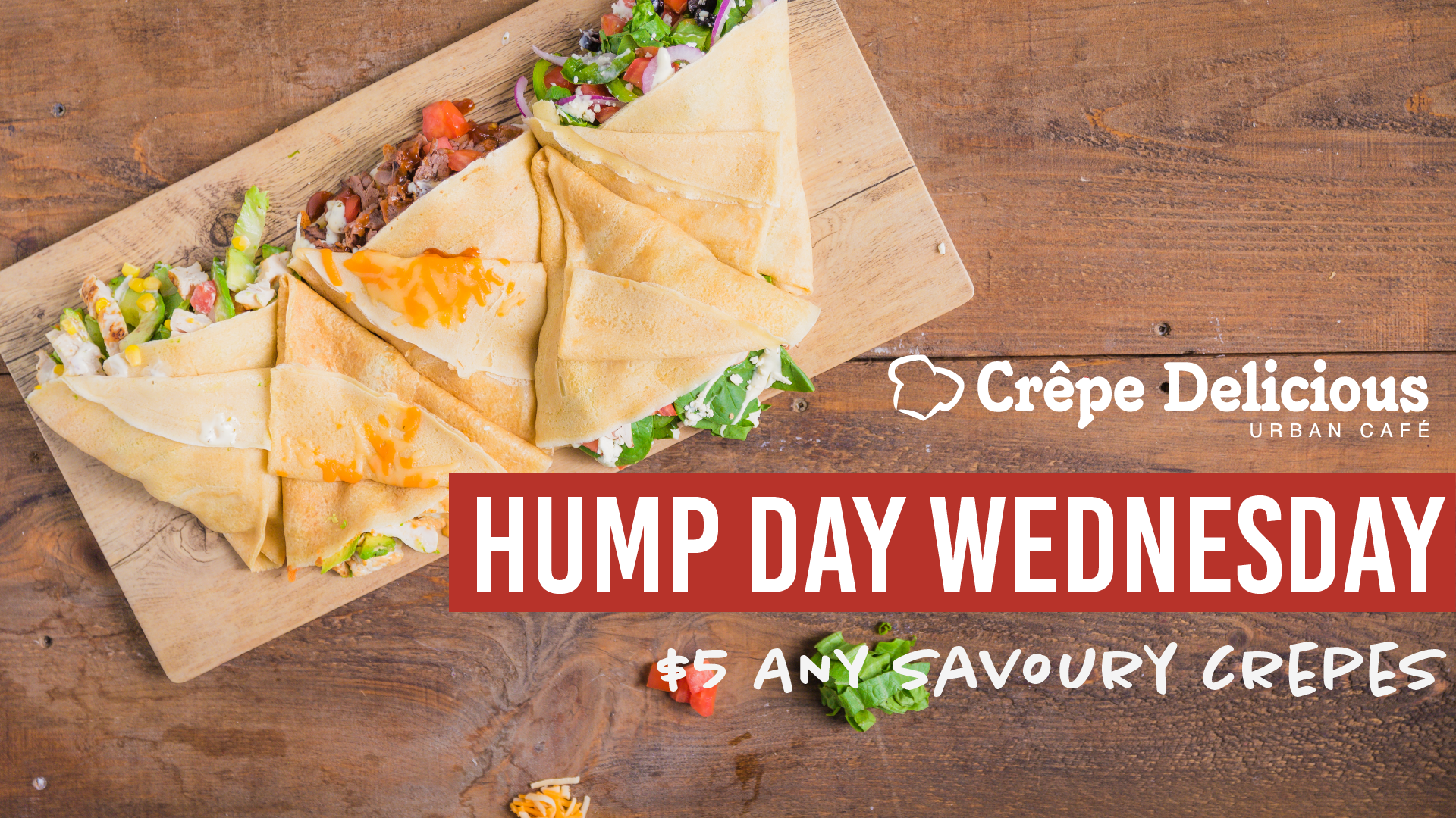


In the final decision making process, the company went with the design highlighted in red because it looks cleaner, more visible to read, and emulates a similar feeling of when you are seeing a modern day café. They also like the font Chantal Medium because the font looks like it was handwritten on a chalkboard or blackboard like what you usually see in café menus.