I was requested to create this company brand book to help developers with the company's upcoming app and to help with the consistency of the social media postings across various platforms. Using InDesign to create the brand, I was inspired by some of the companies previous presentations, documents, and business plans that they have created. I thought of the main objective of the design to be minimalist, clean, and reliable.
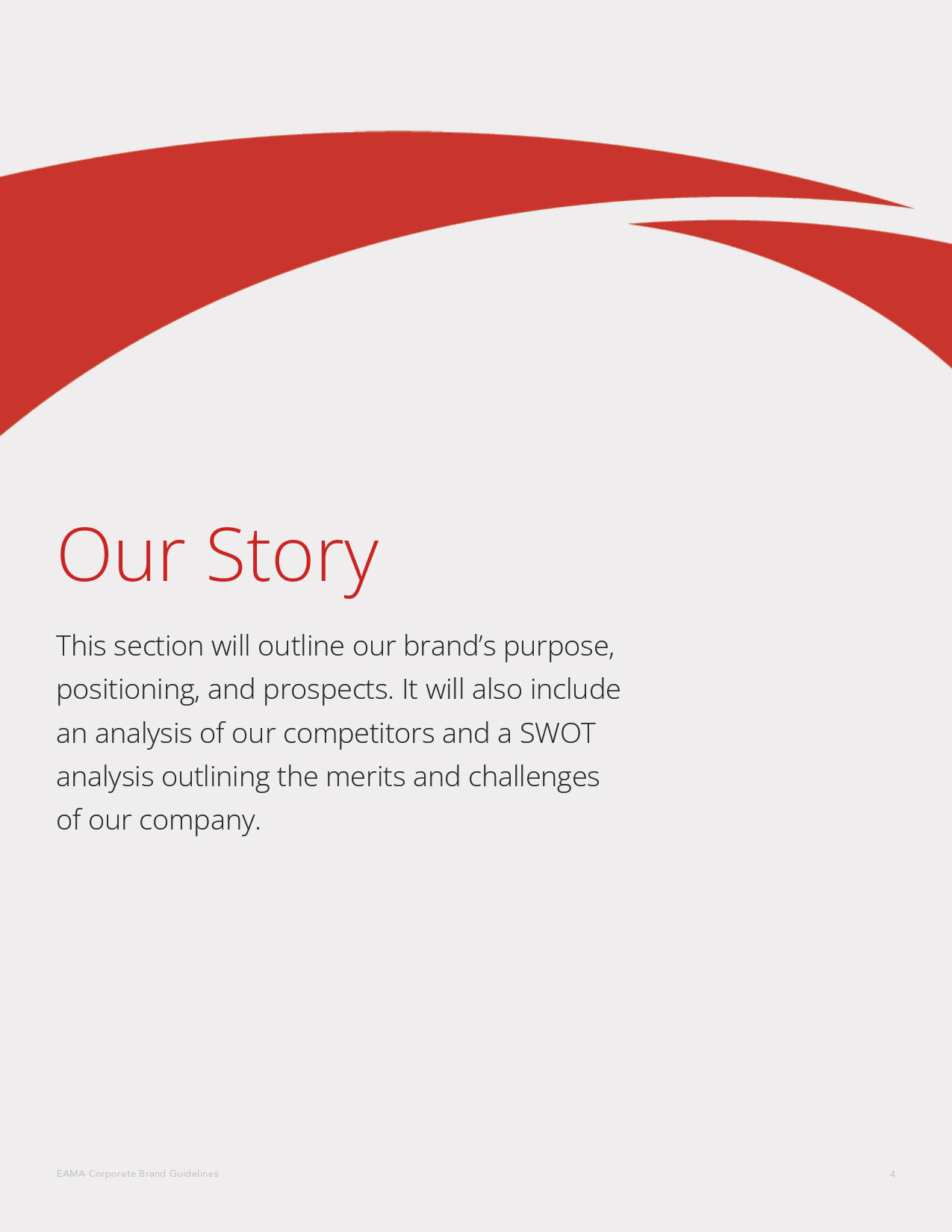
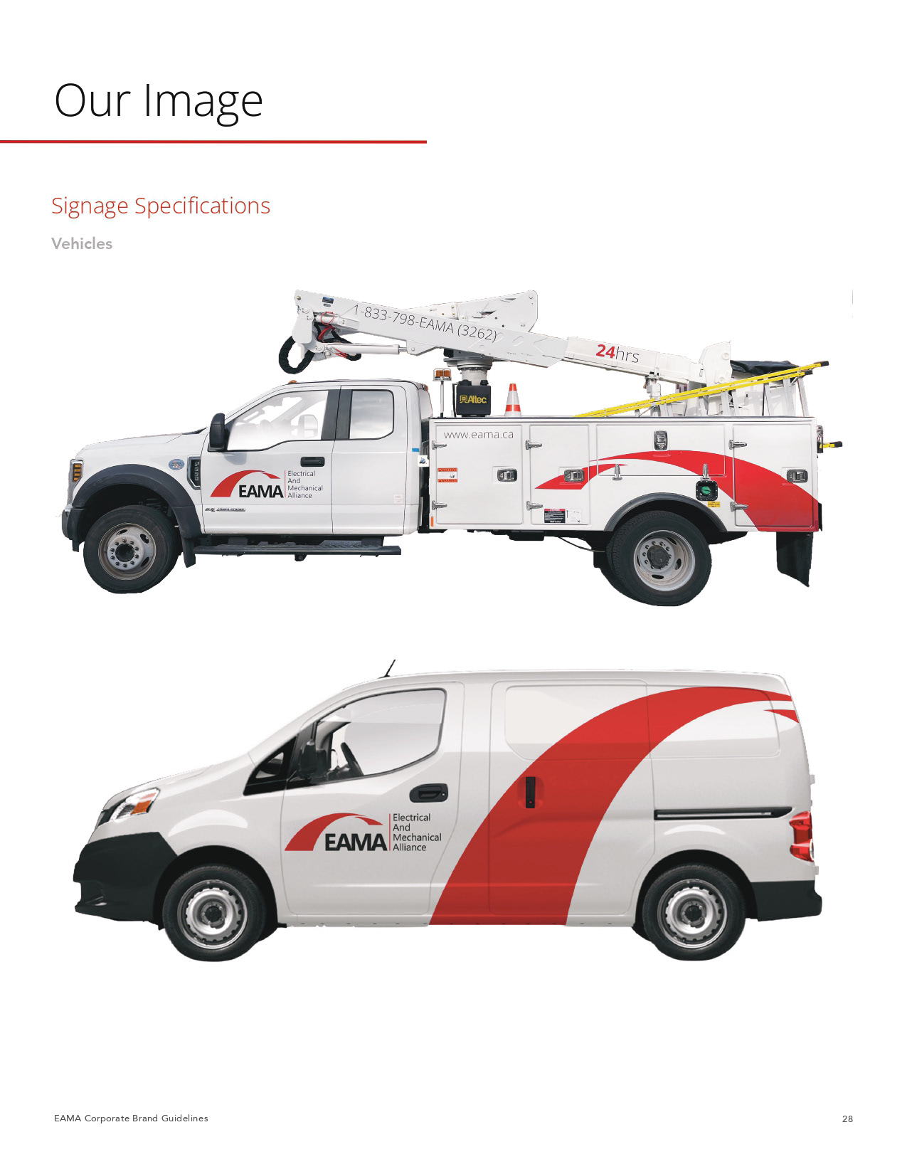
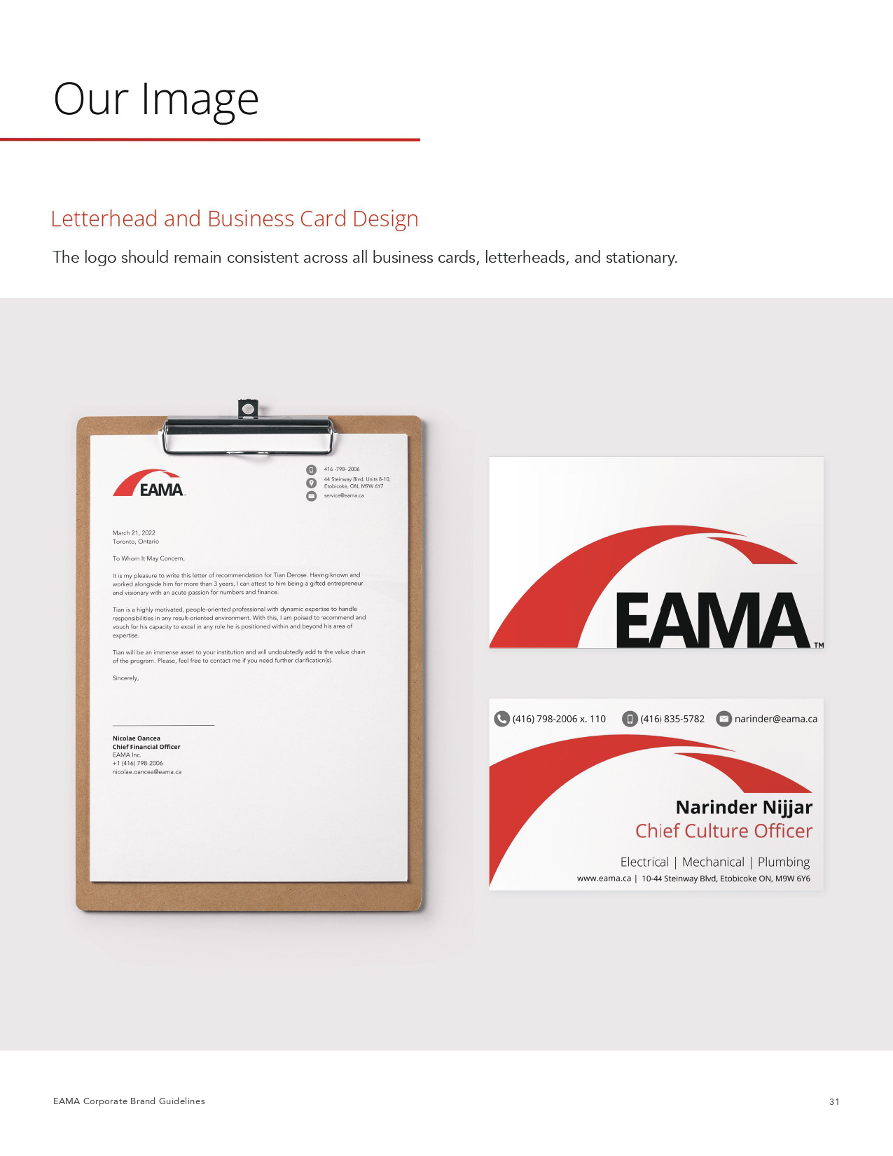
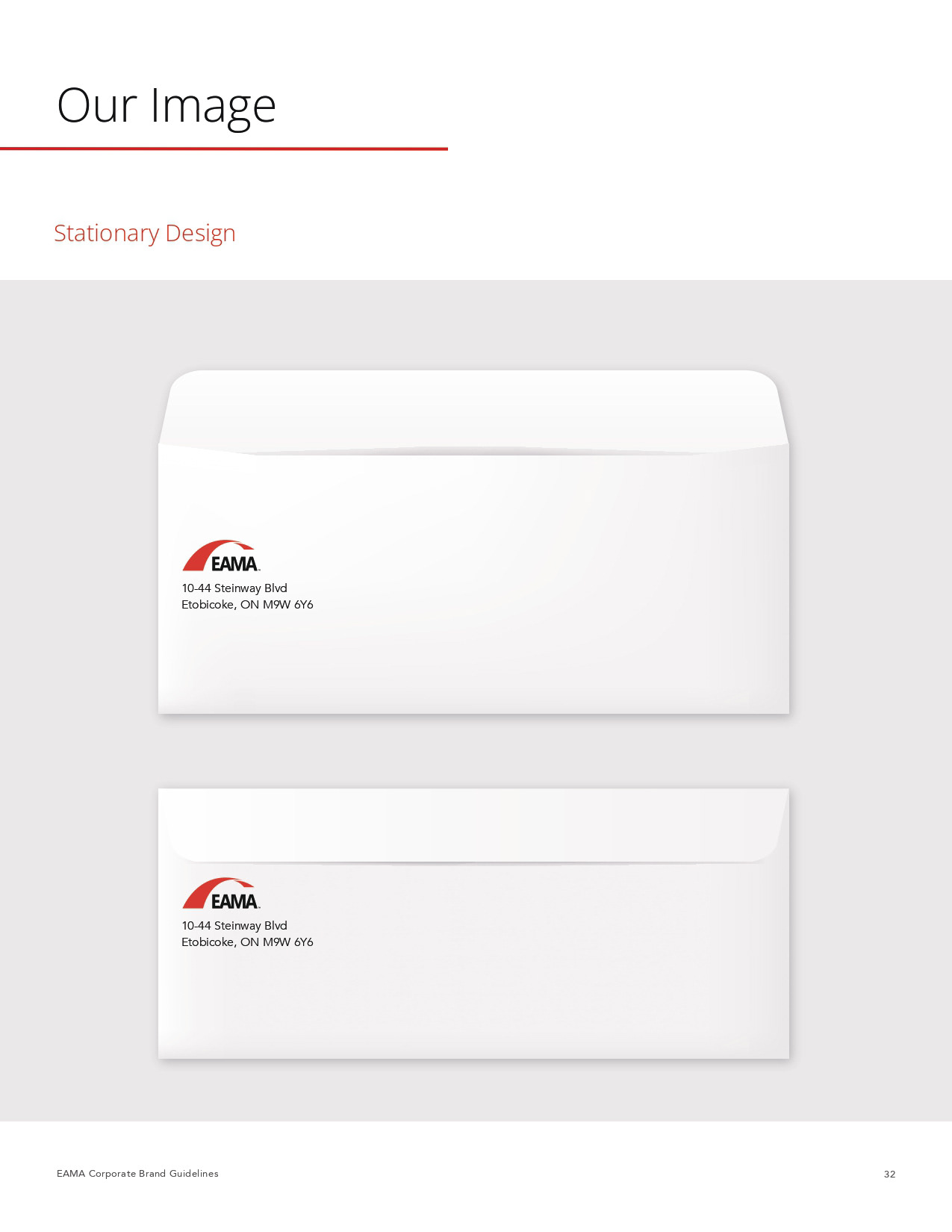
I also wanted to make sure that I can use the swoosh in the brand book since the swoosh is the main part of what makes the EAMA brand. So the swoosh was implemented into the chapter opening pages to make stand out from other pages in the book. I also used a light tint of gray as the background for the chapter opening pages to makes the chapter pages stand out even more than the rest of the white pages.
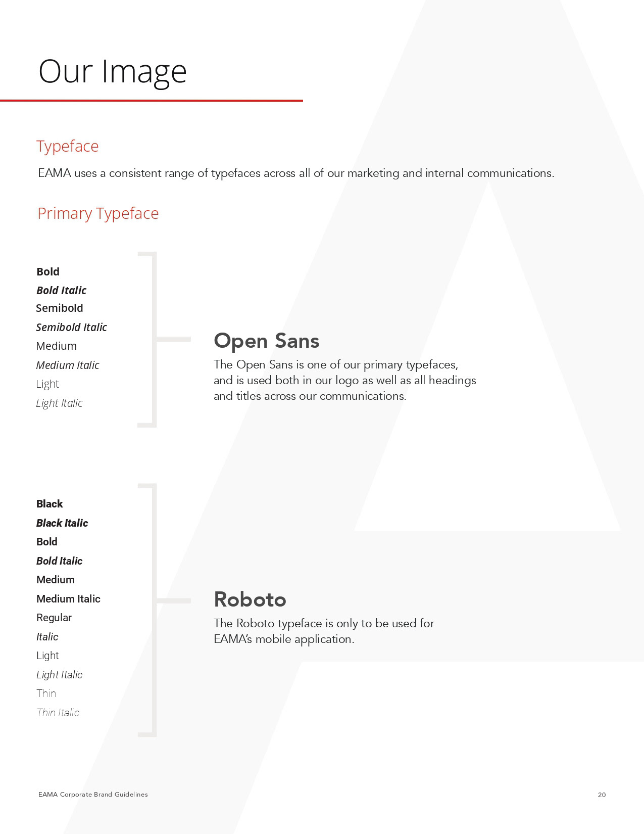
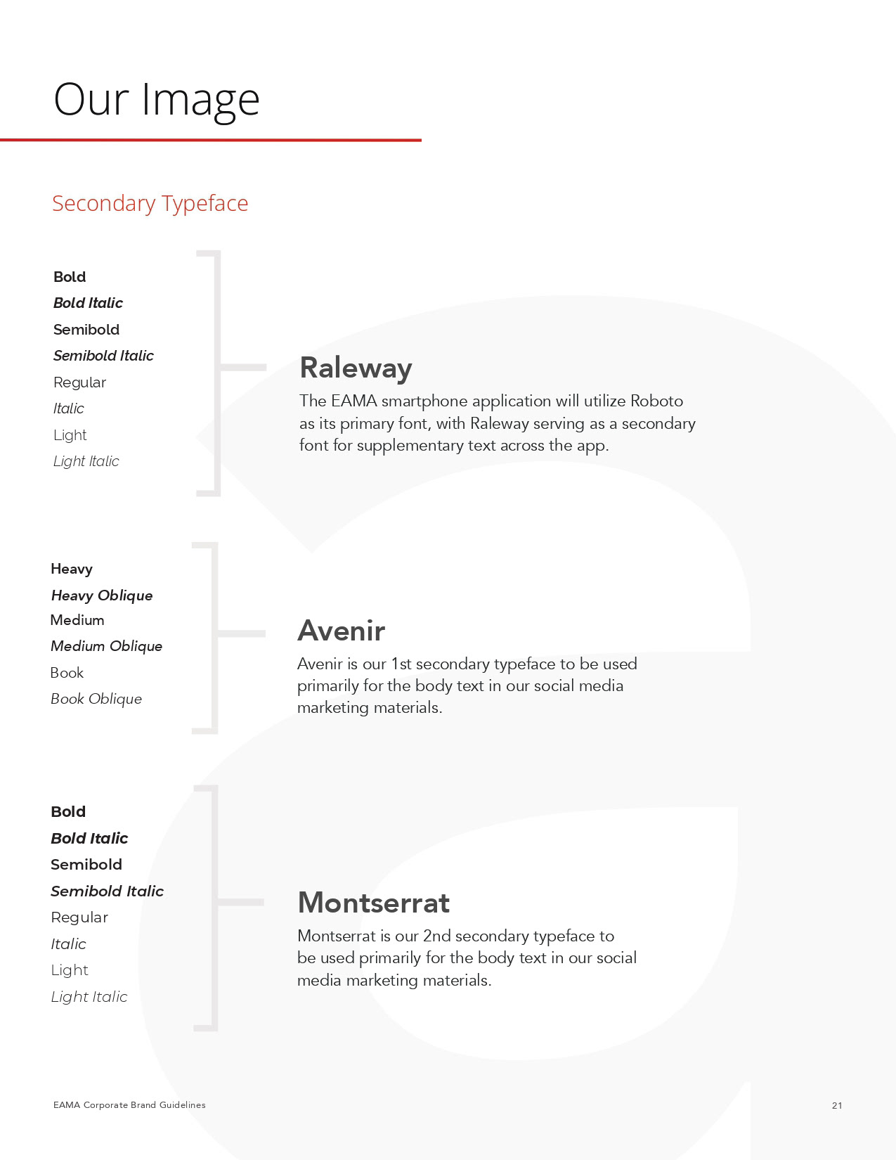
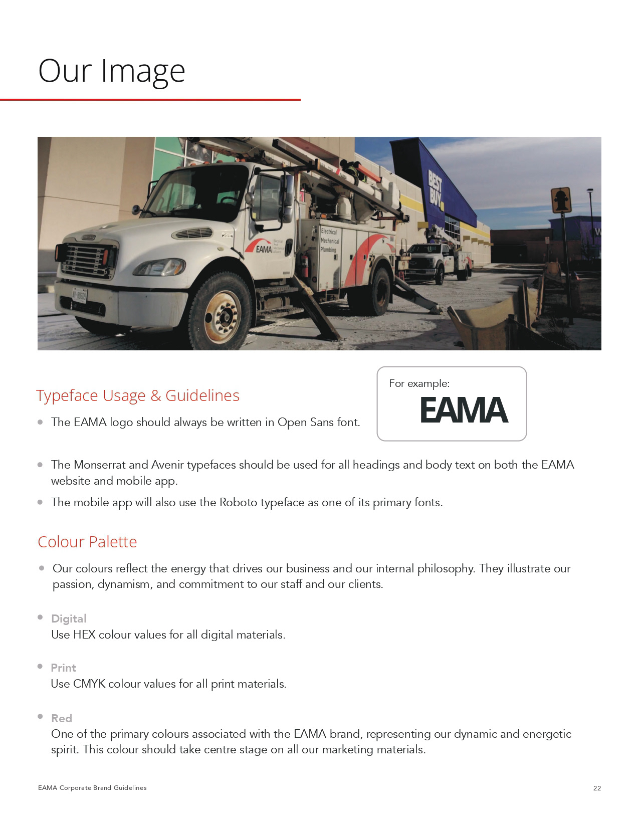
There were times where fonts were newly added as the official fonts of the company. For example, Avenir became our official font for general branding because the company was only using Open Sans and occasionally Montserrat, and there were certain cases were needed to convey information better. Therefore, Avenir was added into the brand book, and similarly with Roboto which is only used for the app design.
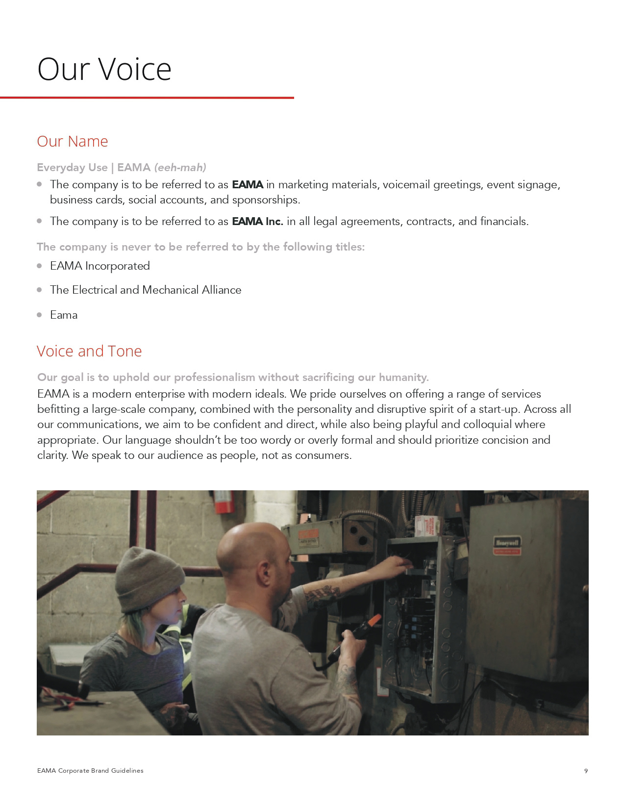
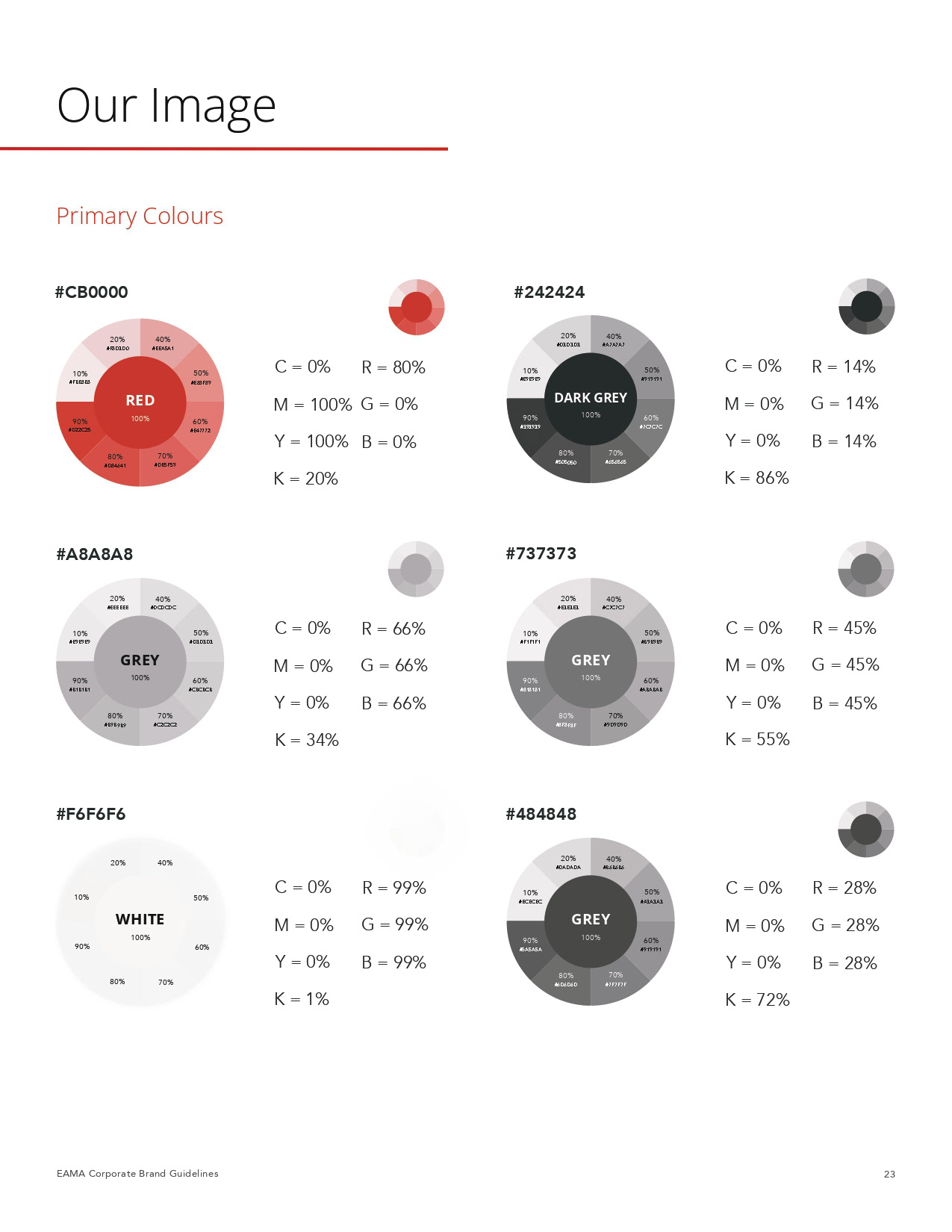
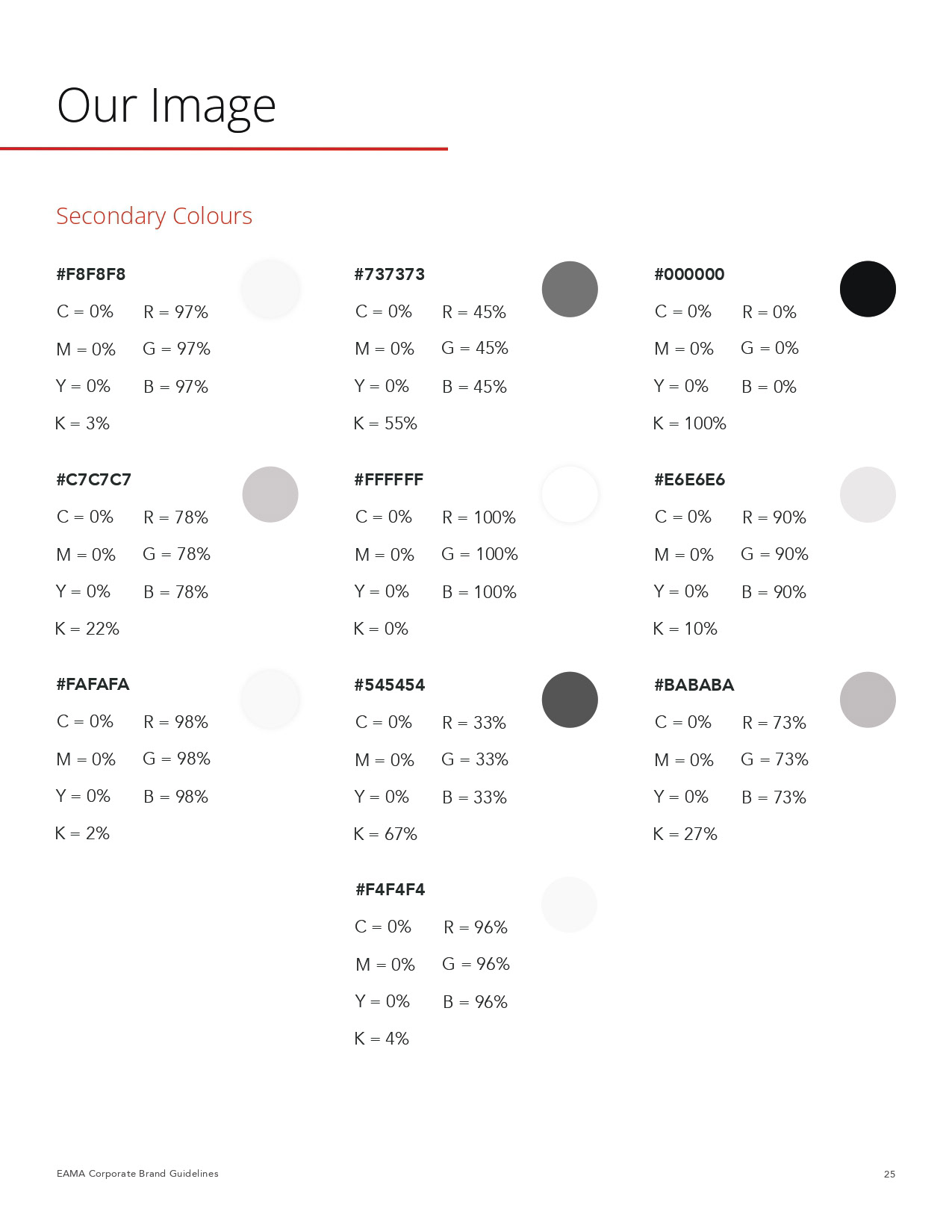
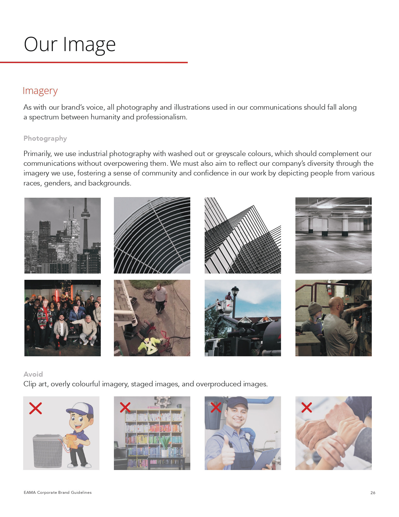
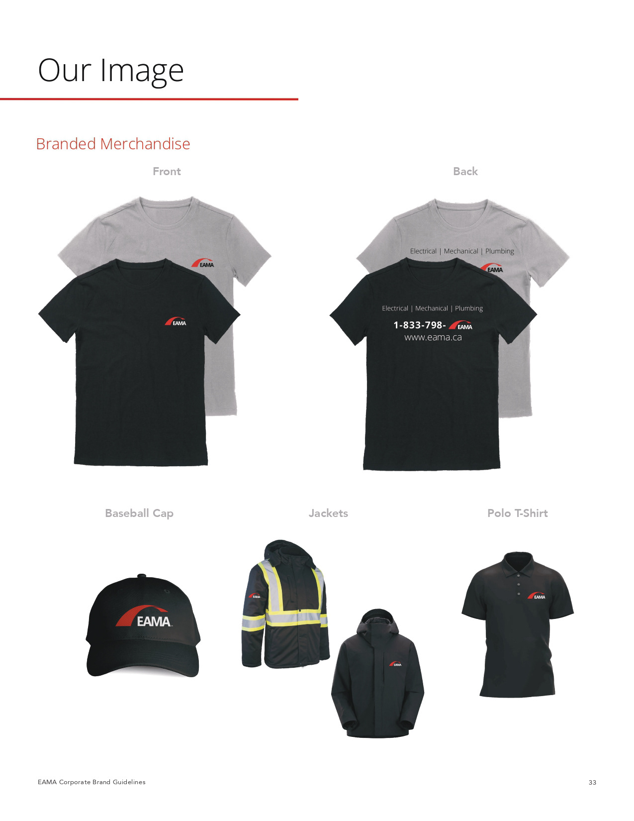
A lot of Photoshop was involved in process of the brand book since there was no official photos of the uniform, truck fleets, or the office supplies. Illustrator was used to edit the Official Logo pages and creating the multiple colour wheels including the company's main red colour. And Figma was the main application that was used for finding some of the official icons and the Application Colours that are part of the AWS (Amazon Web Services).