This video was a big project to help get people to learn the origins of how EAMA Inc. through three different small to mid-sized companies through decades of experience.
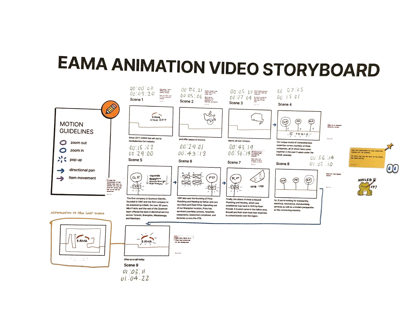
When I was given the written script, I was going to have the year EAMA was established and start the transition inside the zero. But the problem that occurred with the storyboarding is that the inconsistency of the animation and where it was flowing visually. Another issue with the original storyboard was animating the people there because I was going to use the original people for the storyboarding, but there was not further information upon research since most of these companies existed a long time ago before the internet. The last issue with the storyboarding was how the video was originally going to be a timeline and how all of the companies were going to merge together. The company didn't want a timeline for the storyboarding, instead they wanted to introduce the companies based on which company got acquired by EAMA first.
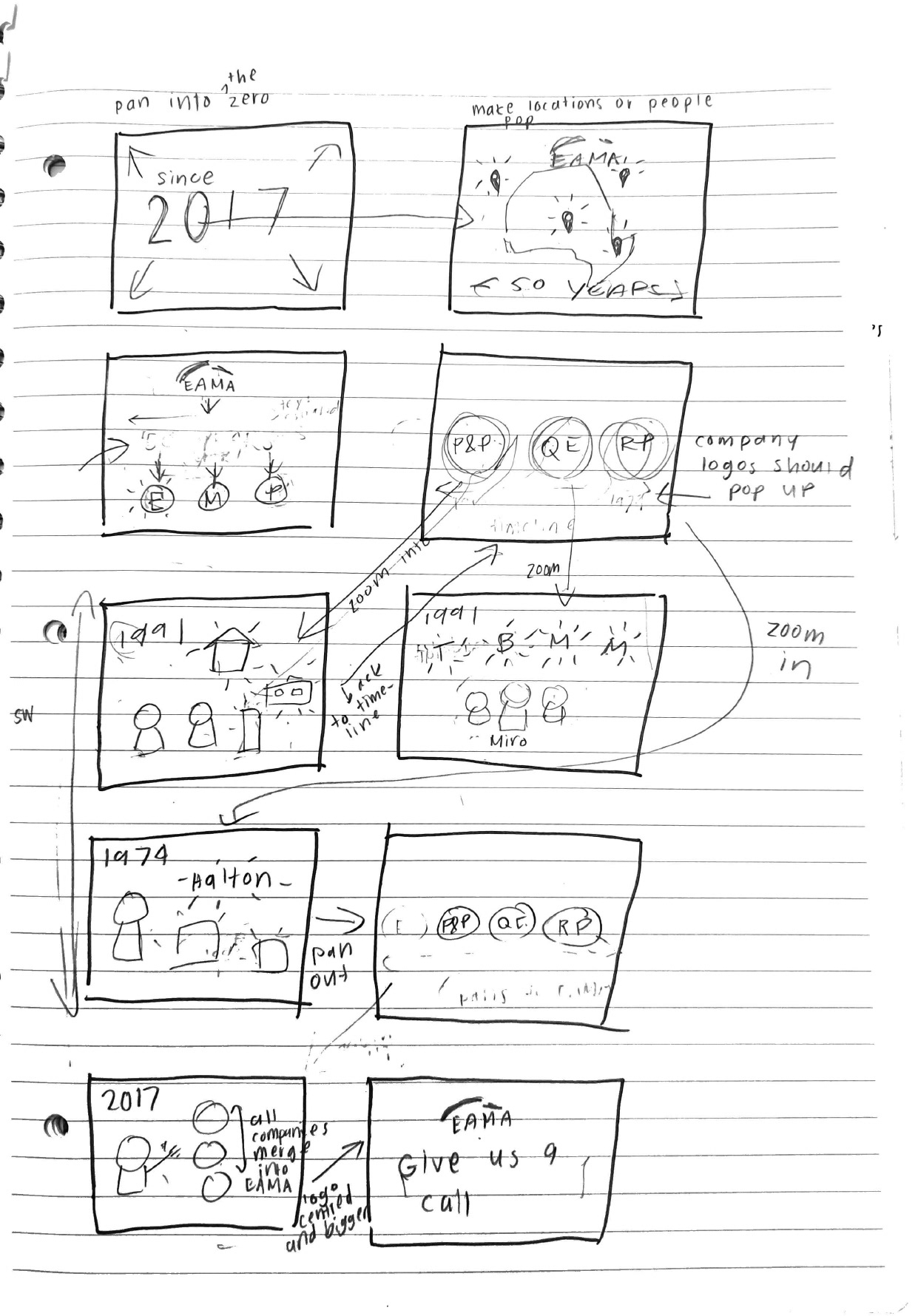
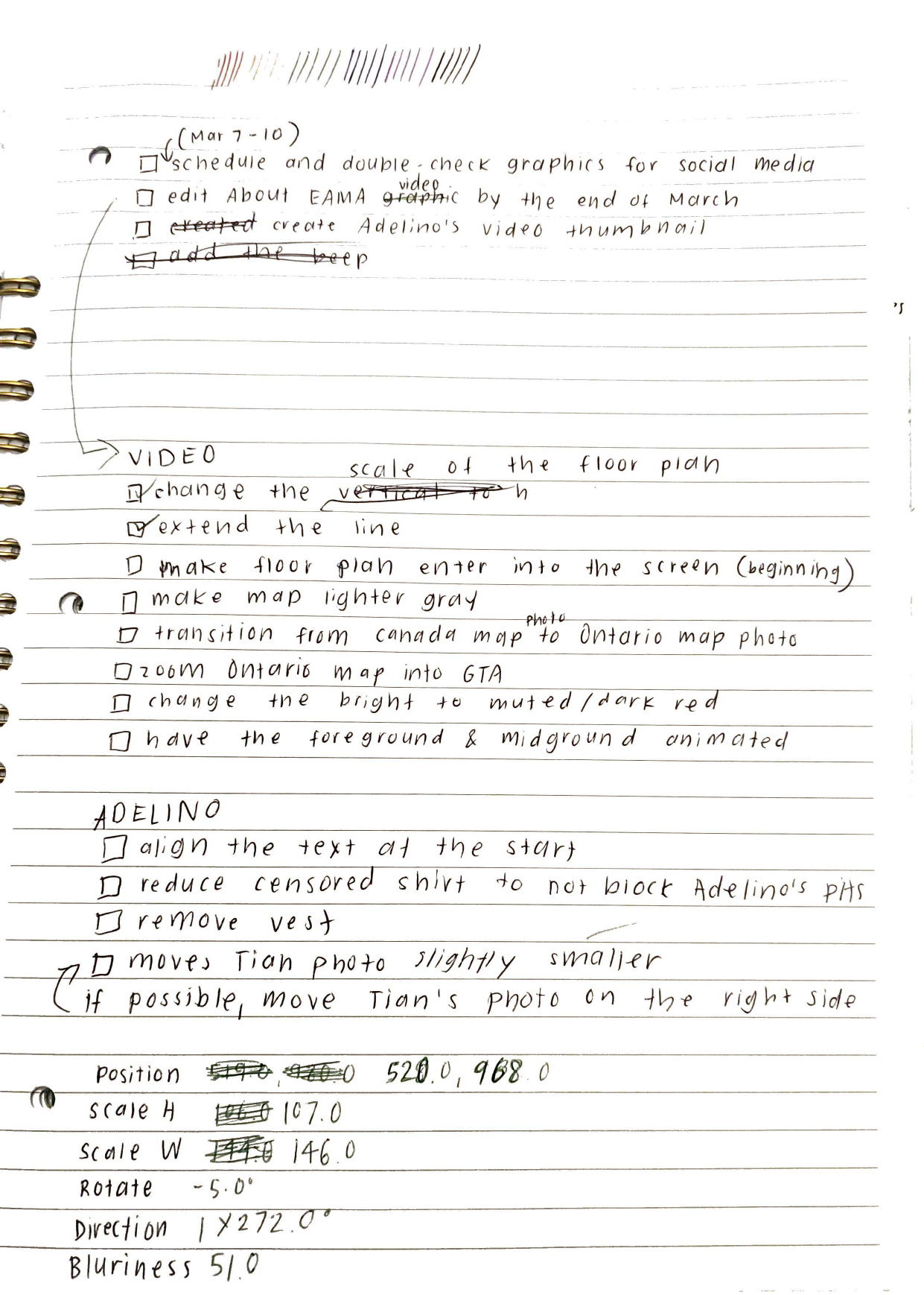
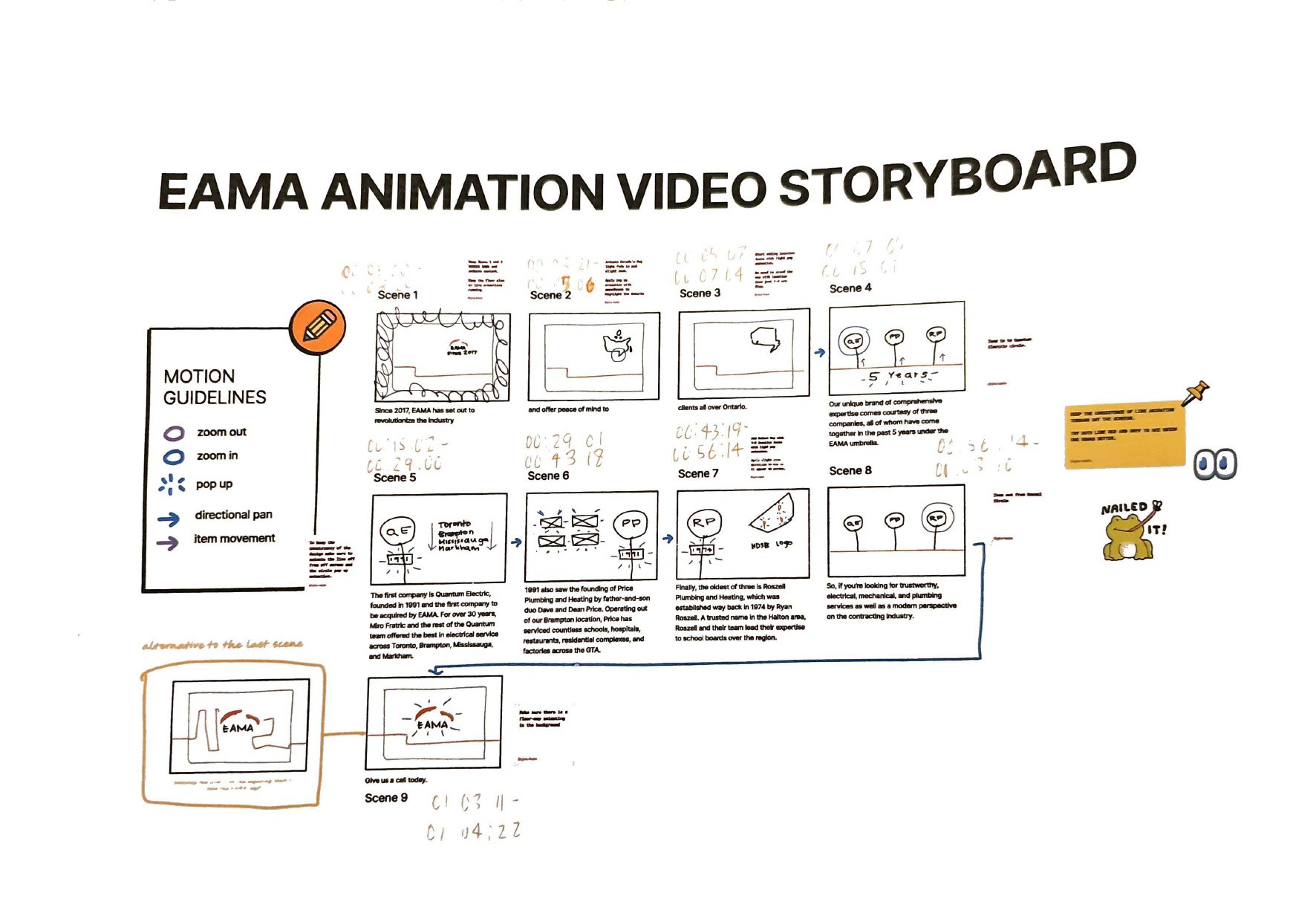
I looked through many different examples of infographics and corporate style animations. One of my coworkers even suggested to take a look at whiteboard animations, but didn't think that was a good idea due to the style looking outdated. The new plan for the storyboarding was to use a blueprint as the background whilst keeping some of the elements from the original storyboard. The blueprint helps guide viewers along with the story and also keep the consistency of the theme since EAMA is a general contractor company. Me and the marketing team asked one of the estimators at the company if we can use a blueprint as a background. The estimator sent the PDF file of the blueprint, vectorize the PDF file on Illustrator, removed the texts and numbers in the original blueprint, then imported the vectorized file to After Effects since there was a lot of animation in the process. Blueprints had a lot of lines, there was going to one main line that flowed along with the story while there's subtle lines being animated in the background lining up with the blueprint.
There was also a suggestion to make the companies pop out from the main line and zoom and out from the companies like a Prezi presentation, but opted to make the companies pop in and fade out one-by-one since it is easier to visualize what was given in the script.
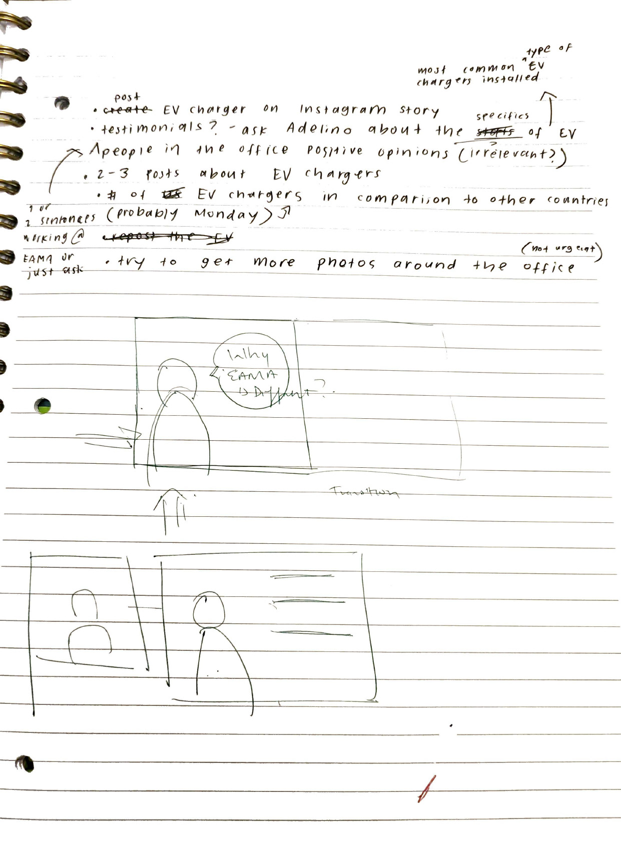
We used people in the official video, but not frequently and we used animated people to help start with the introduction and to introduce a father and son duo when introducing one of the main three companies.
With the ending of the animation, there was originally going to have the logo pop up at the end, or alternatively going to have the main line flow to form the EAMA logo. Instead, I combined both of the ideas together by making the company logo pop up while it was being traced similarly to the lines of the blueprint, and then fade to the opaque logo design.
Official Video